
Buttons that react to your shoppers.
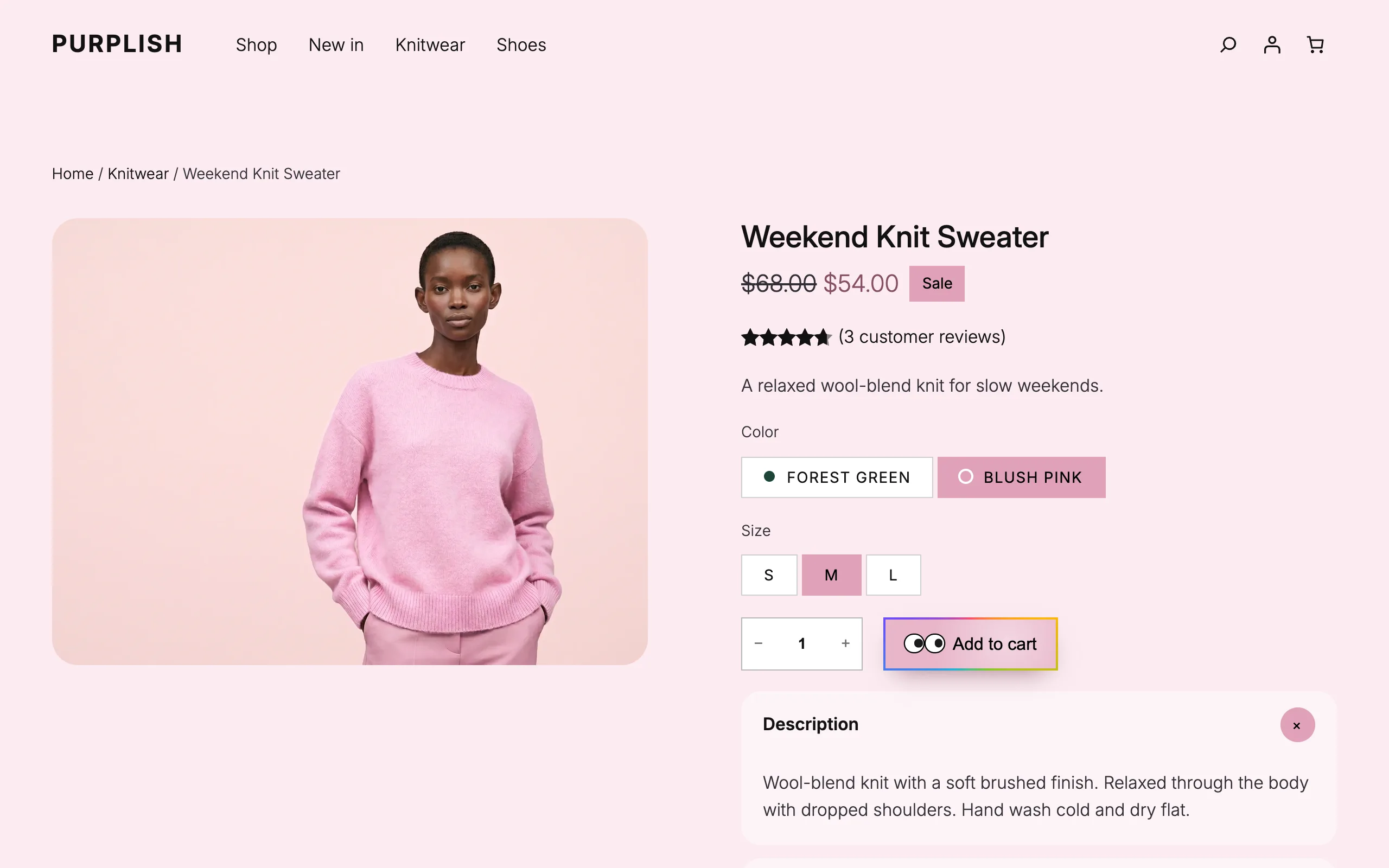
Purplish adds a glow ring, a light sweep, liquid glass, a spectrum ring and googly eyes to the Button block and to the add to cart button in Add to Cart + Options. You pick them in the block sidebar.
Free and open source. New in Purplish 1.3: seals that turn on hover and a ring look for social icons.
Every look sits in the block's own sidebar.
Select a Button or Add to Cart + Options block, and the Purplish panel is right there. Nothing to rebuild.
- Select the block
A Button block on any page, or Add to Cart + Options in the Single Product template.
- Open the Purplish panel
Switch on the looks you want, then pick the eyes and the effect color.
- Pick and save
Save the page or template. Each block keeps its own looks.
Buttons in a Product Collection have their own options. They're on the Product cards page.

Five looks for any Button block.
Select a Button block on any page and switch on the looks you want, in any mix.
- Glow ring
- A soft ring of the effect color around the button.
- Light sweep
- A band of light crosses the button on hover.
- Liquid glass
- A frosted fill with a highlight that follows the mouse.
- Spectrum ring
- A rainbow ring travels once around the edge on hover.
- Googly eyes
- One or two eyes that follow the mouse and blink when it moves again.
- Effect color
- One color for the glow and the glass.
An add to cart button worth a second look.
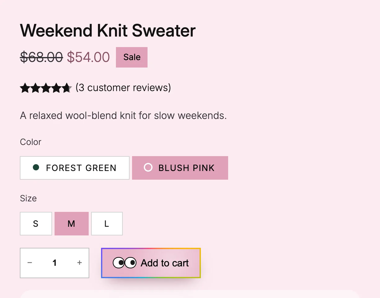
The same looks sit on the add to cart button in the Add to Cart + Options block, plus a halo for the moment a product goes in the cart.
- Glow ring on the button
- A soft ring in the page color around the button.
- Halo after adding to cart
- A ring leaves the button and fades each time a product goes in the cart.
- Liquid glass button
- A frosted fill with a highlight that follows the mouse.
- Spectrum ring on the button
- A rainbow ring travels once around the edge on hover.
- Googly eyes on the button
- One or two eyes that follow the mouse and blink when it moves again.
On a product page, the glow and the halo take the color the shopper picks.
The same looks on the way to checkout.
New in Purplish 1.2. The buttons that take a shopper to checkout and place the order get the Button block's looks too, in any mix, with one effect color.
- Proceed to Checkout
- The button under the cart totals, in the Cart block.
- Place Order
- The button in the checkout's Actions block. It can also show a small lock before its label.
- Go to checkout
- The button at the bottom of the Mini-Cart drawer.
Each one takes Glow ring, Light sweep, Liquid glass and Spectrum ring.

Small details that answer the mouse.
New in Purplish 1.3. Two small touches for the parts around your buttons: a seal or badge that turns like a stamp, and social icons drawn in a thin ring.
- Turn on hover
- On a Group block. The section turns a little, like a stamp, when the mouse is over it or over the group around it. Hover a whole card and its seal turns.
- Ring
- A Look for the Social Icons block. Each icon sits in a thin round ring in the icon color, and the ring fills softly on hover. At the normal size the ring is a comfortable tap target.
Set the icon color to match the section, and the ring follows it.
Hover the card and the iconsTry these with a mouse

Small
batch
Orange knit sweater
Made in small runs each season
A real Group block with Turn on hover, and a real Social Icons block with Ring.
Good to know before you pick.
How the looks behave for shoppers on other devices and themes.
- Touch screens
Phones and tablets have no mouse, so hover effects don't play and the googly eyes stay still.
- Reduced motion
Visitors who ask their device for reduced motion see plain buttons.
- Loads only where it's used
Each effect loads only on pages that use it. A page with plain buttons loads nothing extra.
- Block themes
These looks live in the Site Editor, so they need a block theme. Classic themes get the page colors and three gallery options instead.
More of Purplish
- Image hover effectsSeven hover styles for the Image block, from 3D tilt to Loupe.
- Product cardsTwenty-three card effects and add to cart on the photo for the shop page.
- Product page colorsThe button, the selected option and the sale badge follow the color the shopper picks.
- Filters and mini-cartActive filters that match your chips, and a cart count that pops.
- Cart and checkoutLooks for the cart, the checkout, the Mini-Cart drawer and the thank-you page.
Button questions.
What store owners ask about these looks. The docs cover every option.
How do I add an add to cart button animation in WooCommerce?
On a block theme, open the Single Product template in the Site Editor, select the Add to Cart + Options block and open the Purplish panel. Turn on Liquid glass button or Spectrum ring on the button for a hover effect, Halo after adding to cart for the moment it's pressed, or add googly eyes.
Can I mix button looks?
Yes. Glow ring, Light sweep, Liquid glass and Spectrum ring work in any mix, and googly eyes can go on top. One effect color drives the glow and the glass.
Does it work on any button?
It works on the Button block, on any page or template, and on the add to cart button in the Add to Cart + Options block. The buttons in a Product Collection get their own options, like a button on the photo and a hover look. In Purplish 1.2, Proceed to Checkout, Place Order and the Mini-Cart's Go to checkout button take the same looks as the Button block.
Make your add to cart button the one they notice.
Switch on a look for any Button block, or for the add to cart button in your product template.
Block themes. Free and open source.