
A product page that follows the color shoppers pick.
Pick blue, and the WooCommerce add to cart button, the selected option and the sale badge turn blue. Purplish reads each variation's color from its photo, or you set it yourself.
Free and open source. Updated for Purplish 1.3.2.
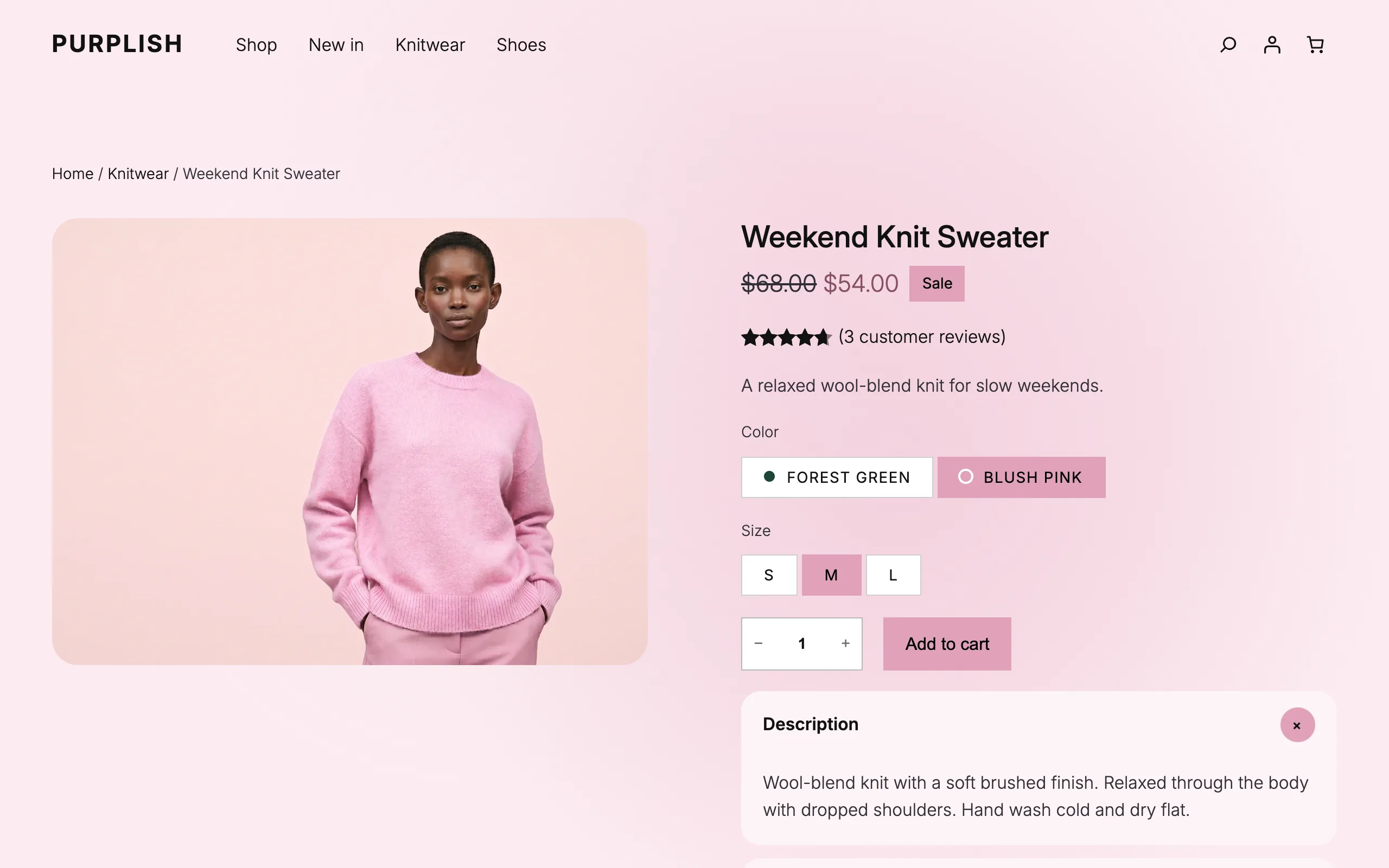
It starts with the products you already have.
Each variation takes its color from its photo by default. The Purplish panel on Add to Cart + Options decides which parts follow it.
- Check each variation
Edit the product and open Variations. Each one has a Page color field: Automatic, Custom or Off. Simple products have it on the General tab.
- Select Add to Cart + Options
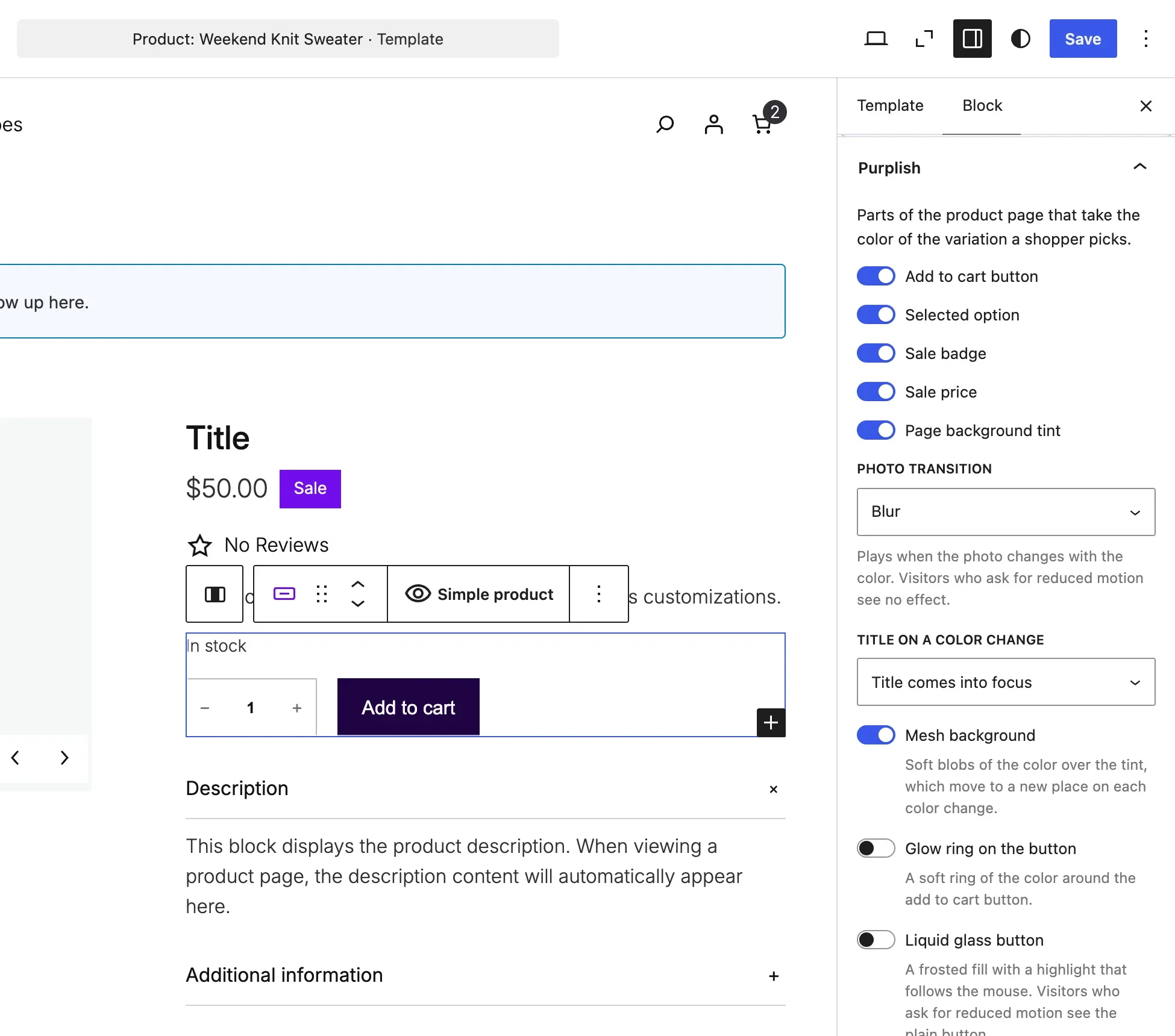
Open the Single Product template in the Site Editor and click the block.
- Open the Purplish panel
Pick the parts that take the color, the photo transition and the small touches. Save the template.
On a classic theme, the color options are under WooCommerce, Settings, Products, Purplish.
New in Purplish 1.3.2: Large buy row on Add to Cart + Options gives the quantity box and the add to cart button one 52px height.
A color for every variation, found for you.
Each variation has a Page color setting. Leave it on Automatic, or set the color yourself when you want an exact one.
- Automatic
- The default. Purplish finds the product in the photo, not the wall behind it, and takes its color. A swatch color on the color attribute comes first.
- Custom
- Pick a color or type a hex code. Purplish uses it exactly as you set it.
- Off
- The variation keeps your theme's colors.
A photo color is often too dark or too pale for a button. Purplish keeps the hue and adjusts it for each use: readable text on the button, a deeper sale price and a pale page tint.
The Page color field on the Blush pink variation, set to Custom with the hex code #c2477d.
You pick which parts take the color.
Turn each part on or off in the Purplish panel. The button, the selected option and the sale badge are on by default.
- Add to cart button
- The color, with readable black or white text.
- Selected option
- The option the shopper picked, like Blush pink or M.
- Sale badge
- The badge next to the price.
- Sale price
- A deeper shade, so the price stays easy to read.
- Page background tint
- A pale tint of the color behind the page.
Photo transition
When the color changes, the photo changes with it: Blur (the default), Fade, Zoom, Slide, Flip, Wipe, Circle reveal, Color wash or None. The recording uses Circle reveal.
Small touches that follow the same color.
Three of them sit on Add to Cart + Options, and one on the Group block.
- Title on a color change
- After the photo changes, the title and price rise into place, or the title comes into focus.
- Mesh background
- Soft blobs of the color over the background tint. They move each time the color changes.
- Color dots on options
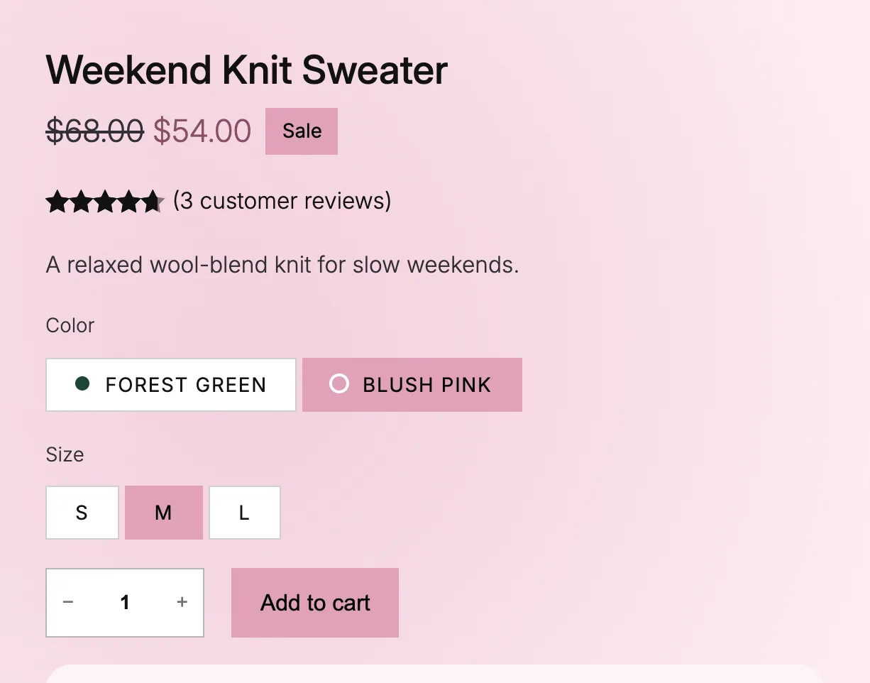
- A dot in each color option's own color. Sizes, and options that come in several colors, get no dot.
- Take the page color
- On a Group block, the section's background becomes a soft version of the color.
The dots don't need color swatches. If the color attribute has swatch colors, Purplish uses those first.
Good to know before you start.
How page colors behave on other themes and devices, and what they load.
- Classic themes
Page colors, the photo transition and the title and price rise, under WooCommerce, Settings, Products, Purplish. The selected option keeps its look, since classic themes show a dropdown.
- Reduced motion
Visitors who ask their device for reduced motion get the colors without the animation.
- Loads only where it's used
The color is saved with the product, and the color script loads on variable products only. The page opens in the default variation's color, with no flash of your theme's colors.
- Photos stay on your server
Purplish reads your photos with the image tools PHP already has. No outside requests, no tracking and no account.
More of Purplish
- Product galleryHover, full-screen and slide styles for the Product Gallery, and round thumbnails.
- Product cardsTwenty-three card effects and add to cart on the photo for the shop page.
- Button effectsGlow, glass, a spectrum ring and googly eyes for any Button block and the add to cart button.
- Sale badge and sold-out optionsPill, circle or price tag badges, and sold-out options crossed out or blurred.
- Scroll effectsHeadings, sections, columns and covers that come in once as the page scrolls.
Color questions.
What store owners ask about page colors. The docs cover every option.
How do I change the add to cart button color for each variation in WooCommerce?
Install Purplish. Each variation takes its color from its photo by default, and the add to cart button follows the variation the shopper picks. To set a color yourself, edit the variation and set Page color to Custom. Step by step: change the add to cart button color per variation.
A color Purplish found looks wrong. What do I do?
Set the variation's Page color to Custom and pick the color. A busy photo, like a model in a furnished room, can point Purplish at the wrong area.
Why do some option buttons have no color dot?
An option gets a dot only when every variation with it has the same color. A size, or an option that comes in several colors, has no single color to show. On the picked option, the dot turns the button's text color so it stays visible. To show options as buttons in the first place, see variations as buttons instead of a dropdown.
Does it work with simple products?
Yes. A simple product gets one Page color for its whole page, read from its photo or set by hand. To keep your theme's colors on one product or variation, set its Page color to Off. For one background on every product page, see change the product page background color.
Let every variation bring its own color.
Your variations already have photos. Purplish reads a color from each one and sets the page to match.
Block and classic themes. Free and open source.