
Purplish docs
Set up Purplish, then find any option by the name the block sidebar shows.
For Purplish 1.3.3
From install to your first option.
Six steps on a block theme. You need WooCommerce 11.0 or later and a variable product with a photo on each variation.
- In your dashboard, go to Plugins, Add New, search for Purplish, then click Install Now and Activate.
- Open Appearance, Editor, Templates, then Single Product.
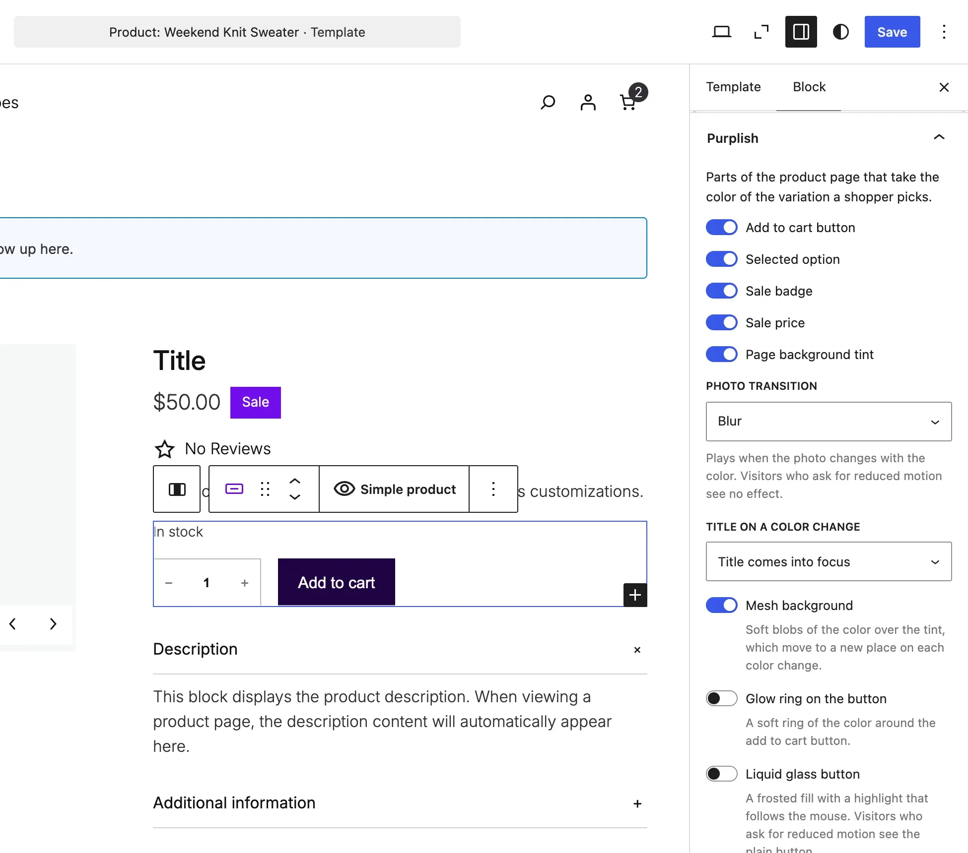
- Click the Add to Cart + Options block in the template. It holds the variation choices and the add to cart button.
- In the Block tab of the sidebar, open the Purplish panel.
- Turn on Page background tint, then turn on Mesh background, which shows up once the tint is on.
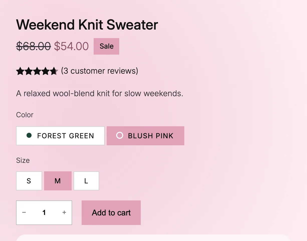
- Save the template. Open a variable product on your store and pick a color. Purplish reads the color from that variation's photo, so there's nothing else to set.
On a classic theme, the options are under WooCommerce, Settings, Products, Purplish.
Every option has its own doc.
Pick what you want to change, then the option by the name the Purplish panel shows. Or search for it.
149 options in 10 groups. New marks options added in 1.3.3.
Product page colors
The color each variation sets, and the parts of the page that follow it.
- Page colorEach variation
- Add to cart buttonAdd to Cart + Options
- Selected optionAdd to Cart + Options
- Sale badgeAdd to Cart + Options
- Sale priceAdd to Cart + Options
- Page background tintAdd to Cart + Options
- Photo transitionAdd to Cart + Options
- Title on a color changeAdd to Cart + Options
- Mesh backgroundAdd to Cart + Options
- Color dots on optionsAdd to Cart + Options
- Take the page colorGroup
Buttons and images
Looks for any Button block and the add to cart button, and hover styles for photos.
- Glow ringButton
- Light sweepButton
- Liquid glassButton
- Spectrum ringButton
- Googly eyesButton
- Effect colorButton
- Glow ring on the buttonAdd to Cart + Options
- Liquid glass buttonAdd to Cart + Options
- Spectrum ring on the buttonAdd to Cart + Options
- Googly eyes on the buttonAdd to Cart + Options
- Halo after adding to cartAdd to Cart + Options
- Large buy rowAdd to Cart + Options
- Hover styleImage
- Turn on hoverGroup
- LookSocial Icons
- HoverCover
Store details
Badges, grayed-out options, reviews, tables, filters and the cart count.
- Grayed-out lookVariation Selector: Template
- ShapeOn-Sale Badge
- CornerOn-Sale Badge
- Review styleProduct Reviews
- Table styleProduct Specifications
- Soft styleAccordion
- Heading lineAccordion
- IconAccordion
- Soft styleAccordion Group
- Soft styleDetails
- Matching chipsProduct Filters
- Count popMini-Cart
- Fly to cartMini-Cart
Product gallery
Hover, full-screen and slide styles, arrows and thumbnail shape.
- Hover styleProduct Gallery
- Full-screen styleProduct Gallery
- Slide styleProduct Gallery
- Frosted arrows on hoverProduct Gallery
- Photo washProduct Gallery
- Hide thumbnailsProduct Gallery
- Rounded cornersProduct Gallery
- Thumbnail shapeProduct Gallery Thumbnails
Product cards
Card effects, hover looks and add to cart on the photo for the shop page.
- Card effectProduct Collection
- Hover plays onProduct Collection
- Card hover fills the buttonProduct Collection
- Details on the photoProduct Collection
- Ruled cardsProduct Collection
- Photo washProduct Collection
- Button on the photoProduct Collection
- Outline buttonProduct Collection
- Button motionProduct Collection
- Effect colorProduct Collection
- Show onShelf Tag
- LookShelf Tag
- Only when sold outProduct Stock Indicator
- Grey out sold-out cardsProduct Stock Indicator
- LookColor Dots
- Swap the photoColor Dots
- Grid switchProduct Collection
- Results changeProduct Collection
Shop pages
Filters, page numbers, category lists, the results count and the category photo.
- Use the category photoCover
- LayoutProduct Filters
- Sidebar can hideProduct Filters
- Tap sizeProduct Filters
- OrderingsCatalog Sorting
- SizeCatalog Sorting
- Names under swatchesChips
- Page numbersPagination
- Load morePagination
- LookTerms Query
- Mark the current termTerms Query
- CountProduct Results Count
- LookProduct Results Count
Cart and checkout
Looks for the Mini-Cart drawer, the cart page, the checkout and the order confirmation page.
- Spring slideMini-Cart Contents
- Soft rowsMini-Cart Contents
- Bigger photosMini-Cart Contents
- Hide short descriptionsMini-Cart Contents
- Free shipping meterMini-Cart Contents
- LooksMini-Cart Proceed to Checkout Button
- Soft rowsCart
- Bigger photosCart
- Sticky totalsCart
- Hide short descriptionsCart
- Free shipping meterCart
- LooksProceed to Checkout
- Field styleCheckout
- Shipping and payment choicesCheckout
- Step numbersCheckout
- Focus ringCheckout
- Soft summaryCheckout
- Side panelCheckout
- Raised cardCheckout
- Bigger photosCheckout
- LooksActions: Place Order
- Lock iconActions: Place Order
- Thank-you momentOrder Status
- Receipt cardOrder Summary
Scroll effects
Headings, sections, columns and covers that come in as the page scrolls.
- Reveal on scrollHeading
- Entrance on scrollGroup
- Entrance on scrollColumns
- Scroll effectCover
- Condense on scrollGroup
- Entrance on scrollTerms Query
Purplish blocks
Showfloor, Changing Room, Wardrobe, Hanging Rail, Story Deck, Runway, Scroll Lookbook and Escalator: the blocks Purplish adds.
- ClipHanging Rail
- Rope sagHanging Rail
- Scroll lengthHanging Rail
- Deck sideStory Deck
- Card shapeStory Deck
- FanStory Deck
- Looks fromRunway
- Photo shapeRunway
- Look numberRunway
- Fly to cartRunway
- Chapter listScroll Lookbook
- TimecodeScroll Lookbook
- Scroll lengthScroll Lookbook
- Outfit photosChanging Room
- RingsChanging Room
- ShowChanging Room
- MovesChanging Room
- Look and colorChanging Room
- After addingChanging Room
- ProductPiece
- Cut-outPiece
- FloorShowfloor
- AutoplayShowfloor
- ControlsShowfloor
- ShoppingShowfloor
- Grid and open lookShowfloor
- Look and productsLook
- Markers and face cropLook
- Menu panelWardrobe
- A look for each linkWardrobe
- TilesEscalator
- Add to cart buttonEscalator
- Columns, speed and heightEscalator
- Tile lookEscalator
See them working: ShowfloorChanging RoomWardrobeHanging RailStory DeckRunwayScroll LookbookEscalator
Patterns and agents
Ready-made pages and sections in the Purplish pattern category, and the abilities AI agents can run.
- Flagship patternsPatterns
- Store page patternsPatterns
- Shop patternsPatterns
- Escalator hero patternsPatterns
- Abilities for AI agentsAbilities
- Corners, shadow and colorsTheme
No option matches that. Try the block name, like Button or Cover, or ask in the support forum.
On a classic theme? Some options work there too, under WooCommerce, Settings, Products, Purplish. See which ones.
Questions about the docs.
For anything about one option, open its doc first. These cover the rest.
Where do I ask a question the docs don't answer?
In the Purplish support forum on WordPress.org. Say which block and option you're using, your theme, and what you expected to see. A screenshot of the Purplish panel helps.
How do I report a security issue?
Privately, through the security policy on GitHub. Please don't post it in the support forum, where anyone can read it.
Which version of Purplish do these docs match?
Purplish 1.3.3. Options added in 1.3.3 are marked New in 1.3.3. If one of them is missing from your sidebar, update Purplish from the Plugins screen.
Pick an option and try it on a real product.
Every doc ends in the same place: the Purplish panel in the block sidebar. If a step doesn't match what you see there, say so in the support forum.
Block and classic themes. Free and open source.