Every design option Purplish adds to WooCommerce blocks.
Purplish is a WooCommerce design plugin for block themes. Each option sits in the sidebar of the block it changes, so you pick a look in the Site Editor and save.
Product cards with a bit of life on the shop page.
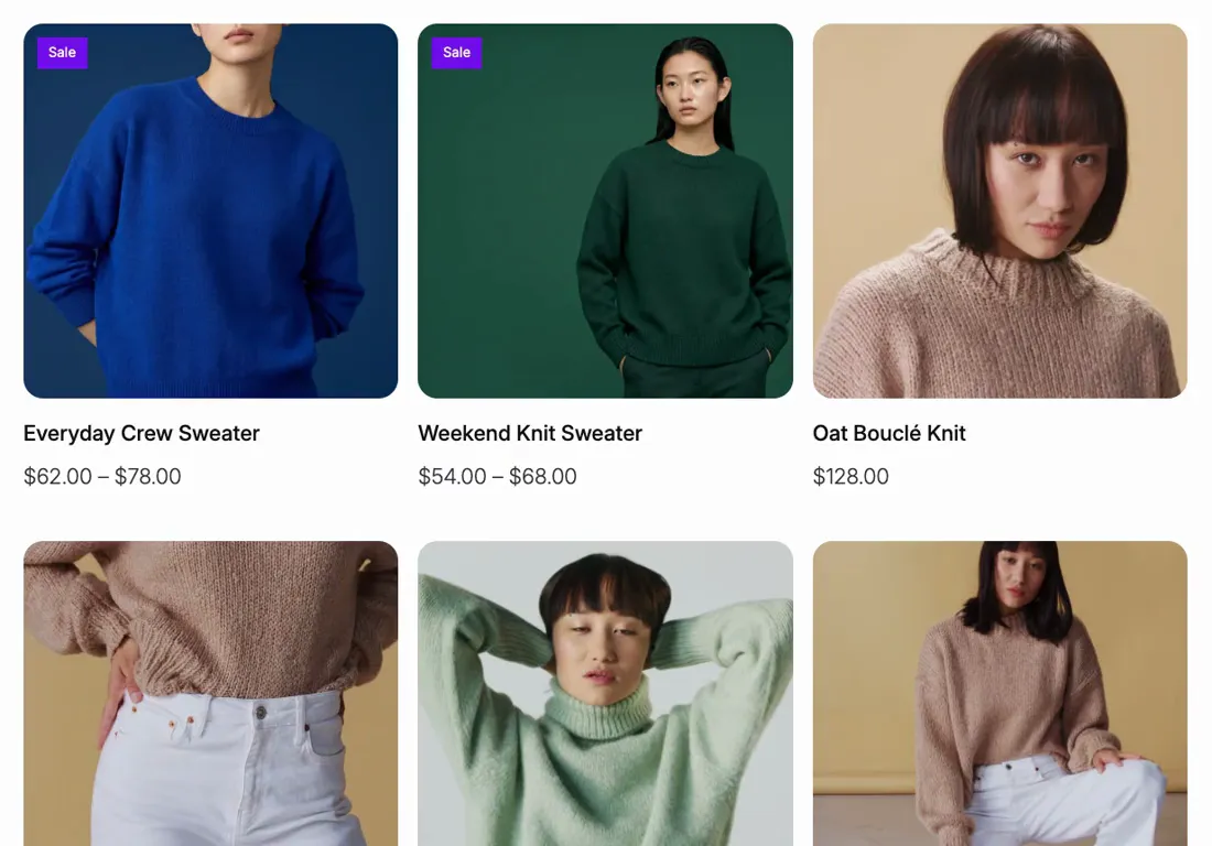
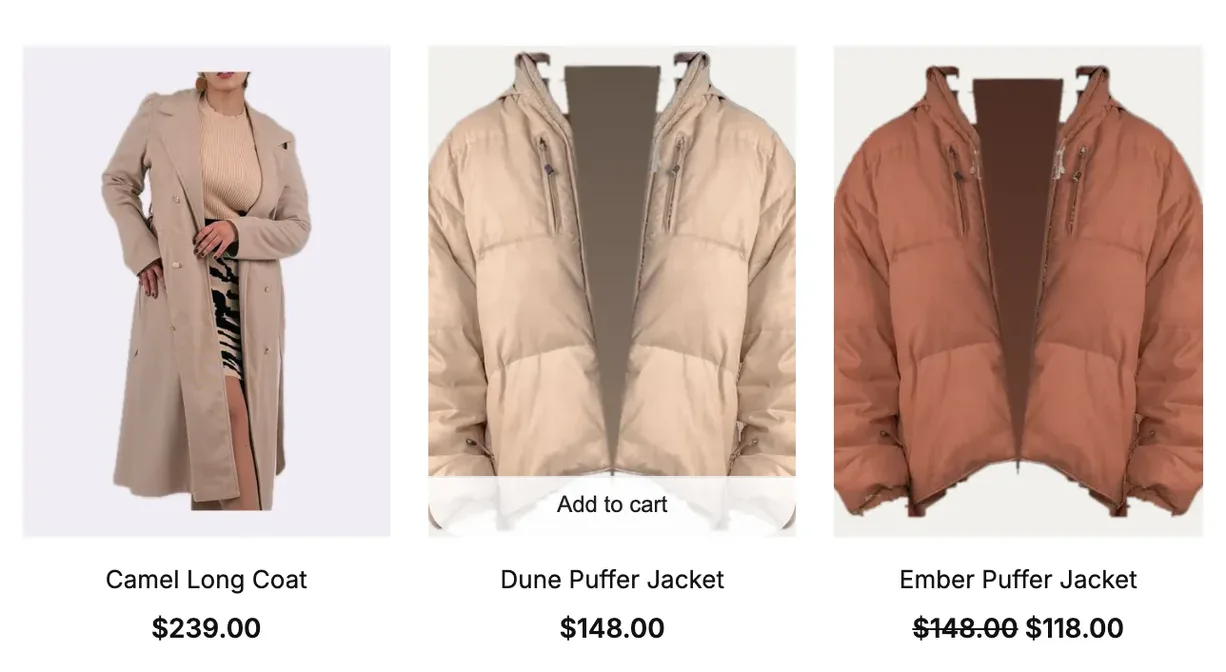
Select the Product Collection block on your shop or collection template. Add to cart moves onto the photo, and one card effect plays across the whole grid.
Add to cart and the product details on the photo
23 card effects on hover, in a carousel or on scroll
Hover looks for the card, the photo and the button
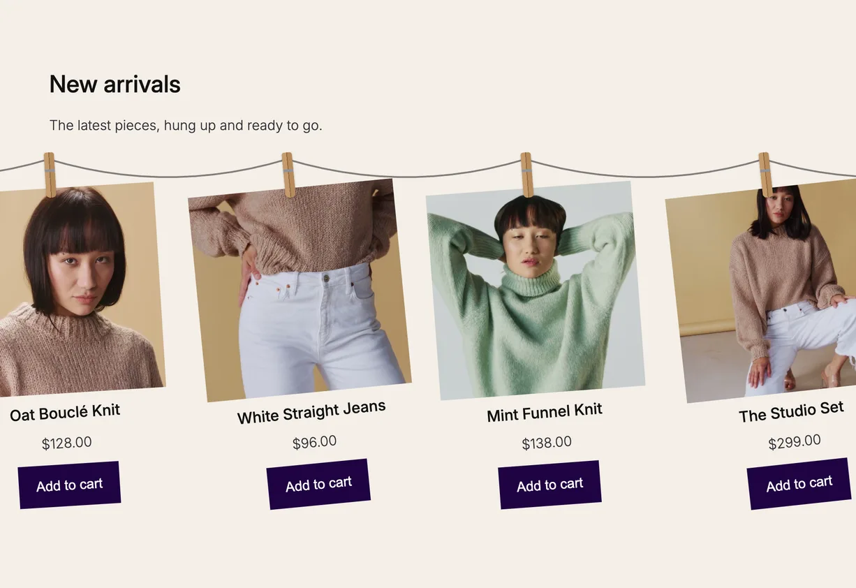
Products on a rope that moves as the page scrolls.
Hanging Rail, a block of Purplish's own. Products hang from clips on a rope, slide along it while the section holds still, and swing a little when the scrolling stops.
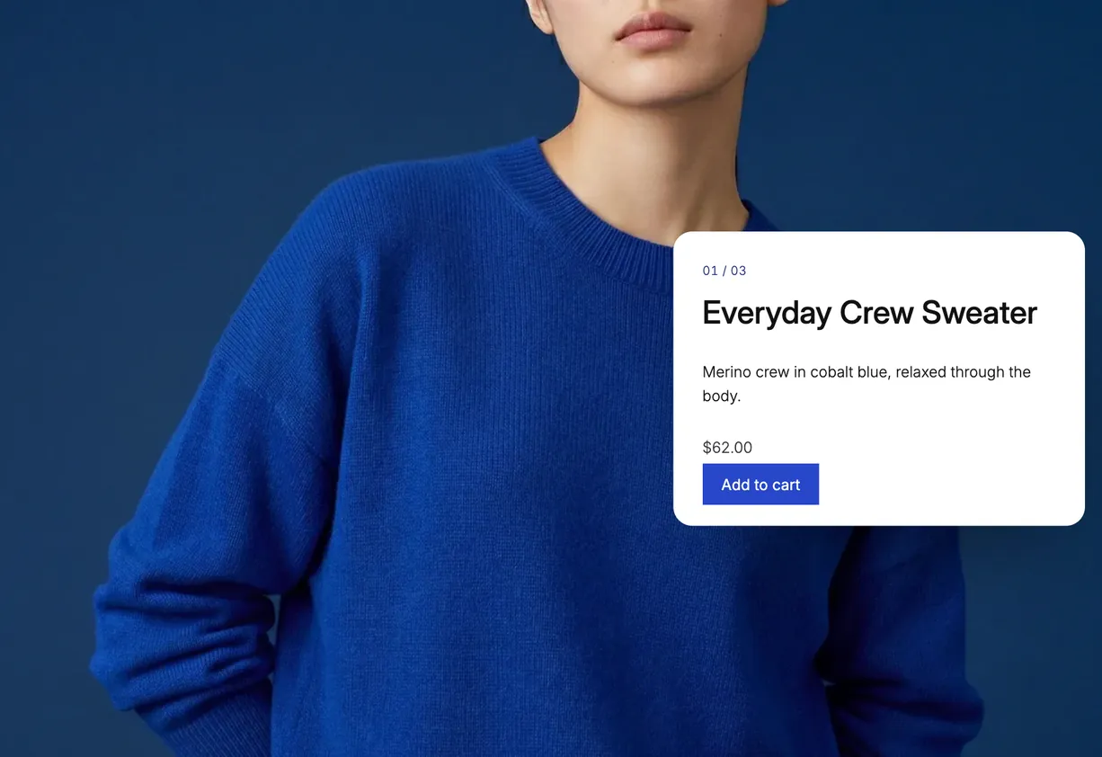
Scroll Lookbook, a block of Purplish's own. Your videos or photos play as shoppers scroll, and at each stop that product's card slides in with add to cart.
A video or a photo in each shot, with a closing line at the end
A chapter list and a running timecode, each on or off
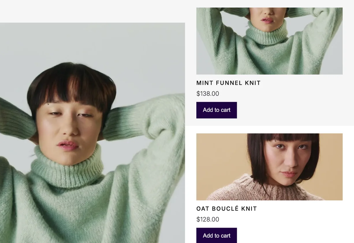
Runway, a block of Purplish's own. Your product photos line up one behind the other, shoppers walk the line with a swipe, a drag or the arrow keys, and add to cart sends the photo to the cart.
Every product photo, or only the featured photo
Framed photos, or cutouts that stand on the floor
A look number and a fly to the cart, each on or off
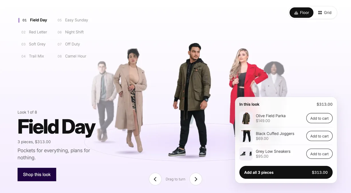
Showfloor, new in Purplish 1.3. Cut-out looks stand on an oval floor, each with a name, a short line and the products in it. Shoppers turn the floor, open a look and add one piece or the whole outfit.
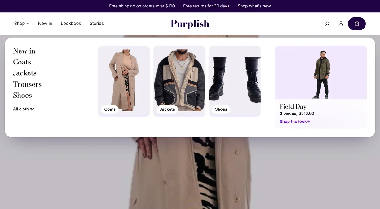
Wardrobe, new in Purplish 1.3. A mega menu item for the Navigation block. Its label opens a big panel under your header with category links, photo tiles and a look card, all blocks you edit in place.
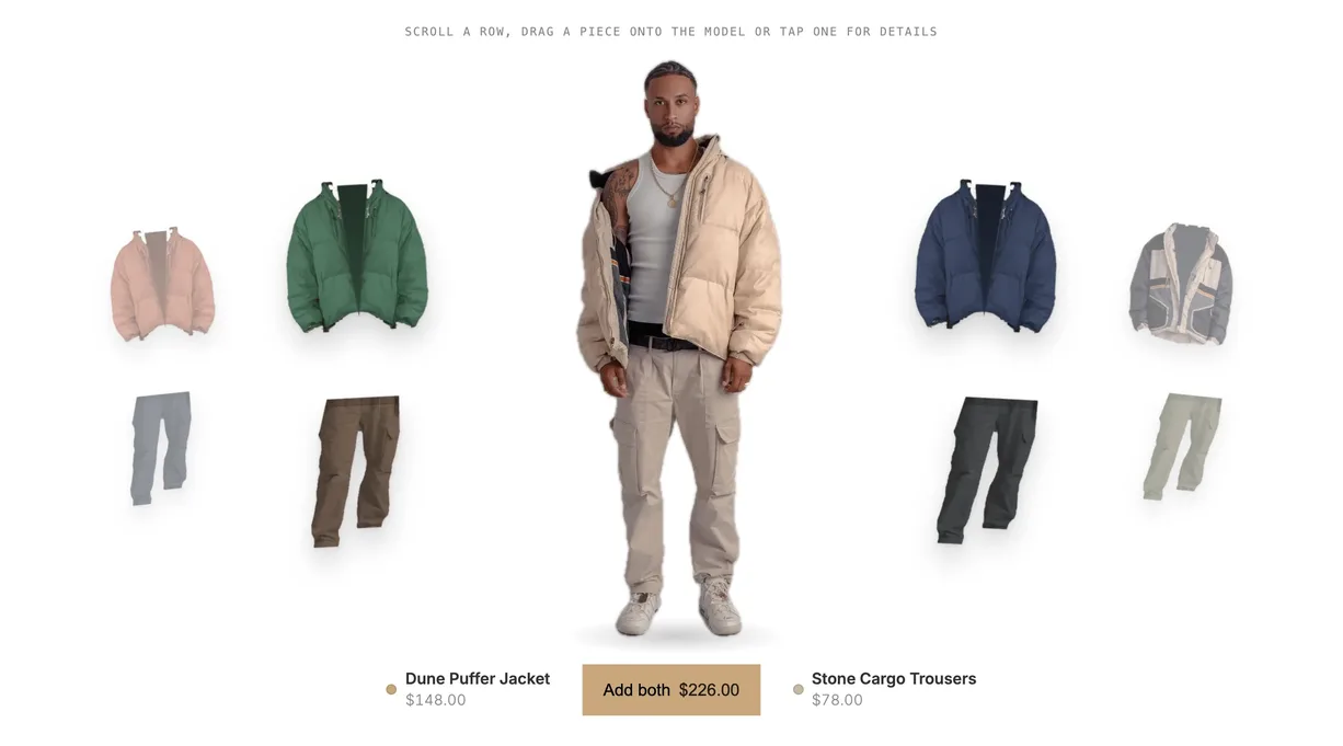
Changing Room, new in Purplish 1.3. Tops and bottoms turn in two rings around a photo of a model, and shoppers drag a piece onto him to see the outfit, then add both to the cart.
A real photo of the model for each top and bottom pair
Sizes from your variations, in a panel beside the room
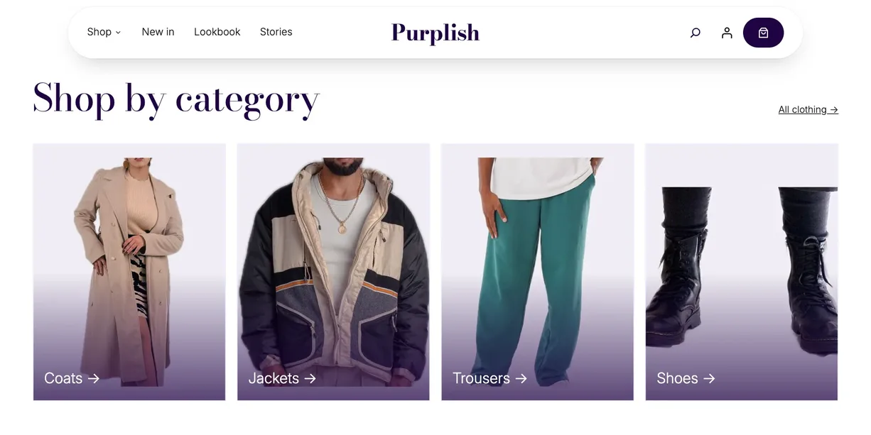
Three shop page patterns, Flagship, Atelier and Boutique, plus new options for the filters, the product grid and the category tabs your shop template already uses.
Filters in a bar above the products, or a sidebar that folds away
A grid switch, Load more and new ways for results to change
Shelf Tag and Color Dots, two small blocks for product cards
Flagship home, new in Purplish 1.3, opens on a turning floor and runs through categories, best sellers and a newsletter. The Flagship header, phone menu and footer, an empty cart, a checkout header and a money-back card come with it.
Seven home sections, each one its own pattern
A header that narrows into a floating pill as the page scrolls
Ordinary core and WooCommerce blocks, yours to change
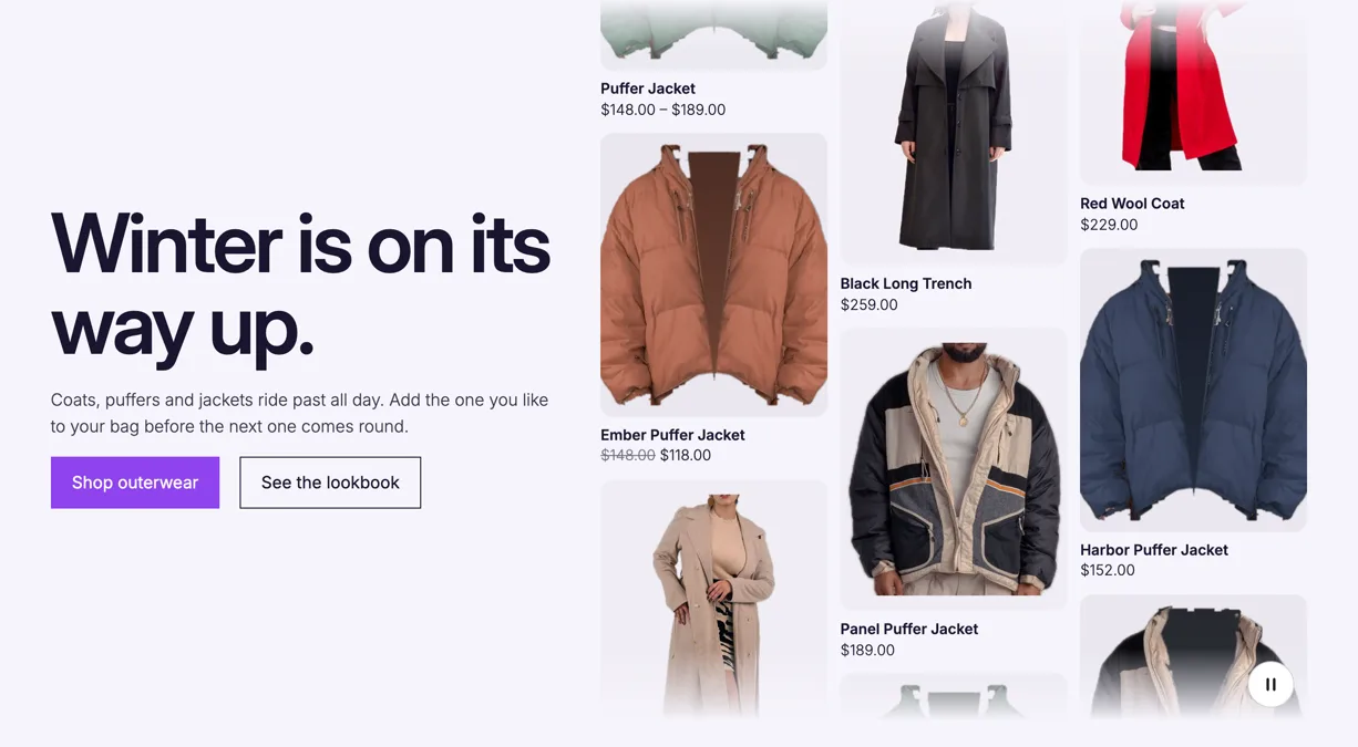
Escalator, new in Purplish 1.3.2, fills a hero with your products in moving columns. Shoppers point at a photo to stop it and add to cart from the photo.
Newest, best sellers, on sale, featured or one category
Four add to cart button styles on the photo
A pause button, and still columns for reduced motion
One row per option, named the way the editor names it. The last two columns show whether it works on a block theme, a classic theme or both.
New in Purplish 1.3: AI agents can work with these options too. Four abilities for the WordPress Abilities API read the design catalog and a page's designs, set a block's design and insert a pattern. Only admins can run them.
New in Purplish 1.3.2: a block theme can set the corners and shadow of the Purplish looks with settings.custom.purplish in its theme.json, a radius, a shadow or both. The checkout and cart looks, the card Ring, the filter bar's lists and Escalator tiles read them. New in 1.3.3: a wash and a rule color too, for Photo wash and the lines between ruled cards. Corners, shadow and colors has the details.
Each variation In the product editor
Block themesClassic themes
Option
What it does
Block themes
Classic themes
Page color
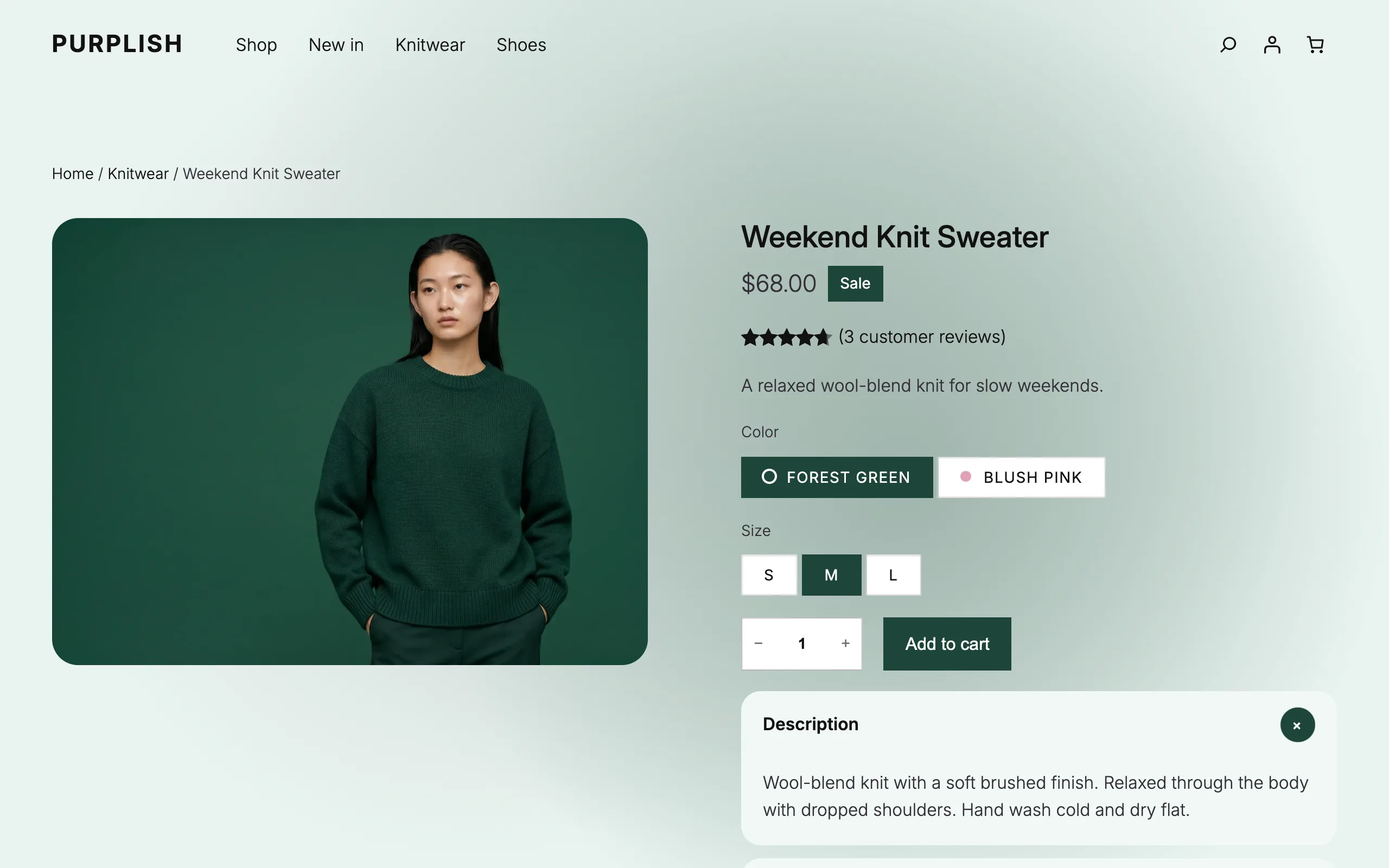
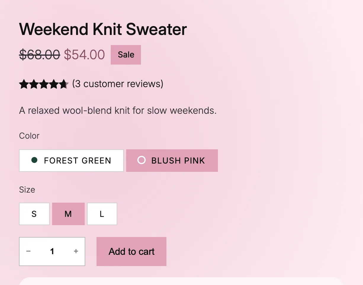
Automatic reads the color from the photo, Custom takes your hex code, and Off keeps your theme's colors.Block and classic themes
Yes
Yes
Add to Cart + Options
Block themesClassic themes
Option
What it does
Block themes
Classic themes
Add to cart button
The button fills with the page color. On by default.Block and classic themes
Yes
Yes
Selected option
The picked option takes the color. On by default.Block themes
Yes
No
Sale badge
The sale badge takes the color. On by default.Block and classic themes
Yes
Yes
Sale price
The sale price shows in a deeper shade of the color.Block and classic themes
Yes
Yes
Page background tint
A pale tint of the color sits behind the product.Block and classic themes
Yes
Yes
Photo transition
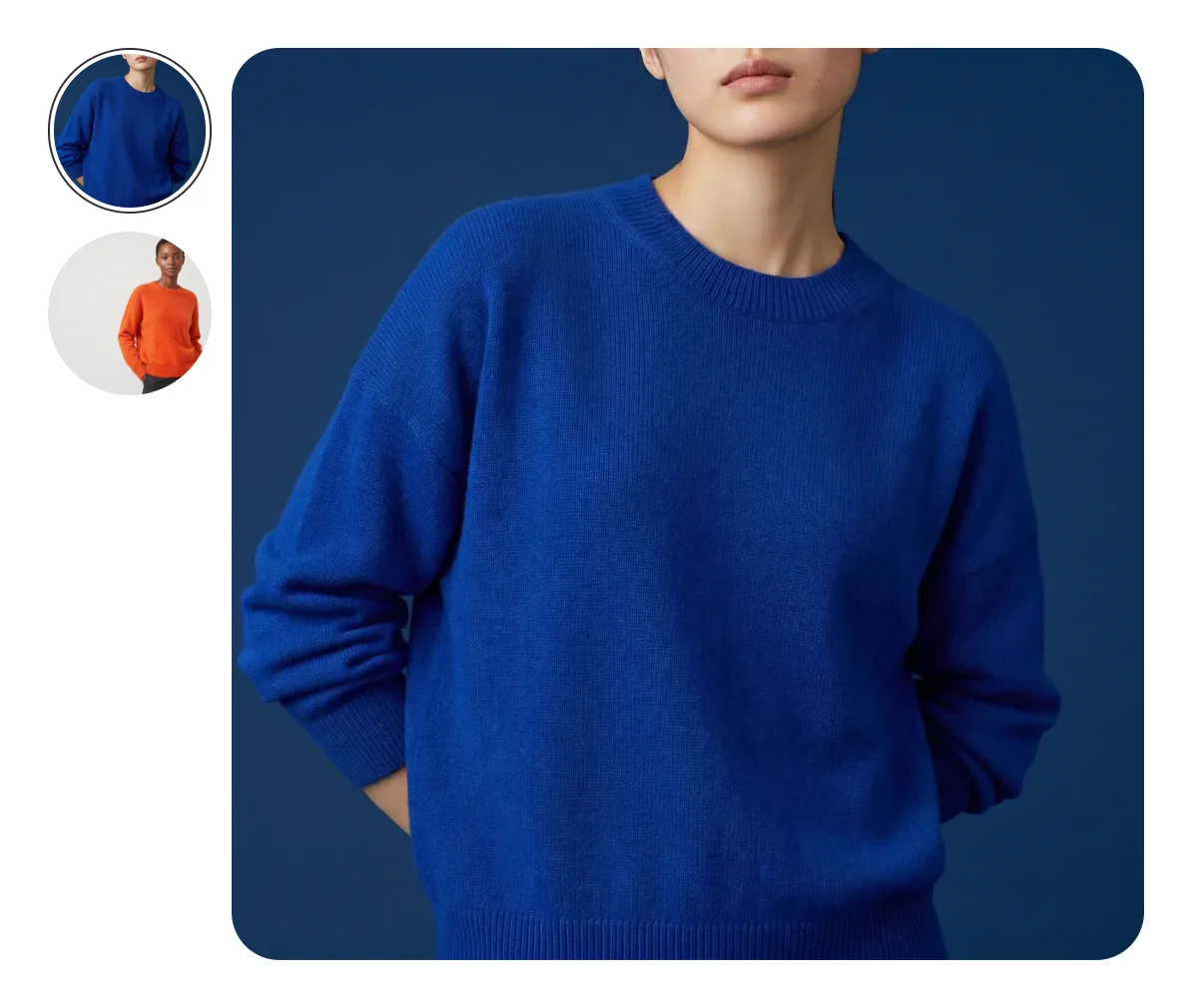
How the photo changes with the color: Blur, Fade, Zoom, Slide, Flip, Wipe, Circle reveal, Color wash or None.Block and classic themes
Yes
Yes
Title on a color change
The title and price rise into place, or the title comes into focus.Block themes. Classic themes: rise only
Yes
Yes, rise onlyRise only
Mesh background
Soft blobs of the color that move each time it changes.Block themes
Yes
No
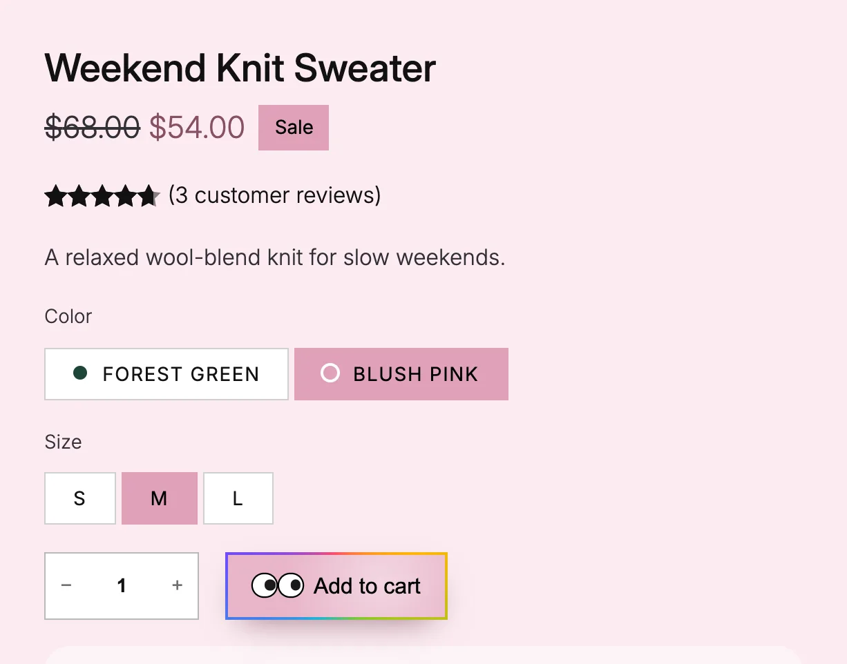
Glow ring on the button
A soft ring in the page color around the button.Block themes
Yes
No
Liquid glass button
A frosted fill with a highlight that follows the mouse.Block themes
Yes
No
Spectrum ring on the button
A rainbow ring travels once around the edge on hover.Block themes
Yes
No
Googly eyes on the button
One or two eyes follow the mouse and blink after a pause.Block themes
Yes
No
Halo after adding to cart
A ring leaves the button and fades each time a product goes in the cart.Block themes
Yes
No
Color dots on options
Each color option shows a dot in its own color.Block themes
Yes
No
Large buy row New in 1.3.2
The quantity box and the add to cart button share one 52px height.Block themes
Yes
No
Variation Selector
Block themesClassic themes
Option
What it does
Block themes
Classic themes
Grayed-out look
Options that can't be bought keep WooCommerce's look, get a line across them, or blur out.Block themes
Yes
No
On-Sale Badge
Block themesClassic themes
Option
What it does
Block themes
Classic themes
Shape
A pill, circle or price tag badge.Block themes
Yes
No
Corner
On the gallery photo, the badge can sit in any of the four corners.Block themes
Yes
No
Product Stock Indicator
Block themesClassic themes
Option
What it does
Block themes
Classic themes
Only when sold out New in 1.3
Pill, Chip or Glass. The indicator shows only on sold-out products, and sits on the photo inside the Product Image block.Block themes
Yes
No
Corner New in 1.3
On the photo, the sold-out look can sit in any of the four corners.Block themes
Yes
No
Grey out sold-out cards New in 1.3
The photo of a sold-out product turns grey and soft, and comes back a little on hover.Block themes
Yes
No
Product Gallery
Block themesClassic themes
Option
What it does
Block themes
Classic themes
Hover style
3D tilt, Zoom, Lift, Parallax, Glare, Loupe or Slow zoom. It replaces WooCommerce's hover zoom.Block and classic themes
Yes
Yes
Full-screen style
Snap stack, Classic fade, Zoom from photo, Filmstrip or Cinema. Needs "Open pop-up when clicked".Block themes
Yes
No
Slide style
3D media gallery, Circular slider, Reel slider or Image tunnel.Block themes
Yes
No
Hide thumbnails
One big photo, with no thumbnail strip.Block and classic themes
Yes
Yes
Rounded corners
Soft corners on the main photo.Block and classic themes
Yes
Yes
Frosted arrows on hover
Round frosted arrows that show when the mouse is over the photo.Block themes
Yes
No
Photo wash New in 1.3.2
A light tint of the page color behind the main photo and the thumbnails, with the photos blended in.Block themes
Yes
No
Product Gallery Thumbnails
Block themesClassic themes
Option
What it does
Block themes
Classic themes
Thumbnail shape
Rounded or circle thumbnails.Block themes
Yes
No
Group
Block themesClassic themes
Option
What it does
Block themes
Classic themes
Take the page color
On product pages, the section background turns a soft version of the color the shopper picks.Block themes
Yes
No
Entrance on scroll
The section fades up or zooms in as it scrolls into view.Block themes
Yes
No
Condense on scroll New in 1.3
Made for headers. The section stays at the top and narrows into a floating pill as the page scrolls.Block themes
Yes
No
Turn on hover New in 1.3
Made for badges and seals. The section turns a little, like a stamp, when the mouse is over it.Block themes
Yes
No
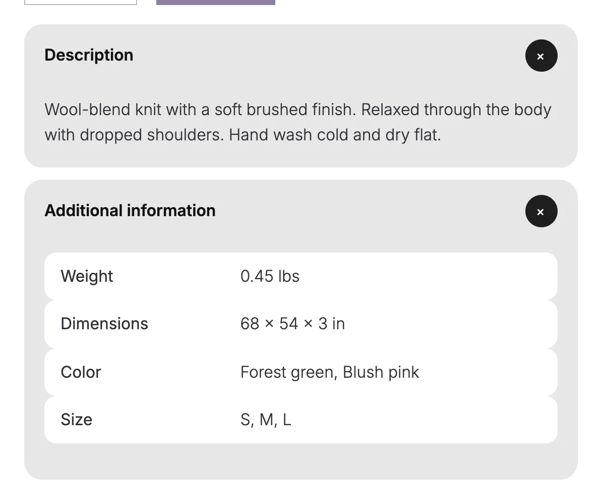
Accordion
Block themesClassic themes
Option
What it does
Block themes
Classic themes
Soft style
Each item becomes a soft card, and the plus turns into an x that fills with the page color.Block themes
Yes
No
Heading line New in 1.3
Drawn adds a hairline under each item, with a line that draws across on hover and stays while the item is open. Not with Soft style.Block themes
Yes
No
Icon New in 1.3
Plus or Chevron. The chevron turns over when the item opens. Not with Soft style.Block themes
Yes
No
Accordion Group
Block themesClassic themes
Option
What it does
Block themes
Classic themes
Soft style
The same soft cards on WooCommerce's own accordion, with its icon in a round button.Block themes
Yes
No
Details
Block themesClassic themes
Option
What it does
Block themes
Classic themes
Soft style
The block becomes a soft card, and a round plus turns into an x when open.Block themes
Yes
No
Product Reviews
Block themesClassic themes
Option
What it does
Block themes
Classic themes
Review style
Soft cards puts each review on its own card. Chat bubbles puts the text in a bubble.Block themes
Yes
No
Product Specifications
Block themesClassic themes
Option
What it does
Block themes
Classic themes
Table style
Striped shades every other row. Cards puts each row on a soft card. Screen readers still read a table.Block themes
Yes
No
Product Collection
Block themesClassic themes
Option
What it does
Block themes
Classic themes
Button on the photo
Add to cart sits on the photo, with the title and price on one line. It shows on hover, and always on touch screens.Block themes
Yes
No
Button look New in 1.3
Pill is a small frosted button on the bottom right of the photo. Bar is a full-width bar across the bottom that slides up on hover.Block themes
Yes
No
Details on the photo New in 1.2
The title, price and add to cart sit on the bottom of the photo over a soft shade. They show on hover, and always on touch screens.Block themes
Yes
No
Card effect
One of 23 effects on hover, in a carousel or on scroll, like Spotlight, Fan deck and Clothes line. Unfold, Momentum, Wheel, Helix and Reel are new in 1.2.Block themes
Yes
No
Hover looks New in 1.2
A look for the card, the photo or the button on hover, like Lift, Push in, Second photo, Bag and sweep or Glow ring. Hover plays on picks the part.Block themes
Yes
No
Effect color
One color for the button fill, the card effects and the hover looks.Block themes
Yes
No
Grid switch New in 1.3
Two buttons beside Sort by let shoppers switch between the grid's columns and a second count you pick. The choice lasts for the visit, and phones keep their grid.Block themes
Yes
No
Results change New in 1.3
Fade, Rise or Move: how the cards change when shoppers filter, sort or change page. Move glides the cards that stay to their new places.Block themes
Yes
No
Outline button New in 1.3.2
Add to cart runs the width of the card with a thin edge and no fill, and fills with the effect color on hover and keyboard focus. With the button and details off the photo.Block themes
Yes
No
Ruled cards New in 1.3.2
Thin lines between the cards instead of the gap, with each button at the foot of its card. Phones show two cards a row.Block themes
Yes
No
Tablet columns New in 1.3.3
With Ruled cards on, how many cards a row from 600 to 1023 pixels wide, 2 to 5, with the lines counted for it.Block themes
Yes
No
Closing rule New in 1.3.3
With Ruled cards on, keeps the line under the last row, so the grid ends closed.Block themes
Yes
No
Photo wash New in 1.3.2
A light tint of the effect color behind each photo, with the photo blended in.Block themes
Yes
No
Card hover fills the button New in 1.3.2
Hovering anywhere on a card fills its add to cart button with the effect color and underlines the name.Block themes
Yes
No
Ring settings New in 1.3.2
For the Ring card look: Ring inside the card, Square ring for the theme's corner size, and Full color ring.Block themes
Yes
No
Pagination
Block themesClassic themes
Option
What it does
Block themes
Classic themes
Page numbers New in 1.3
Boxed puts each number, Previous and Next in a small box and fills the current page. Underline underlines the current page and makes the others lighter.Block themes
Yes
No
Load more New in 1.3
A button adds the next page under the products, on its own or over a fade of the last row. It can take the outline style and the Button block's looks. Needs a Product Collection block.Block themes
Yes
No
Product Results Count
Block themesClassic themes
Option
What it does
Block themes
Classic themes
Count New in 1.3
Full sentence, Just the number, In brackets, or the number with the word products. Screen readers still hear the full sentence.Block themes
Yes
No
Look New in 1.3
Plain, Pill or Outline. Pill fills the count with a soft tint of the effect color, and Outline draws a thin ring around it.Block themes
Yes
No
Motion New in 1.3
Roll brings the digits up one after another, and Pop grows the number in. It plays when the page opens and when a filter changes the count. Not with Full sentence.Block themes
Yes
No
Catalog Sorting
Block themesClassic themes
Option
What it does
Block themes
Classic themes
Orderings New in 1.3.2
Pick which orderings the Sort by list offers. Default sorting always shows.Block themes
Yes
No
Average rating only once a product has one New in 1.3.2
Leaves out Average rating until a product in the store has a rating.Block themes
Yes
No
Size New in 1.3.2
Large makes the select at least 44px tall.Block themes
Yes
No
Product Filters
Block themesClassic themes
Option
What it does
Block themes
Classic themes
Layout New in 1.3
Column stacks the filters for a sidebar. Bar puts them in one row above the products, and each one opens as a dropdown. Phones keep the overlay.Block themes
Yes
No
Open on hover New in 1.3
With the bar, a list opens when the mouse rests on its label. Clicks, the keyboard and touch screens work as before.Block themes
Yes
No
Open style New in 1.3
Slide, Grow, Fold or Cascade: how a list in the bar moves as it opens.Block themes
Yes
No
Matching chips
Active filters take the look of a selected chip, with its colors, corners and letter case.Block themes
Yes
No
Sidebar can hide New in 1.3
A Hide filters button beside Sort by folds the filters away, and the products take the width. Phones keep the overlay.Block themes
Yes
No
Tap size New in 1.3.2
Chips and the button that opens the filters on phones are at least 44px tall.Block themes
Yes
No
Chips Inside Product Filters
Block themesClassic themes
Option
What it does
Block themes
Classic themes
Names under swatches New in 1.3
On an attribute with color swatches, each swatch shows its name under it, and the chosen ones get a check.Block themes
Yes
No
Terms Query
Block themesClassic themes
Option
What it does
Block themes
Classic themes
Look New in 1.3
Tabs puts the terms in a row and marks the current one. Category photos shows a photo above each name, from a Featured Category block in the term template.Block themes
Yes
No
Tab style New in 1.3
Line draws in under a tab on hover and stays under the current one. Pill fills the current tab, and Dot puts a small dot under it. Chip, new in 1.3.3, gives each tab a thin edge and a 44px height, and fills the current one.Block themes
Yes
No
Shape New in 1.3
Circle, Rounded square, Square or Arch for the category photos. The current term gets a ring in the effect color.Block themes
Yes
No
Hover New in 1.3
Zoom, Ring, Morph, Turn or None on the category photos. Morph turns the shape into a circle, or a circle into a rounded square.Block themes
Yes
No
Entrance on scroll New in 1.3
The terms fade up or zoom in, one after another, as the list scrolls into view.Block themes
Yes
No
Mark the current term New in 1.3
On a category or tag page, that term shows as the current one. Tabs and Category photos always mark it.Block themes
Yes
No
Wrap onto more rows New in 1.3.2
Shows every tab, on as many rows as it takes, instead of one row that scrolls sideways.Block themes
Yes
No
Mini-Cart
Block themesClassic themes
Option
What it does
Block themes
Classic themes
Count pop
The item count pops and the bag gives a small turn each time something goes in the cart.Block themes
Yes
No
Fly to cart New in 1.2
The product photo flies into the cart icon on add to cart. Not used when the drawer opens on add.Block themes
Yes
No
Mini-Cart drawer
Block themesClassic themes
Option
What it does
Block themes
Classic themes
Spring slide New in 1.2
The drawer opens with a soft settle, then the items and the footer follow one after another.Block themes
Yes
No
Soft rows New in 1.2
Each item sits on its own rounded card in a light tint of the effect color.Block themes
Yes
No
Bigger photos New in 1.2
Item photos grow from 64 to 96 pixels, with rounded corners.Block themes
Yes
No
Free shipping meter New in 1.3.2
Shows how much more the cart needs for free shipping, with a bar, above the subtotal. Needs a Free shipping method with a minimum order amount.Block themes
Yes
No
Meter text New in 1.3.3
Your own words for the meter, with %s where the amount goes, and Text once it ships free. Left empty, the line uses your Free shipping method's name.Block themes
Yes
No
Hide short descriptions New in 1.3.2
Each item shows its name, price and quantity without the short description. Variation details stay.Block themes
Yes
No
Cart
Block themesClassic themes
Option
What it does
Block themes
Classic themes
Soft rows New in 1.2
Each item sits on its own rounded card in a light tint of the effect color.Block themes
Yes
No
Bigger photos New in 1.2
Item photos grow from 80 to 120 pixels, with rounded corners.Block themes
Yes
No
Sticky totals New in 1.2
The totals and the checkout button stay in view while a long cart scrolls.Block themes
Yes
No
Free shipping meter New in 1.3.2
Shows how much more the cart needs for free shipping, with a bar, above the cart. Needs a Free shipping method with a minimum order amount.Block themes
Yes
No
Meter text New in 1.3.3
Your own words for the meter, with %s where the amount goes, and Text once it ships free. Left empty, the line uses your Free shipping method's name.Block themes
Yes
No
Meter placement New in 1.3.3
Above the cart, or at the top of the totals column.Block themes
Yes
No
Hide short descriptions New in 1.3.2
Each item shows its name, price and quantity without the short description. Variation details stay.Block themes
Yes
No
Proceed to Checkout
Block themesClassic themes
Option
What it does
Block themes
Classic themes
Button looks New in 1.2
Glow ring, Light sweep, Liquid glass and Spectrum ring, the same looks as the Button block, with one effect color.Block themes
Yes
No
Checkout
Block themesClassic themes
Option
What it does
Block themes
Classic themes
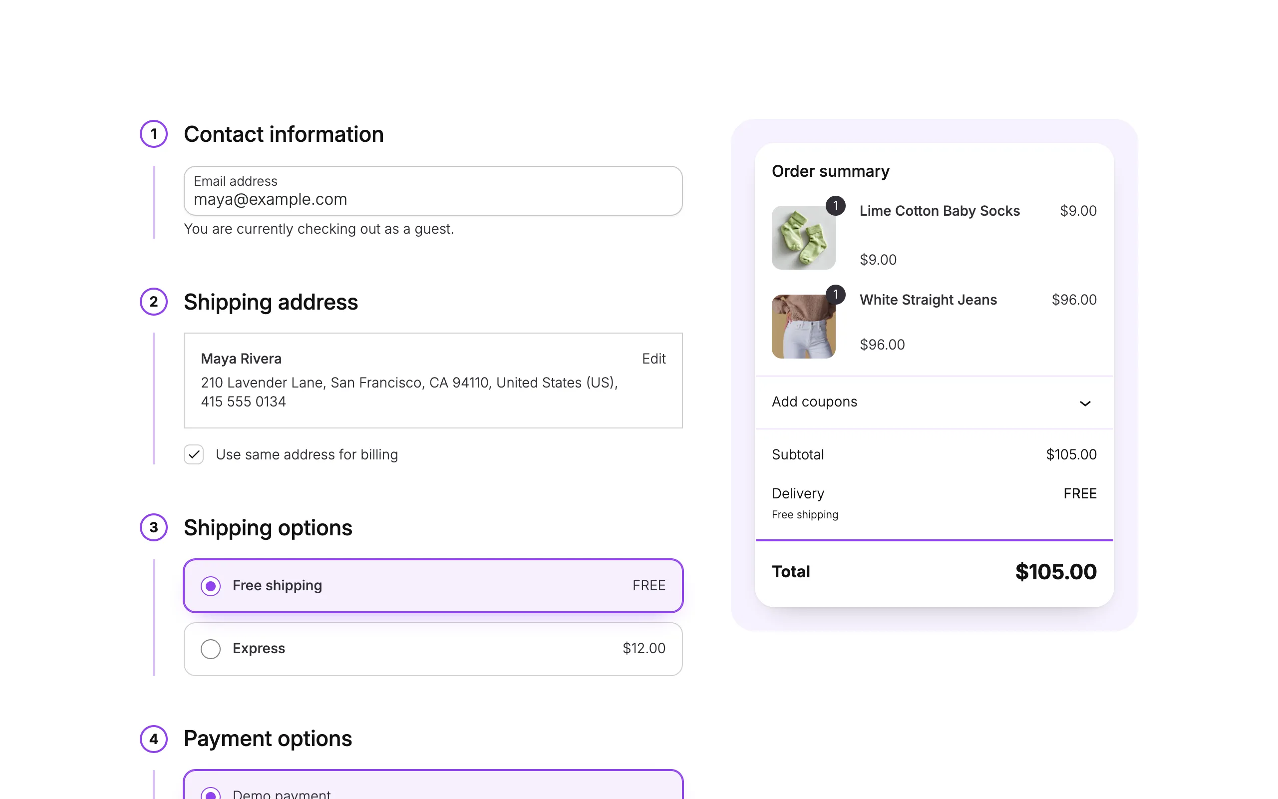
Field style New in 1.2
Soft, Filled or Underline. Labels still float inside the fields.Block themes
Yes
No
Shipping and payment choices New in 1.2
Cards puts each option in its own box, and List joins them in one box. The picked option gets a light tint.Block themes
Yes
No
Step numbers New in 1.2
Badges puts each section number in a circle, and Timeline puts it in a ring with a line down the side.Block themes
Yes
No
Focus ring New in 1.2
The field a shopper is typing in gets a ring in the effect color.Block themes
Yes
No
Soft summary New in 1.2
The order summary sits on a rounded card, with a bigger, bolder total.Block themes
Yes
No
Side panel New in 1.2
On wide screens, the order summary column sits on a rounded, tinted panel.Block themes
Yes
No
Raised card New in 1.2
The whole checkout sits on a raised card.Block themes
Yes
No
Bigger photos New in 1.2
Photos in the order summary grow from 48 to 64 pixels, with rounded corners.Block themes
Yes
No
Place Order
Block themesClassic themes
Option
What it does
Block themes
Classic themes
Button looks New in 1.2
Glow ring, Light sweep, Liquid glass and Spectrum ring, the same looks as the Button block, with one effect color.Block themes
Yes
No
Lock icon New in 1.2
A small lock before the Place Order label.Block themes
Yes
No
Go to checkout
Block themesClassic themes
Option
What it does
Block themes
Classic themes
Button looks New in 1.2
The drawer's checkout button takes glow ring, Light sweep, Liquid glass and Spectrum ring, the same looks as the Button block, with one effect color.Block themes
Yes
No
Order Status
Block themesClassic themes
Option
What it does
Block themes
Classic themes
Thank-you moment New in 1.2
The heading rises in and one burst in the effect color plays behind it when the page opens.Block themes
Yes
No
Order Summary
Block themesClassic themes
Option
What it does
Block themes
Classic themes
Receipt card New in 1.2
The order number, date, total, email and payment sit on a printed receipt with a torn edge. Since 1.3.3, the paper takes the block's background color when it has one.Block themes
Yes
No
Button
Block themesClassic themes
Option
What it does
Block themes
Classic themes
Glow ring
A soft ring of the effect color around the button.Block themes
Yes
No
Light sweep
A band of light crosses the button on hover.Block themes
Yes
No
Liquid glass
A frosted fill in the effect color, with a highlight that follows the mouse.Block themes
Yes
No
Spectrum ring
A rainbow ring travels once around the edge on hover.Block themes
Yes
No
Googly eyes
None, One eye or Two eyes. They follow the mouse and blink.Block themes
Yes
No
Effect color
One color drives the glow ring and the glass.Block themes
Yes
No
Image
Block themesClassic themes
Option
What it does
Block themes
Classic themes
Hover style
The gallery's seven hover styles on any image. The caption and lightbox button stay put.Block themes
Yes
No
Heading
Block themesClassic themes
Option
What it does
Block themes
Classic themes
Reveal on scroll
Rise, Focus or Rise from the floor. Rise and Focus play once as the heading scrolls into view. Rise from the floor, new in 1.3, follows the scroll and brings the heading up out of its own bottom edge.Block themes
Yes
No
Social Icons
Block themesClassic themes
Option
What it does
Block themes
Classic themes
Look New in 1.3
Ring draws each icon in a thin round ring in the icon color, and fills it on hover.Block themes
Yes
No
Columns
Block themesClassic themes
Option
What it does
Block themes
Classic themes
Entrance on scroll
The columns fade up or zoom in, one after another, as they scroll into view.Block themes
Yes
No
Cover
Block themesClassic themes
Option
What it does
Block themes
Classic themes
Scroll effect
Slow zoom or Parallax moves the background with the scroll. Pill reveal opens the cover from a small rounded pill.Block themes
Yes
No
Hover New in 1.3
Push in moves the background in slowly. Tilt turns the cover toward the mouse with a sheen, Lift raises it with a soft shadow, and Glare runs a light after the mouse.Block themes
Yes
No
Use the category photo New in 1.3
On a product category or brand page, the cover shows that page's photo. Other pages keep the cover's own image.Block themes
Yes
No
Featured Category WooCommerce 11.3 and later
Block themesClassic themes
Option
What it does
Block themes
Classic themes
Scroll effect New in 1.3
Slow zoom, Parallax or Pill reveal as the page scrolls, the same as the Cover block.Block themes
Yes
No
Hover New in 1.3
Push in, Tilt, Lift or Glare on hover, the same as the Cover block.Block themes
Yes
No
Featured Product WooCommerce 11.3 and later
Block themesClassic themes
Option
What it does
Block themes
Classic themes
Scroll effect New in 1.3
Slow zoom, Parallax or Pill reveal as the page scrolls, the same as the Cover block.Block themes
Yes
No
Hover New in 1.3
Push in, Tilt, Lift or Glare on hover, the same as the Cover block.Block themes
Yes
No
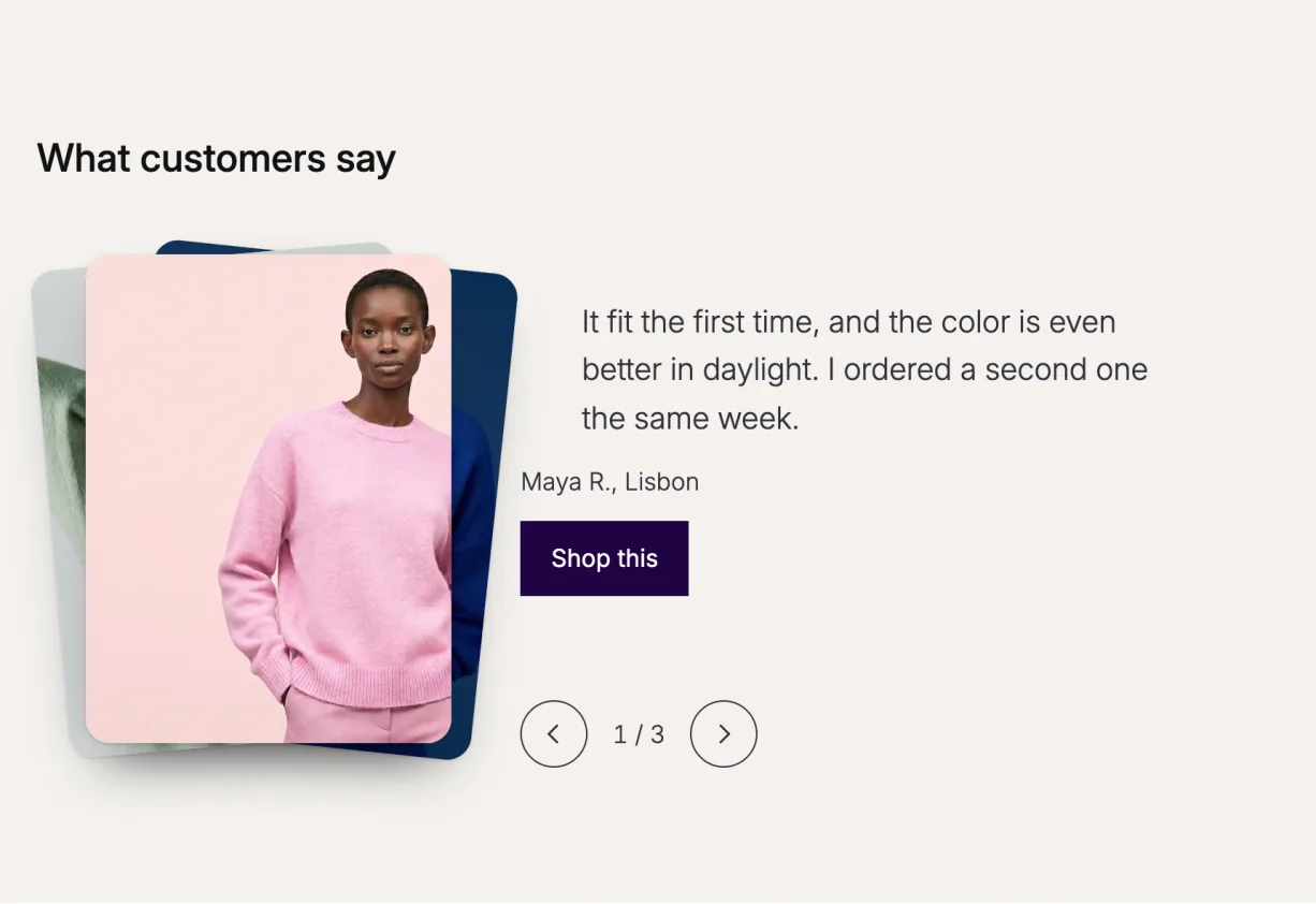
Story Deck
Block themesClassic themes
Option
What it does
Block themes
Classic themes
Deck side
Left or Right. The cards sit on that side, with the story beside them. On phones the story sits under the cards.Block themes
Yes
No
Card shape
Rounded or Square corners on the cards.Block themes
Yes
No
Fan
Fanned cards under the top one lean out like a hand of cards. Flat cards sit straight, each a little lower and smaller.Block themes
Yes
No
Hanging Rail
Block themesClassic themes
Option
What it does
Block themes
Classic themes
Clip
Peg, Binder clip or Tape: what holds each product on the rope.Block themes
Yes
No
Rope sag
A little or More: how far the rope dips between the cards.Block themes
Yes
No
Scroll length
Short, Medium or Long: how much scrolling it takes to show every product. The section holds still while they slide by.Block themes
Yes
No
Scroll Lookbook
Block themesClassic themes
Option
What it does
Block themes
Classic themes
Chapter list
On or Off. Names each stop beside the film, from a short line in each Cover or the product's name.Block themes
Yes
No
Timecode
On or Off. A running timecode in the corner while the film plays.Block themes
Yes
No
Scroll length
Short, Medium or Long: how much scrolling each stop takes. The film holds still while the shots play.Block themes
Yes
No
Runway
Block themesClassic themes
Option
What it does
Block themes
Classic themes
Looks from
Featured and gallery photos or Featured photo only: every photo of each product becomes a look, or only the featured one.Block themes
Yes
No
Photo shape
Framed or Cutout. Framed puts each photo in a rounded frame; Cutout stands photos with a transparent background on the floor.Block themes
Yes
No
Look number
On or Off. A big number counts the looks; screen readers hear which look is at the front either way.Block themes
Yes
No
Fly to cart
On or Off. Add to cart sends the photo to the mini-cart. Off when the shopper asks for less motion.Block themes
Yes
No
Showfloor
Block themesClassic themes
Option
What it does
Block themes
Classic themes
Floor shape New in 1.3
Oval or Flat row: the shape of the floor the cut-out looks stand on.Block themes
Yes
No
Autoplay New in 1.3
Off or On. The floor turns one look at a time, every 3 to 8 seconds, with a pause button. It holds while a visitor hovers, drags or opens a look.Block themes
Yes
No
Whole-look button New in 1.3
On or Off. One button adds every piece in the look to the cart.Block themes
Yes
No
Tap a marker to New in 1.3
Highlight the piece or Add it to the cart. Each Look puts a numbered marker on every piece of its figure.Block themes
Yes
No
Wardrobe Inside the Navigation block
Block themesClassic themes
Option
What it does
Block themes
Classic themes
Panel width New in 1.3
Wide, Content or Full: how wide the panel opens under the header.Block themes
Yes
No
Panel look New in 1.3
Card has rounded corners and a soft shadow. Flat is a sheet straight under the header.Block themes
Yes
No
Link New in 1.3
Phones and the Navigation overlay show the label as a plain link to this page. Left empty, it goes to the shop page.Block themes
Yes
No
Changing Room
Block themesClassic themes
Option
What it does
Block themes
Classic themes
Outfit photos New in 1.3
One photo of the model for each top and bottom pair, all shot from the same spot. The photo changes as visitors try pieces on.Block themes
Yes
No
Ring New in 1.3
Top ring or Bottom ring: where each Piece turns. A Piece takes a product and a flat cut-out, or the product image.Block themes
Yes
No
Photo change New in 1.3
Fade, Reveal from the top or Instant: how the model's photo changes to the new outfit.Block themes
Yes
No
Page color from New in 1.3
Last piece worn, Top piece, Bottom piece or Off. The buttons, the whole block or the whole page take the Purplish page color of that piece.Block themes
Yes
No
Shelf Tag
Block themesClassic themes
Option
What it does
Block themes
Classic themes
Show on New in 1.3
Best sellers, New products or Featured products. The tag shows only on products that match. Best sellers count from orders, and new products from the day they were published.Block themes
Yes
No
Look New in 1.3
Chip, Pill or Glass.Block themes
Yes
No
Corner New in 1.3
On the photo, the tag can sit in any of the four corners.Block themes
Yes
No
Shine on hover New in 1.3
A light passes over the tag once when the card is hovered.Block themes
Yes
No
Color Dots
Block themesClassic themes
Option
What it does
Block themes
Classic themes
Look New in 1.3
Dots or Swatches: the colors a product comes in, on its card.Block themes
Yes
No
How many to show New in 1.3
The rest show as a count, such as +3.Block themes
Yes
No
Swap the photo New in 1.3
Off, On hover or On tap. A dot shows its color's photo on the card, from each variation photo.Block themes
Yes
No
Swap motion New in 1.3
Fade, Wipe or Slide: how the card photo changes to the new color.Block themes
Yes
No
Escalator
Block themesClassic themes
Option
What it does
Block themes
Classic themes
Tiles New in 1.3.2
Products link to the product with its name and price. Photos show your own photos only.Block themes
Yes
No
Products New in 1.3.2
Newest, Best sellers, On sale, Featured or One category, and how many to show.Block themes
Yes
No
Add to cart button New in 1.3.2
None, Filled, Liquid glass, Light sweep or Spectrum ring, on the photo. Products that need a choice get a link to the product.Block themes
Yes
No
Columns New in 1.3.2
Three or Two. Next to each other, the columns move in opposite directions. Phones show two.Block themes
Yes
No
Speed New in 1.3.2
Slow, Medium or Fast. The columns stop while a visitor points at them, and the pause button stops them for good.Block themes
Yes
No
Hover New in 1.3.2
None, Ring, Lift, Light sweep or Push in, in the effect color.Block themes
Yes
No
Corner radius in pixels New in 1.3.2
Without one, tiles take the theme's Purplish radius.Block themes
Yes
No
On a classic theme, the options marked for classic themes are under WooCommerce, Settings, Products, Purplish.
It works with the theme you already have.
Purplish adds its options to WooCommerce's own blocks, so any theme that uses those blocks gets them. Classic themes get a smaller set.
Purple
Built and tested with the free Purple block theme. This site runs on Purple and Purplish.
Any block theme
Every option sits in a Purplish panel on the block it changes, in the Site Editor.
Classic themes
Page colors, the photo transition, the title and price rise, hide thumbnails, rounded corners and the hover style. Tested on Storefront.
Finding your way around.
Where the options live and what a classic theme gets. The docs cover every option.
On a block theme, select the block you want to change and open the Purplish panel in its sidebar. Product blocks are in the Single Product or shop templates in the Site Editor. Button, Image, Heading, Group, Columns and Cover blocks work on any page. A variation's Page color is in the product editor. On a classic theme, the options are under WooCommerce, Settings, Products, Purplish.
Which options work on a classic theme?
The page colors (except the selected option, since classic themes show a dropdown), the photo transition, the title and price rise, and three gallery options: hide thumbnails, rounded corners and the hover style. Everything else in the table needs a block theme.
Start with one block, add the rest later.
Each option lives on its own block, so you can try one today and leave everything else as it is.