
A sale badge and sold-out sizes in your store's style.
Purplish gives the On-Sale Badge three shapes and a corner on the gallery photo, and lets the Variation Selector cross out or blur options that can't be bought.
Free and open source. Updated for Purplish 1.2.
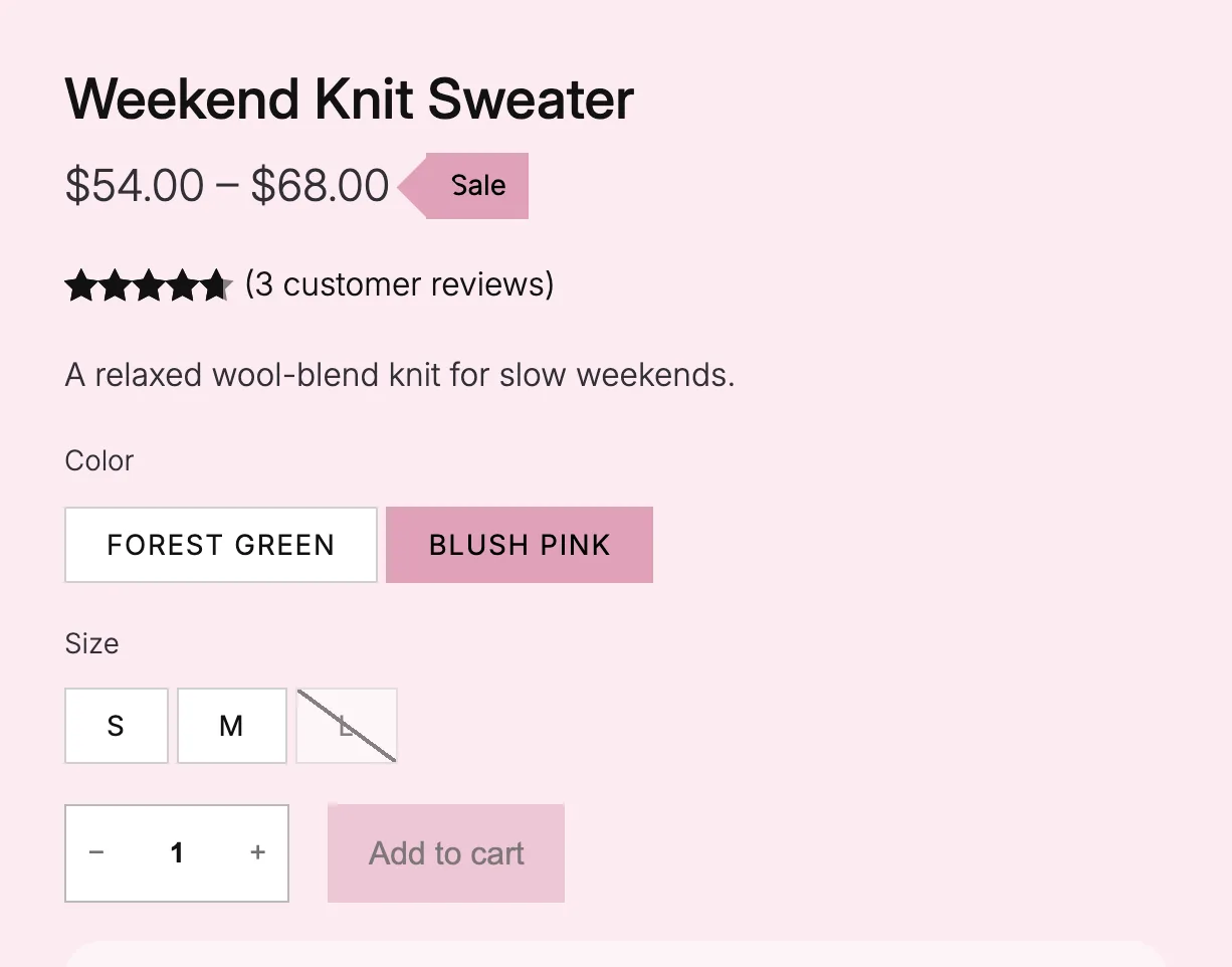
Both sit in the block's own sidebar.
Select the On-Sale Badge or the Variation Selector: Template block in the Site Editor, and the Purplish panel shows only the settings for that block.
- Select the block
Open the Single Product template and click the On-Sale Badge or the Variation Selector.
- Open the Purplish panel
Pick a Shape and a Corner for the badge, or a Grayed-out look for the options.
- Save the template
The choice is saved on the block in that template, so two templates can look different.
Both need a block theme. The classic theme settings don't include these blocks.
Two blocks shoppers read before they pick.
Both sit right next to the add to cart button, so they should look like the rest of your store.
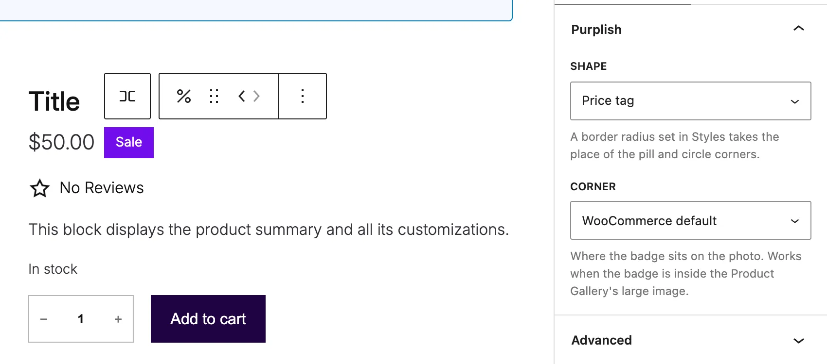
On-Sale Badge
- Shape
- Pill, Circle or Price tag.
- Corner
- On the gallery photo, the badge can sit in any corner.
Variation Selector: Grayed-out look
- Crossed out
- A diagonal line over an option that can't be bought, swatches too.
- Blurred
- The option blurs out.
- WooCommerce default
- Keeps WooCommerce's own look.
To hide options that can't be bought, use WooCommerce's own Invalid options setting on the Variation Selector: Template block.
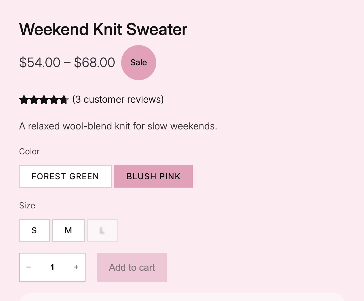
Try a shape, a corner and a sold-out look.
Size L is sold out in this demo. Pick the options and watch the badge and the sizes change.
On a product page with Product page colors on, the badge takes the color the shopper picks.

The On-Sale Badge and Variation Selector markup WooCommerce renders, with Purplish's own stylesheet.
Good to know before you pick.
Where these options work, and what they change.
- Block themes only
Both options live on blocks in the Site Editor, so they need a block theme.
- Swatches too
Crossed out draws its line over color swatches as well as text options.
- Follows the shopper's color
With Product page colors on, the badge takes the color the shopper picks.
- Nothing gets replaced
Purplish styles WooCommerce's own blocks. Deactivate it, and they look exactly as they did before.
More of Purplish
- Product page colorsThe button, the selected option and the sale badge follow the color the shopper picks.
- Product galleryHover, full-screen and slide styles for the Product Gallery, and round thumbnails.
- Reviews and accordionsSoft cards and chat bubbles for reviews, styled specifications and soft accordions.
- Filters and mini-cartActive filters that match your chips, and a cart count that pops.
- Button effectsGlow, glass, a spectrum ring and googly eyes for any Button block and the add to cart button.
Badge and option questions.
What store owners ask about these two blocks. The docs cover every option.
How do I change the sale badge shape in WooCommerce?
On a block theme, open the Single Product template in the Site Editor, select the On-Sale Badge and open the Purplish panel. Pick a Shape: pill, circle or price tag.
Can I move the sale badge to another corner?
Yes. When the badge sits on the gallery photo, Corner puts it top left, top right, bottom left or bottom right.
How do I hide variation options that can't be bought?
Use WooCommerce's own Invalid options setting on the Variation Selector: Template block. Purplish's Grayed-out look is for when you'd rather keep them on show, crossed out or blurred, so shoppers see the option exists but isn't available.
Make the badge and the sizes look like your store.
Pick a badge shape and a sold-out look in the blocks you already have.
Block themes. Free and open source.