
A whole WooCommerce store front, from one pattern.
Purplish's Flagship patterns give your block theme a home page, a header that turns into a floating pill, a phone menu and a footer. Store patterns cover the empty cart, the checkout header and a money-back guarantee. Every one is made of blocks you already know.
Free and open source. New in Purplish 1.3.
Add them like any other pattern.
The patterns sit in the Purplish group of the inserter's Patterns tab. A new page offers Flagship home as a starter, and the header and footer show up when you replace a template part.
- Start a page or open the inserter
Create a page and pick Flagship home, or open the Patterns tab and pick any one section on its own.
- Edit the blocks
Every section comes in as core and WooCommerce blocks, so you change the words, photos and products the usual way.
- Swap the header and footer
In the Site Editor, replace the header or footer template part and pick Flagship header or Flagship footer.

A home page where every section sells.
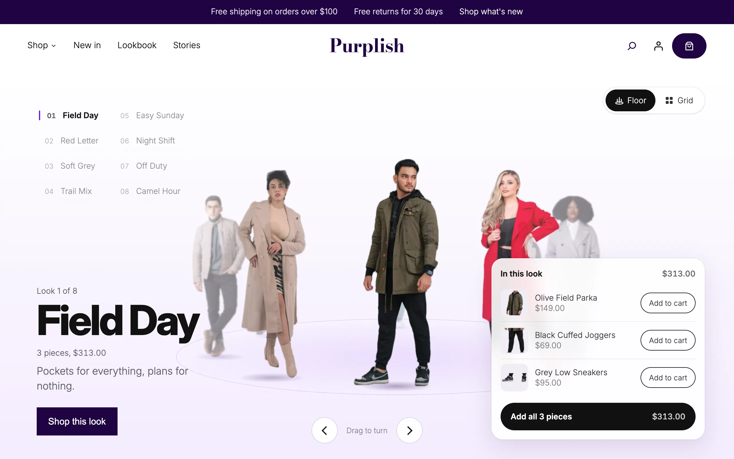
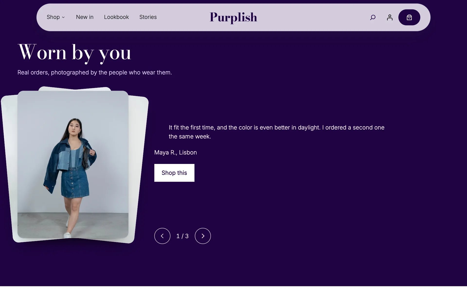
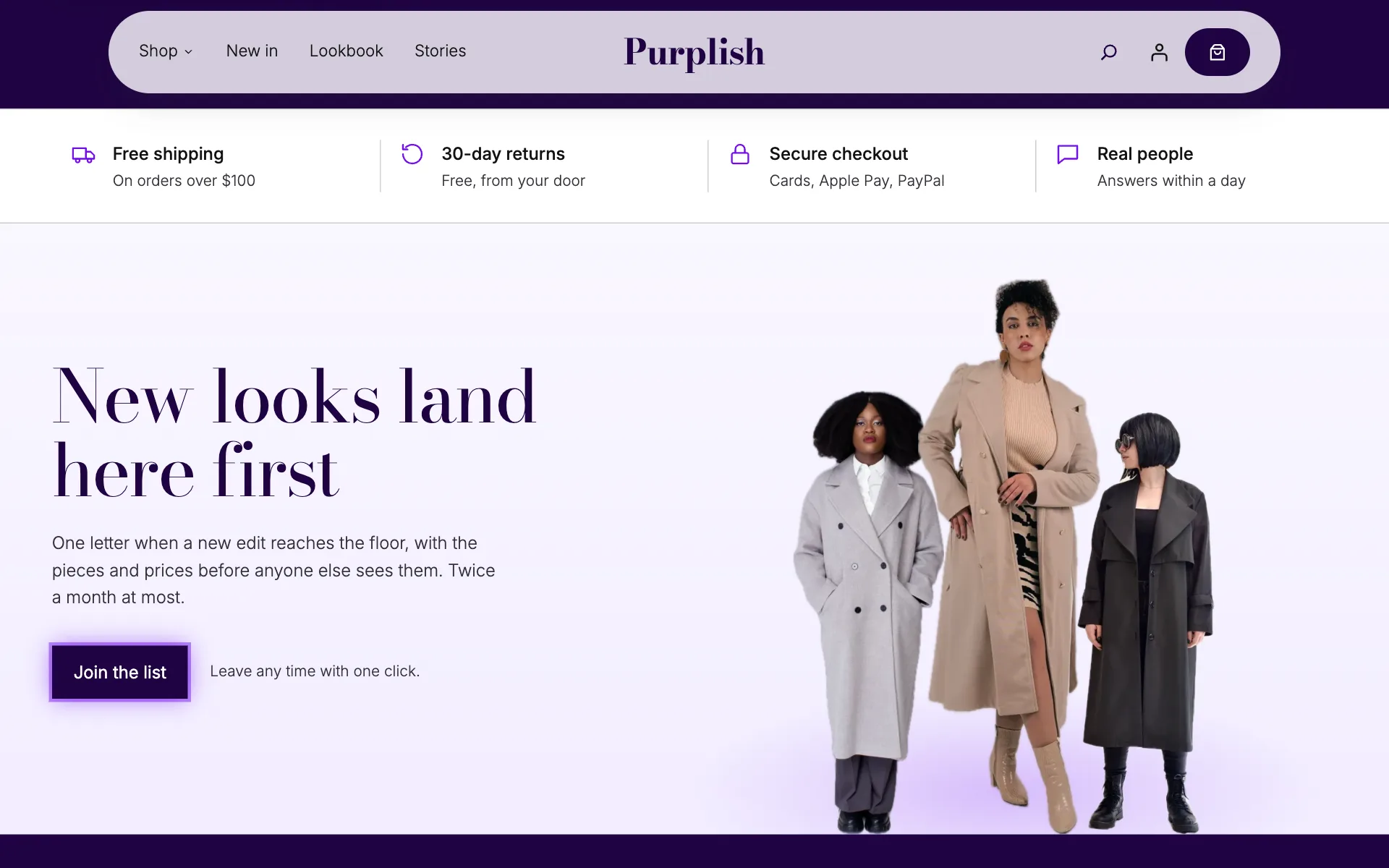
Flagship home opens on the floor, then Shop by category, Best sellers, Brand band, Just in, Worn by you, Trust row and Newsletter. Each section sits on its own color, and each one is also its own pattern, so you can add a single section to any page.
Pick a section
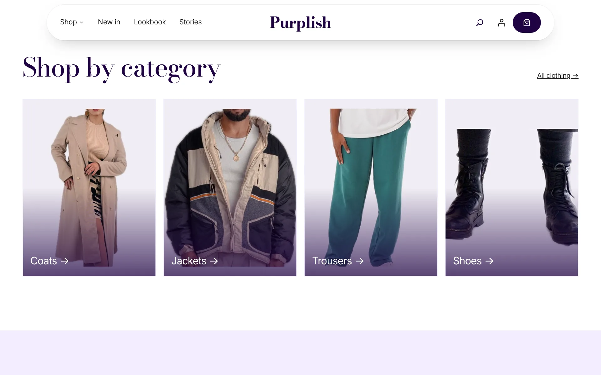
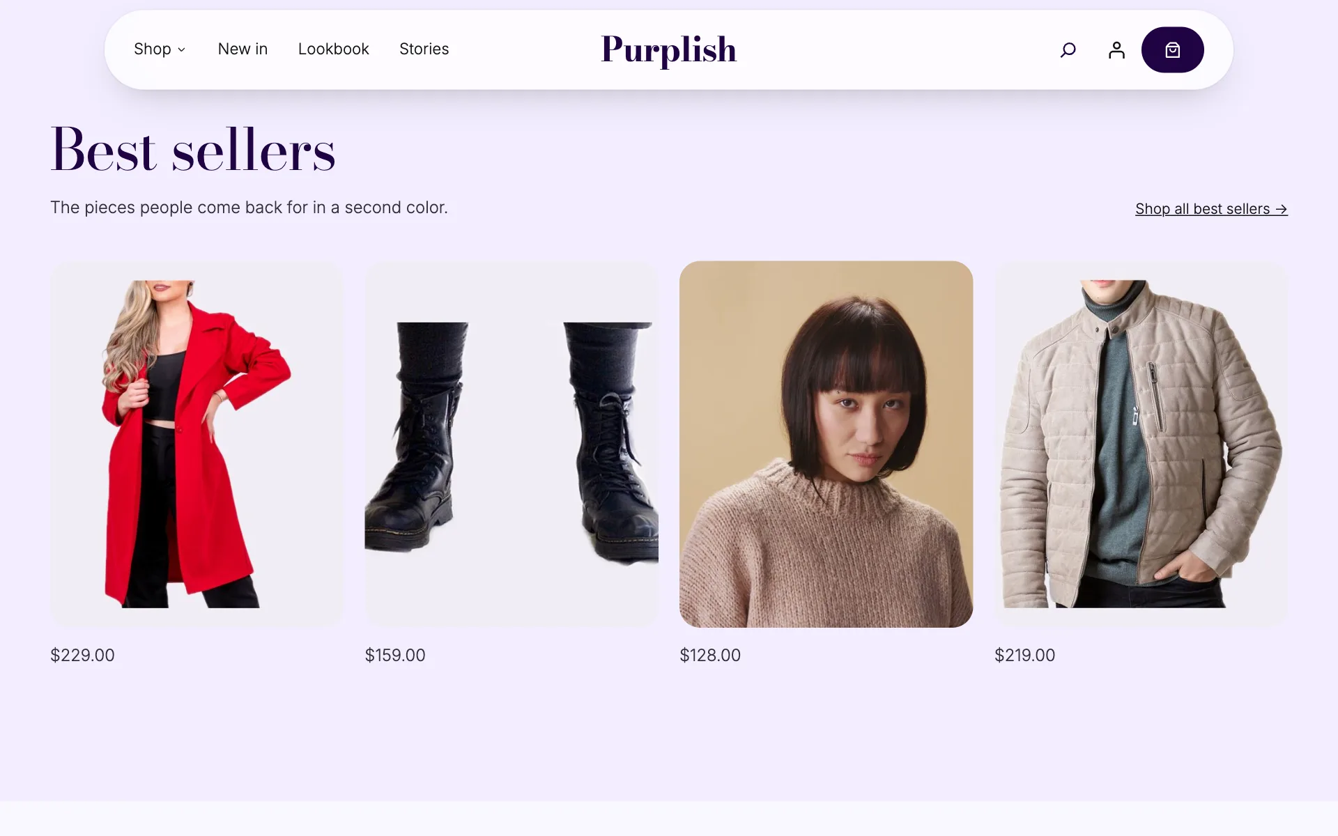

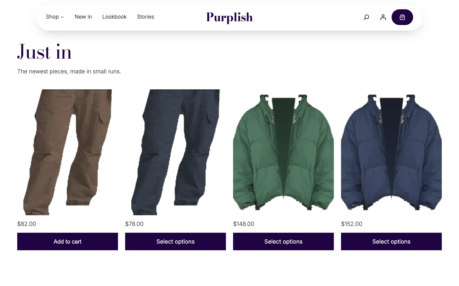
Shop by category: four tall tiles with the category name on the photo. Each tile tilts toward the mouse, and the tiles rise in one after another. Captured from a store running Purplish.
Flagship floor
The top of the page is a Showfloor with eight looks and no headline, so the clothes speak first. Shoppers turn the floor, see the pieces in each look, and add the whole look to the cart in one go.
New hovers for the Cover block
- Push in
- The background moves in slowly.
- Tilt
- The whole cover, text included, turns toward the mouse with a sheen. The category tiles use it.
- Lift
- The cover rises with a soft shadow.
- Glare
- A light runs after the mouse.
Pick one under Hover in the Cover block's Purplish panel. Touch screens and reduced motion show the plain cover.
A header that narrows into a floating pill.
The Flagship header stays at the top of the window. As the page scrolls, the note bar goes away and the bar narrows into a frosted pill. The page under it doesn't jump.
Condense on scroll
A new switch in the Group block's Purplish panel, made for headers. The Flagship header has it on, and you can turn it on for your own header group too.
Over the first few hundred pixels of scroll the bar narrows, rounds into a pill and gets a soft shadow. On phones the pill keeps 16 pixels from each edge. A header with no background of its own turns into frosted glass, and one with a background keeps it.
What's in the Flagship header
- A note bar. Free shipping, free returns and a Shop what's new link, in a thin purple bar that scrolls away.
- A Shop menu. A Wardrobe panel with serif links, photo tiles and a look card for each link, then New in, Lookbook and Stories.
- Your store name in a serif. Right in the middle of the bar.
- Search, account and a bag. The bag is a dark pill around the Mini-Cart, and its count pops when it changes.
A phone menu that feels like part of the store.
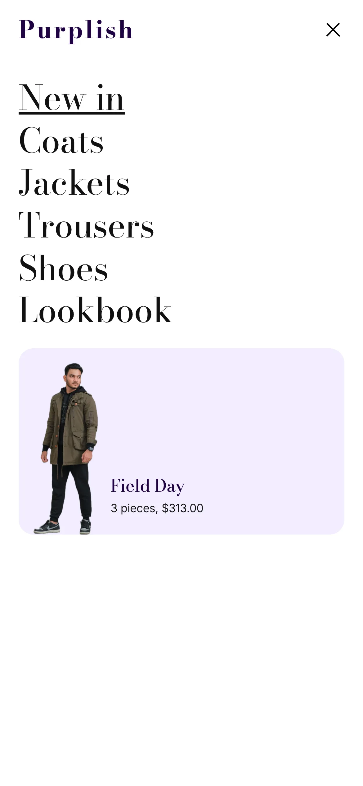
On phones the header shows the menu button, your store name and the bag. The menu button opens the Flagship phone menu over the whole screen.
- Large serif links rise in one after another each time the menu opens.
- A look card under the links, with a photo, the look's name and its price.
- Your store name at the top and a close button beside it.
Set it up from the Navigation block's overlay setting, where the Flagship phone menu pattern shows. Without it, phones get WordPress's own menu with the same links.
A footer that ends on your store's name.
The Flagship footer closes the page on deep purple. As a shopper reaches the bottom, your store name comes up out of the floor in a big serif, in step with the scroll.
- Fit help
- Not sure about the fit?, a short line, an Ask about a size button and a size guide link.
- Four columns
- Shop, Help and Company links, and Follow the floor with ringed social icons.
- The wordmark
- Your site title, sized to fit the width, with the new Rise from the floor reveal from the Heading block.
- Base row
- The year and site name, privacy and terms links, a secure checkout note and Back to the floor.
The rings come from Ring, a new Look for the Social Icons block. Each icon sits in a thin ring that fills softly on hover.
An empty cart and a checkout that still look like your store.
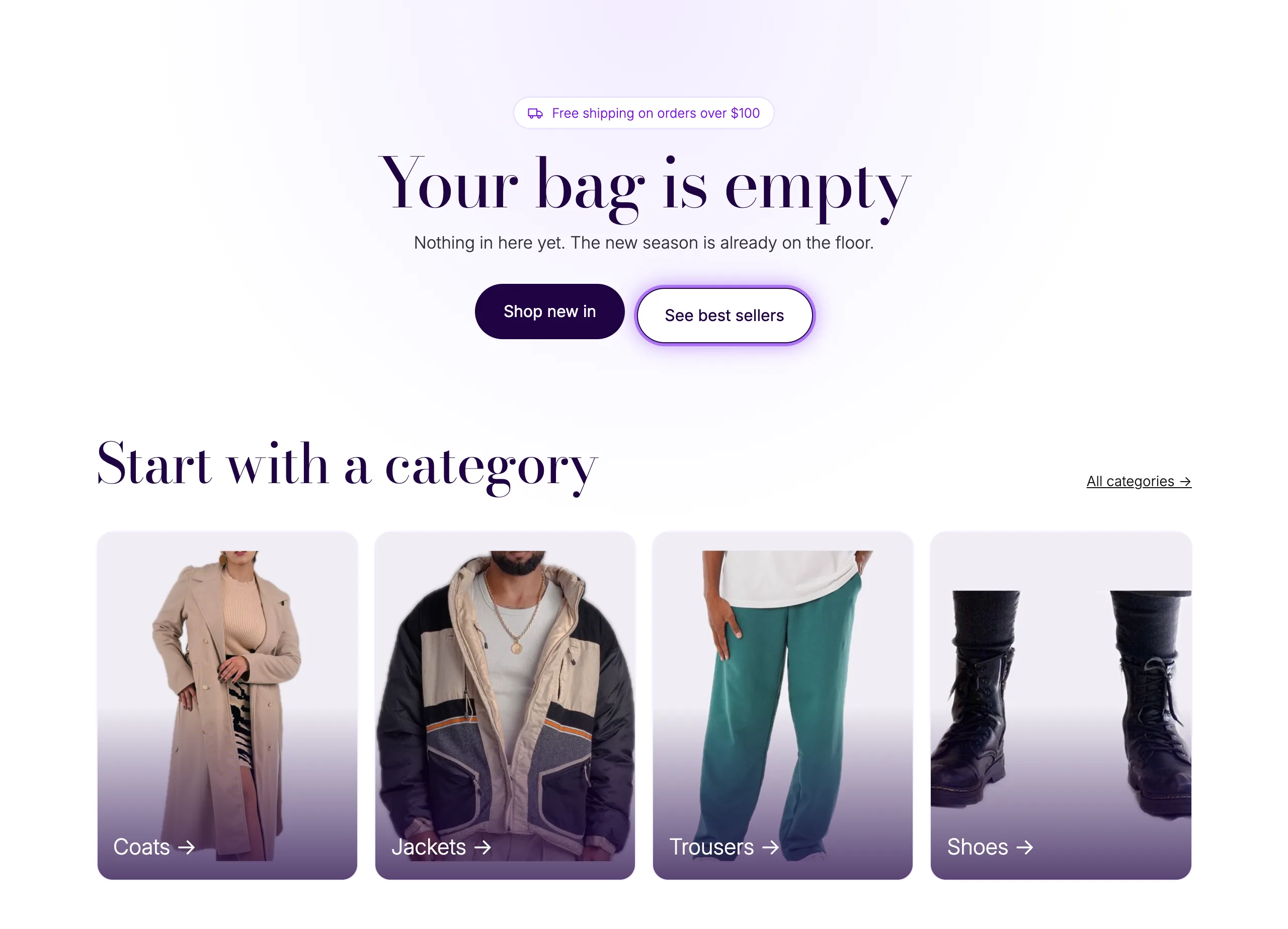
Two pages most themes leave plain. The Empty cart pattern gives a shopper somewhere to go next, and the Checkout header keeps the checkout calm and clear.

Three store patterns
- Empty cart
- A heading that rises in, two buttons, four category tiles that tilt and four best sellers that link to the product.
- Checkout header
- Your store name, Bag, Checkout and Done steps with Bag linked back to the cart, and a Secure checkout pill. Nothing on it moves.
- Money-back guarantee card
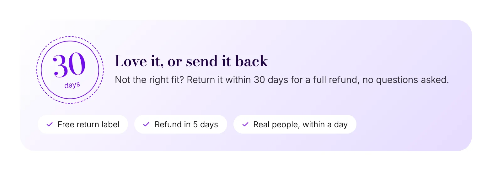
- A 30 days seal, a short promise and three proof chips. It goes under the Cart or Checkout block.
Good to know before you add them.
What the patterns bring with them, and what they take from your store.
- Plain blocks, yours to change
Once inserted, a pattern is ordinary core and WooCommerce blocks. Change the words, swap the photos or remove a section like any other block.
- Colors and fonts
The deep purple and lavender are set on each block, so the patterns look the same on Purple and Twenty Twenty-Five. Text uses your theme's font, and headings use Bodoni Moda when it's in the Font Library, then Didot or Georgia.
- Your real categories
On WooCommerce 11.3 and later, Shop by category shows your four biggest categories, each with its own image, name and a Shop now button. Older versions get four tiles you set up by hand.
- Phones
Tiles and products go two per row, the Brand band puts the photo above the words, the footer columns go two per row, and the header keeps the menu button, the name and the bag.
- Reduced motion and older browsers
With reduced motion, the header stays a full bar, the wordmark sits in place and nothing tilts or turns. A browser that can't tie motion to the scroll yet shows the full sticky bar and the wordmark in place.
- Drawn figures to start
The patterns ship with drawn figures instead of stock photos. Best sellers and Just in show your own products, and you swap in your photos for the rest.
More of Purplish
- ShowfloorLooks stand on a lit floor, with the pieces in each look and Add all beside them.
- WardrobeA mega menu for the Navigation block, with category links, photo tiles and a look card.
- Shop pagesFlagship, Atelier and Boutique shop patterns, with Shelf Tag and Color Dots.
- Cart and checkoutLooks for the cart, the checkout, the Mini-Cart drawer and the thank-you page.
- Customer storiesCustomer photos and quotes on a deck of cards, the one behind Worn by you.
- EscalatorProduct photos ride up and down in columns, and shoppers add to cart from the photo.
Store patterns questions.
What store owners ask about building a store front from patterns. The docs cover every pattern.
How do I add a WooCommerce homepage pattern?
On a block theme with Purplish active, create a new page and pick Flagship home from the starter patterns. You can also open the inserter's Patterns tab, choose Purplish and add Flagship home or any one section, like Best sellers or Brand band. Set the page as your home page under Settings, Reading.
How do I use the Flagship header and phone menu?
In the Site Editor, open your header template part, replace it and pick Flagship header. For the phone menu, select the Navigation block in the header and create its overlay from the overlay setting, where Flagship phone menu shows. The Flagship footer works the same way through the footer template part.
Where does the Empty cart pattern go?
Inside the Cart block. Open the Cart page or template, select the Empty Cart area of the Cart block and insert Empty cart from the Patterns tab. The Checkout header goes in the Checkout Header template part, and the guarantee card goes under the Cart or Checkout block.
Do the patterns use my own products and photos?
The product rows do. Best sellers and Just in are Product Collections that show your store's products, and on WooCommerce 11.3 and later Shop by category shows your biggest categories with their images. The floor, the Brand band, the Newsletter and the menu's look card start with drawn figures, and you swap in your photos in the editor.
Open your store on a page that's ready to sell.
A home page, a header, a phone menu, a footer and the cart pages, all as blocks you can change.
Free and open source. New in Purplish 1.3.