
Give your shop menu a big panel of photos, links and looks.
Wardrobe is a Purplish block for WooCommerce, a mega menu item for the Navigation block. Its label opens a big panel under your header, and everything in the panel is blocks you edit in place.
Free and open source. New in Purplish 1.3.
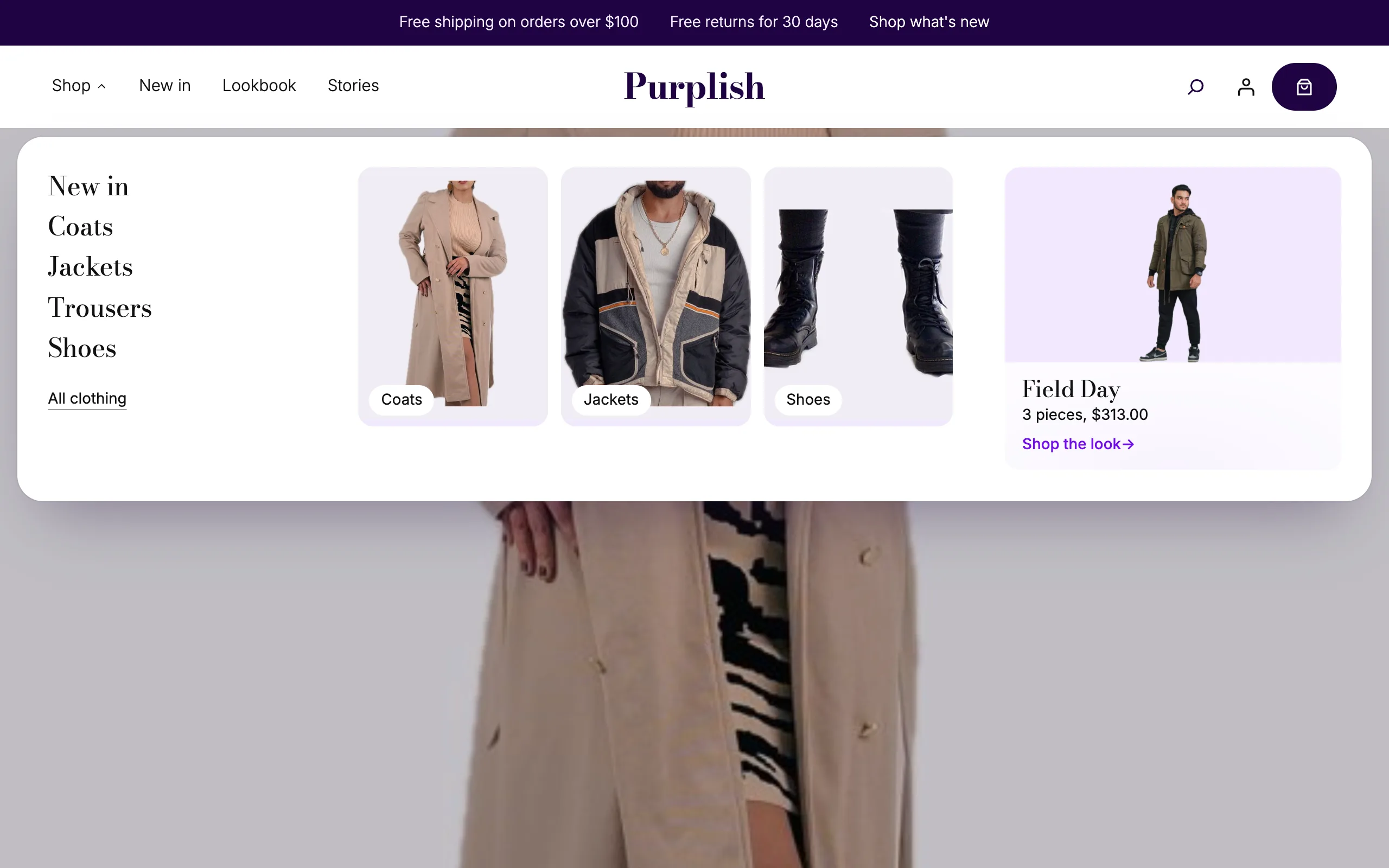
Add it inside your Navigation block.
Wardrobe sits in your menu next to the other items. Add it from the Navigation block's inserter, and it arrives labeled Shop with a panel ready to edit.
- Add it to your menu
Select the Navigation block in your header, open its inserter and pick Wardrobe. The Flagship header pattern comes with one in place.
- Edit the panel in place
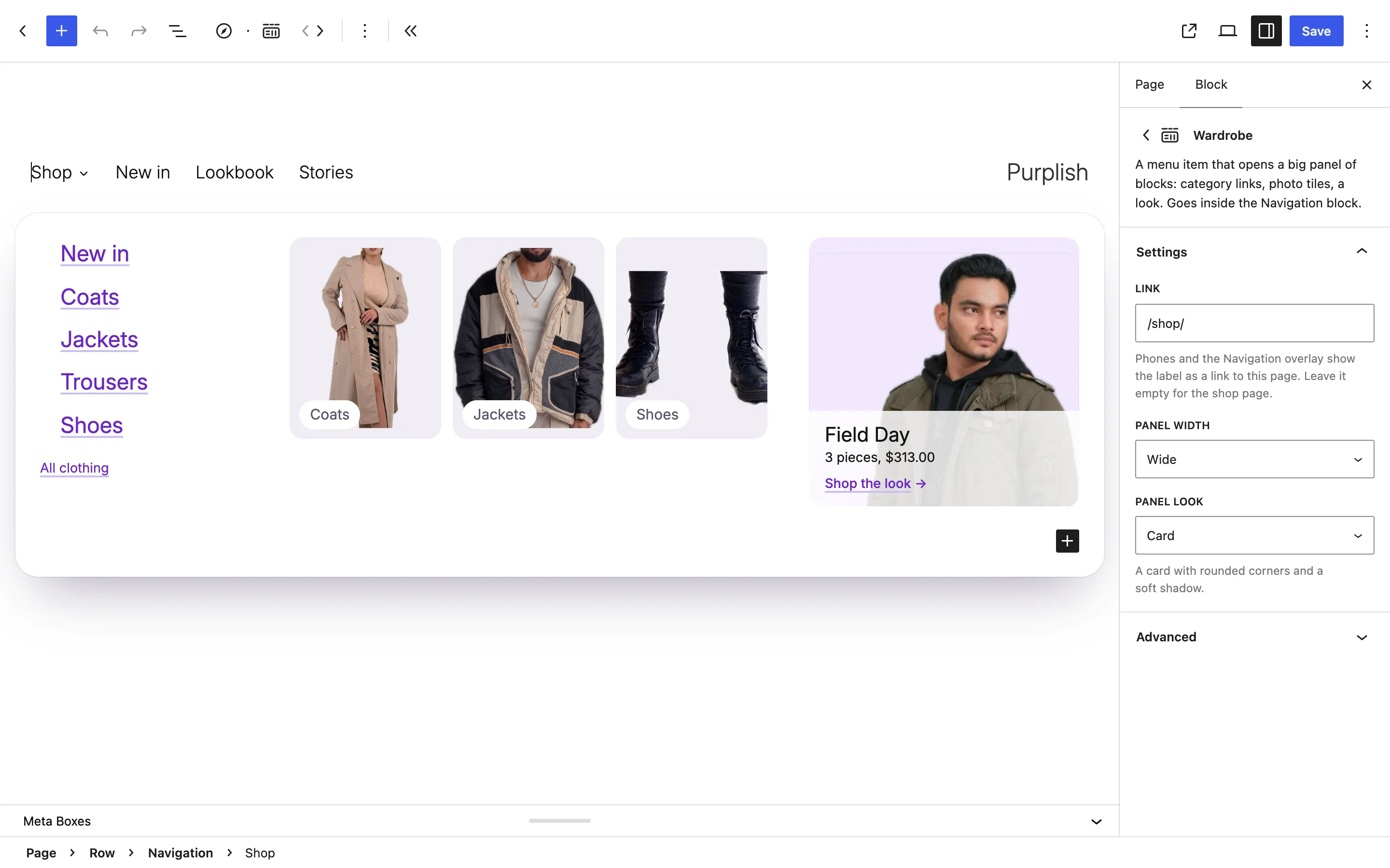
Select the label and the panel opens under the header in the editor. A new Wardrobe starts with five category links, three photo tiles and a look card, and you change them like any other blocks.
- Set the link, width and look
Link is where the label goes on phones, and empty means your shop page. Then pick Panel width and Panel look.
The panel opens when a shopper rests on the label.
The panel unrolls under the header and its columns rise in, one after another. Moving down into the panel keeps it open, and moving away closes it.
Hover or click
It opens the way your other submenus do.
- Hover. The pointer has to rest on the label for a moment, so passing over the menu doesn't open it. A short pause before closing gives the pointer time to reach the panel.
- Click. The label opens and closes the panel, and hovering does nothing.
Where it opens
- Under the header. The panel lines up under your header and stays 16px inside the edges of the window.
- Fits the window. On a short screen the panel stops at the bottom of the window and scrolls inside.
- One at a time. Opening a second Wardrobe closes the first.
Wide, content or full width, as a card or flat.
Two options set the panel's shape. Panel width picks how far it spreads, and Panel look picks a floating card or a flat sheet under the header.
Try the two options

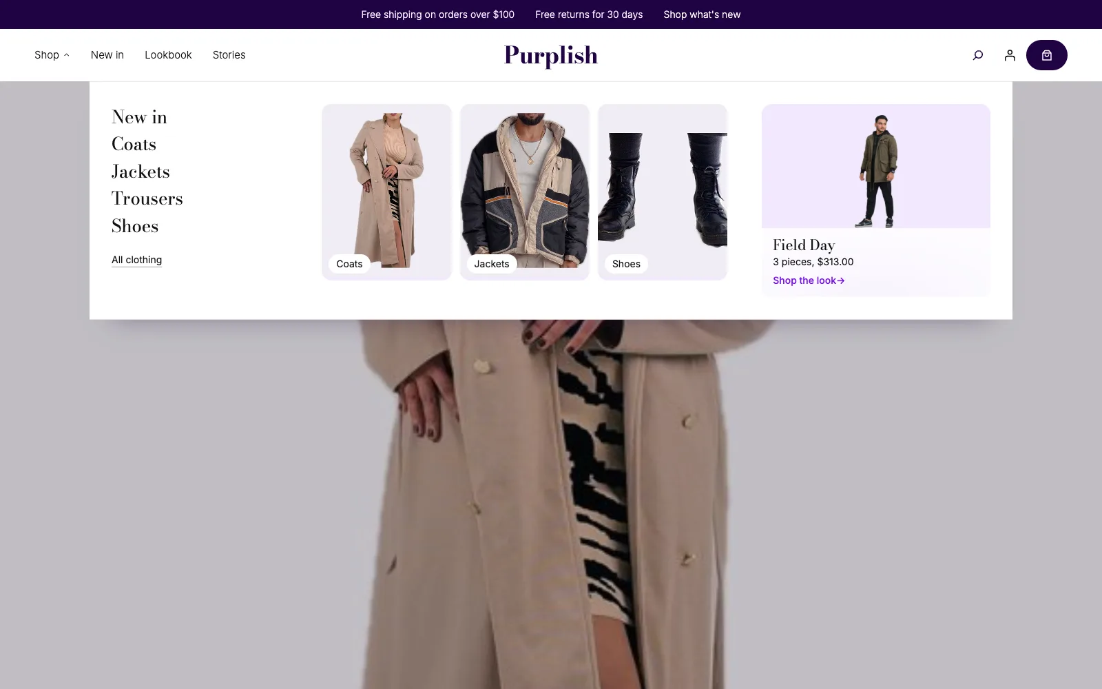

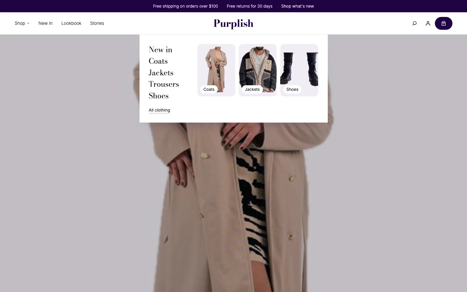

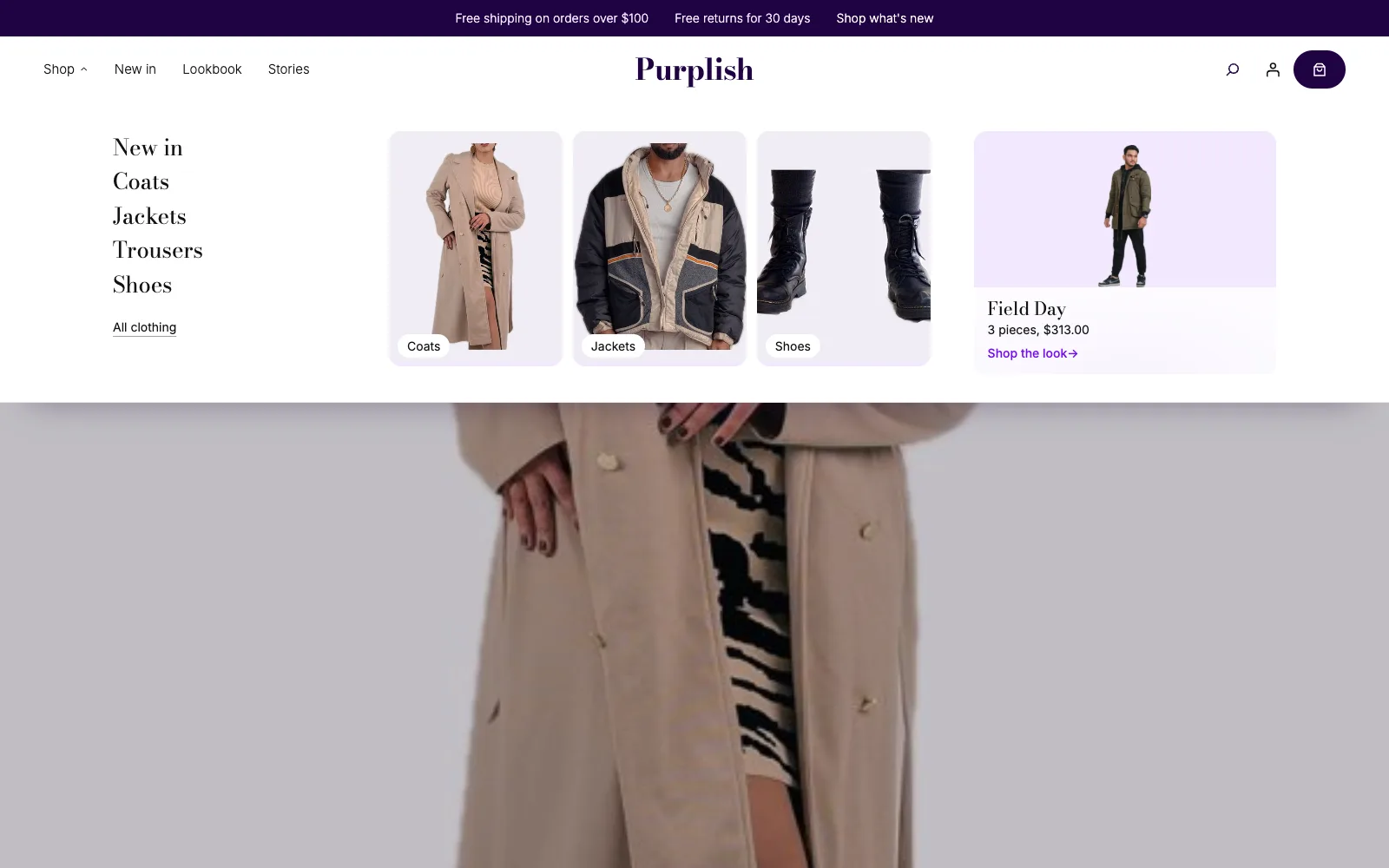
Wide, card: the panel spans your theme's wide width as a card with rounded corners and a soft shadow. Card and Wide are the defaults. Captured from a store running Purplish.
A look card for each link.
Put more than one look card in the panel and each category link gets its own. As the pointer moves down the links, the cards fade from one to the next.
- Same order. The first link shows the first card, the second link the second card, and so on. Links past the last card keep the card that shows.
- From the keyboard too. Tabbing to a link shows its card, and Tab moves into each card so its own links can be reached.
- Ready in the Flagship header. The Flagship header pattern's Shop panel comes with five links and a look card for each.
Good to know before you add it.
How the menu behaves for every shopper, on every device.
- Phones
Under 600px wide, and in the Navigation overlay menu, the label is a plain link. It goes to the page in Link, or to your shop page when Link is empty.
- Keyboard and screen readers
The label is a button that says whether the panel is open. Enter or Space opens it, and Escape closes it and puts focus back on the label. Tabbing out or clicking outside closes it too.
- Hover or click
The panel follows the Navigation block's Submenu Visibility setting. Hover opens it when the pointer rests on the label. Click, and Always, open it on click, since a panel that stays open would cover the page.
- Reduced motion
Visitors who ask their device for reduced motion get the panel open at once, with no unroll and no rising columns.
- Theme custom properties
The accent color comes from your theme. Change the panel with
--purplish-wardrobe-radius,--purplish-wardrobe-gap(space under the header),--purplish-wardrobe-pad(space inside),--purplish-wardrobe-widthand--purplish-wardrobe-tint(tile and look card background). - Speed
The script is 1.1 KB gzipped, with nothing else to load. The styles are 2.1 KB. Without the script, the label is a plain link.
More of Purplish
- Store patternsThe Flagship header with its Wardrobe Shop menu, plus a store front page, a footer and more ready-made sections.
- ShowfloorA shop the look floor of figures, where shoppers add one piece or the whole look.
- Changing RoomTops and bottoms turn in rings around a model, and shoppers drag pieces on to build an outfit.
- Shop pagesFlagship, Atelier and Boutique shop patterns, with Shelf Tag and Color Dots for the cards.
- RunwayLine up your new collection and let shoppers walk it, one look at a time.
- Product cardsTwenty-three card effects and add to cart on the photo for the shop page.
Wardrobe questions.
What store owners ask about the menu. The docs cover every option.
How do I add a mega menu to my WooCommerce store?
Install Purplish, select the Navigation block in your header, open its inserter and add Wardrobe. Edit the links, photo tiles and look card in its panel, then pick Panel width and Panel look in the block's Settings.
Can I put any block in the panel?
Yes. The panel is plain blocks, so you can change the starting links, tiles and look card, or add images, headings, buttons and columns like anywhere else on the page.
What does the menu do on phones?
Under 600px wide, and in the Navigation overlay menu, Wardrobe is a plain link. It goes to the page you set in Link, or to your shop page when Link is empty.
Why does my panel open on click instead of hover?
Wardrobe follows the Navigation block's Submenu Visibility setting. Set it to hover and the panel opens when the pointer rests on the label. With click or Always, the label opens it on click.
Give your shop menu more room.
Add Wardrobe to your Navigation block, fill the panel with your categories and looks, and let shoppers start from the header.
Free and open source. New in Purplish 1.3.