
A WooCommerce shop page that looks like a real storefront.
Purplish adds three shop page patterns, two small blocks for product cards and new options for the blocks your shop template already uses. Start from a pattern in the Site Editor, then change any part of it in the block sidebar.
Free and open source. Updated for Purplish 1.3.2.
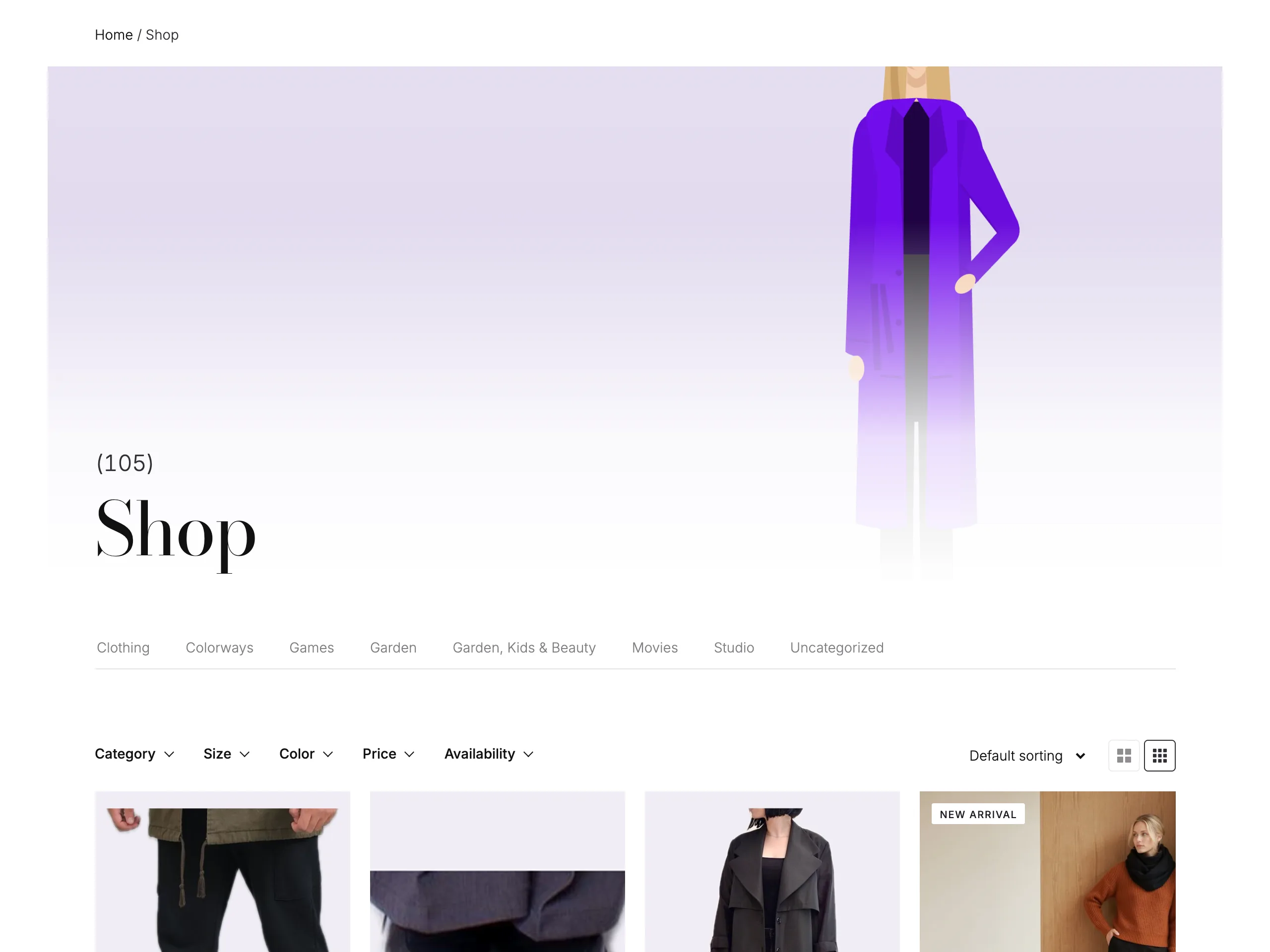
Three shop pages to start from.
Open your shop or product category template in the Site Editor and search the patterns for Flagship, Atelier or Boutique. Each one follows the page, so on a category template it shows that category's products.
Try the three patterns
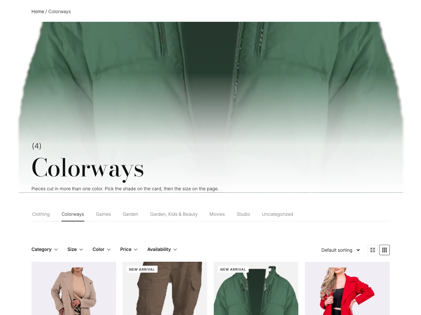
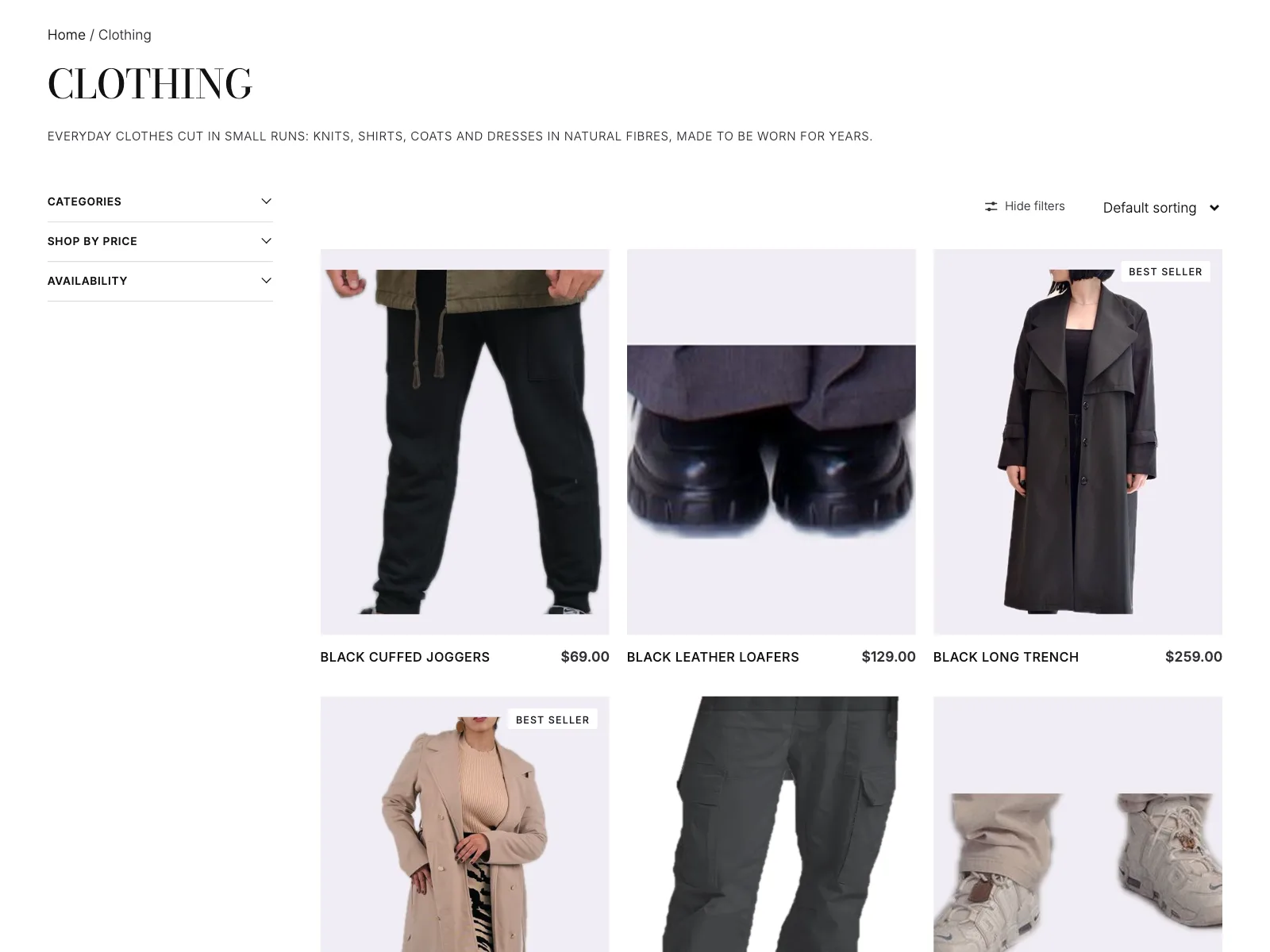
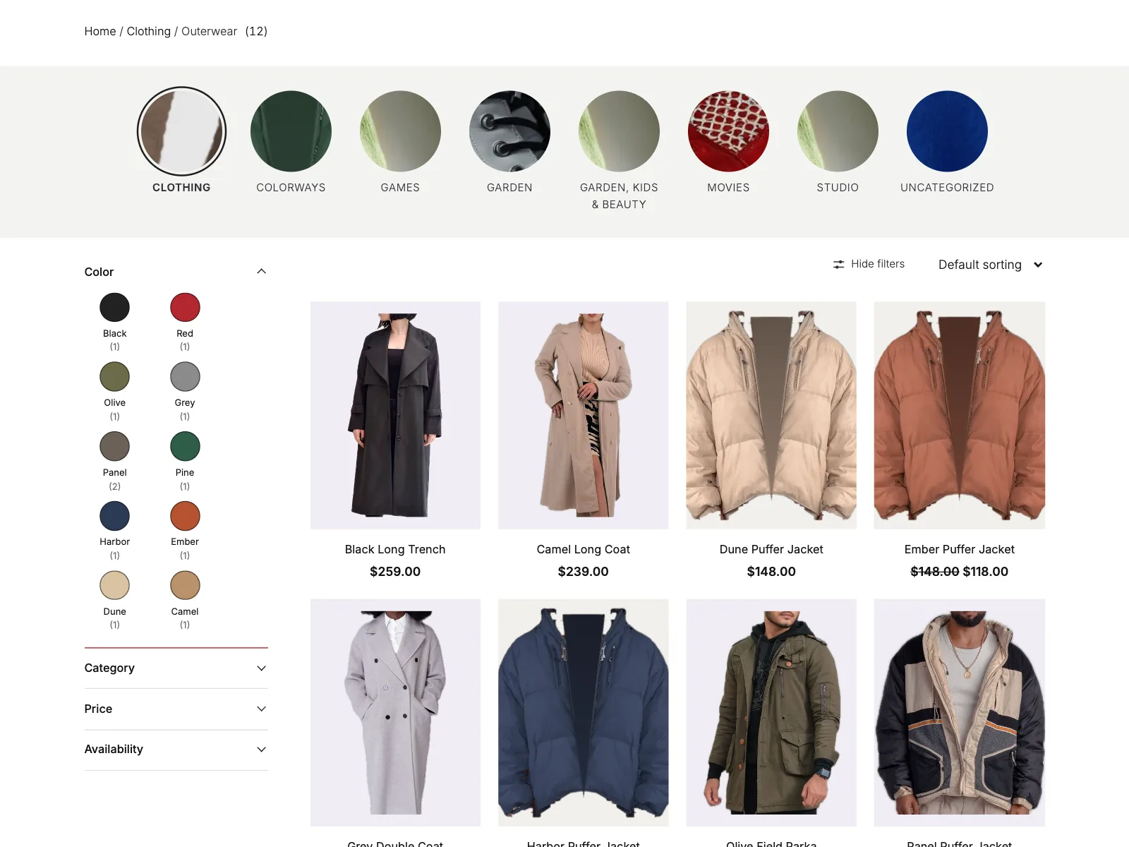
Flagship: the category photo behind a big serif title, category tabs, every filter in one row with Sort by and the grid switch, four columns with color dots and tags, and Load more over a faded last row. A trust row and an offer band close the page. Captured from a store running Purplish.
Two small blocks for your product cards.
Shelf Tag and Color Dots go inside the product card in a Product Collection block. Add them like any other block, and set them in their own sidebar.
- Shelf Tag
- A small tag on the photo, such as New arrival or Best seller. Show on picks your top best sellers, products added in the last 30 days or featured products, and only those cards get it.
- Tag look
- Chip, Pill or Glass, in any corner of the photo, with a shine on hover if you like. You can change the words too.
- Color Dots
- The colors a product comes in, as dots or swatches under the card. Show up to 12, and the rest show as a count, such as +3.
- Sold out
- The Stock Indicator gets Only when sold out, in a Pill, Chip or Glass look, and Grey out sold-out cards turns those photos grey and soft.
Color Dots takes its colors from your color attribute, or from the Purplish page color of each variation. Neither block adds a script to your store's pages.
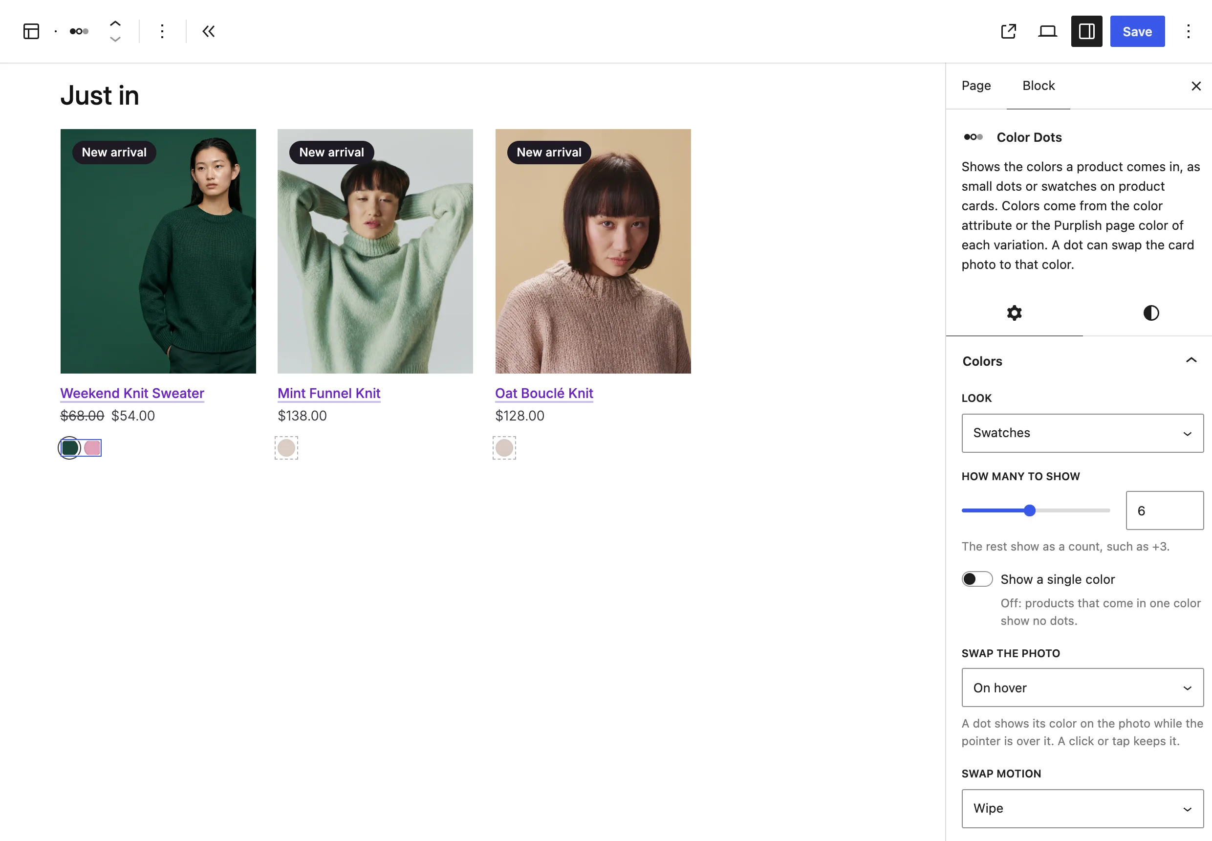
Point at a color, see the product in it.
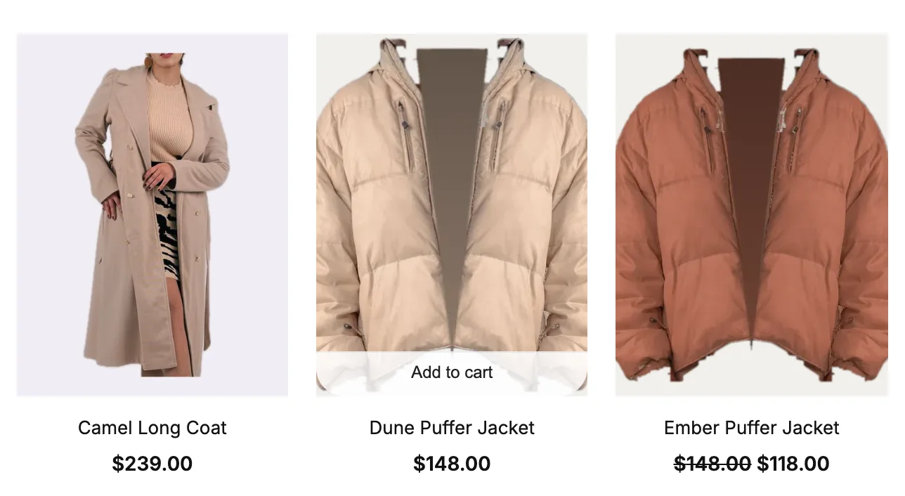
Turn on Swap the photo on Color Dots, and the card photo changes to that color's variation photo. Shoppers see every color without leaving the shop page.
- Swap the photo
- On hover shows the color while the pointer rests on a dot, and a click or tap keeps it. On tap waits for the click or tap.
- Swap motion
- Fade, Wipe or Slide, for how the new photo comes in.
Visitors who ask their device for reduced motion get the new photo at once.
Filters in one row, or a sidebar that folds away.
New options on the Product Filters block. Your filters and how they work stay WooCommerce's own.
- Layout
- Column stacks the filters for a sidebar. Bar puts them in one row above the products, each opening as a dropdown.
- Open on hover
- A list opens when the mouse rests on its label. Clicks, the keyboard and touch screens work as before.
- Open style
- Slide, Grow, Fold or Cascade, for how a list moves as it opens.
- Sidebar can hide
- A Hide filters button beside Sort by folds the sidebar away, and the products take the width.
- Names under swatches
- On the Chips filter, each color swatch shows its name, and the chosen ones get a check.
Atelier's filters use the Accordion's new looks: a Heading line that draws across on hover, and a Chevron icon that turns over when the item opens.

A product grid shoppers can change.
New options on the Product Collection, Catalog Sorting and Pagination blocks, for how the grid looks and how shoppers move through it.
- Grid switch
- Two buttons beside Sort by switch between your column count and one more you pick, from 2 to 6. The choice lasts for the visit.
- Sort by
- New in 1.3.2. On Catalog Sorting. Pick which orderings the list offers, and Default sorting always stays. Average rating can wait until a product has a rating, and Large makes the select 44px tall.
- Results change
- Fade, Rise or Move, for how the cards change when shoppers filter, sort or change page.
- Button look
- For add to cart on the photo: Pill is a small frosted button, and Bar slides up across the bottom on hover.
- Load more
- On the Pagination block. A button adds the next page under the products, on its own or over a faded last row.
- Page numbers
- Boxed puts each number in a small box with the current page filled. Underline marks the current page with a line.
Category tabs, round photos and a count that fits.
New looks for the Terms Query, Product Results Count and Cover blocks, so the top of the shop page leads shoppers on.
- Look
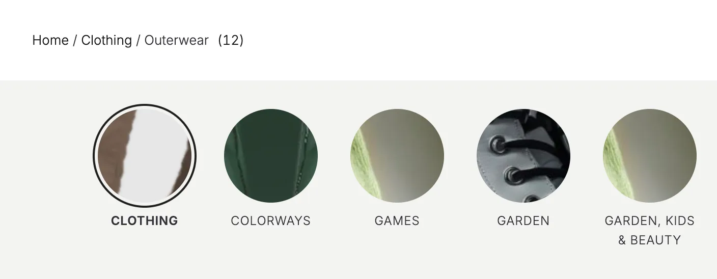
- On Terms Query. Tabs puts your categories in a row with a Line, Pill or Dot under the current one. Category photos puts a photo in a circle, rounded square, square or arch above each name.
- Chip tabs
- New in 1.3.2. On Terms Query. Chip gives each tab a thin edge and a 44px height, and fills the current one. Wrap onto more rows shows every tab, instead of one row that scrolls sideways.
- Mark the current term
- On a category page, that category shows as the current one.
- Count
- On Product Results Count. Just the number, In brackets or Number and "products", in a Plain, Pill or Outline look.
- Use the category photo
- On Cover. A category page shows that category's photo, and other pages keep the cover's own image.
Good to know before you pick.
What the patterns and options change, and what they leave alone.
- Your shop works as before
Products, filters, sorting and the cart stay WooCommerce's own. Load more uses WooCommerce's own page links, so the address keeps the page.
- Phones keep what works
Filters keep WooCommerce's overlay on phones, the grid switch hides on small screens, and Boutique shows two cards to a row.
- Reduced motion
Visitors who ask their device for reduced motion see photo swaps, new results and counts change without motion.
- Block themes and templates
The patterns show in the Site Editor for templates only, and the options live on WooCommerce's blocks, so they need a block theme.
More of Purplish
- Store patternsA full store home page, a header, a phone menu, a footer and an empty cart, all as patterns.
- ShowfloorA shop-the-look block where shoppers add one piece or the whole look to the cart.
- WardrobeA mega menu item for the Navigation block that opens a panel of blocks.
- Changing RoomA try-on block where shoppers drag tops and bottoms onto a model and add the outfit to the cart.
- Product cardsCard effects, hover looks and add to cart on the photo for the shop page.
- Filters and mini-cartActive filters that match your chips, a cart count that pops and Fly to cart.
Shop page questions.
What store owners ask about styling the shop page. The docs cover every option.
How do I change the WooCommerce shop page design?
On a block theme, open the Site Editor, pick your shop or product category template and insert the Flagship, Atelier or Boutique pattern. Then select any block on the page, such as the filters or the product grid, and change it in the Purplish panel. No code. Step by step: customize the WooCommerce shop page in a block theme.
How do I add a New or Best seller badge to product cards?
Add the Shelf Tag block inside the Product Image block of your product cards. Pick Best sellers, New products or Featured products under Show on, and the tag shows only on the products that match. You can change its words, look and corner.
Can I show color swatches on the WooCommerce shop page?
Yes. Add the Color Dots block to your product cards. It shows the colors each product comes in, as dots or swatches, from your color attribute or each variation's Purplish page color. With Swap the photo on, a dot also shows that color on the card photo.
Can I add a Load more button to the shop page?
Yes. Select the Pagination block under your products and set Load more to Button or Button over a fade. The button adds the next page under the products, and it needs the Product Collection block.
Give your shop page the care your products get.
Three patterns to start from, and the blocks you already use to make it yours.
Free and open source. Updated for Purplish 1.3.2.