

Pick Burnt orange on a WooCommerce product page and the photo turns orange. The add to cart button stays the same dark color it had for Cobalt blue, and so does the sale badge. Whatever the shopper picks, the rest of the page keeps your theme's colors.
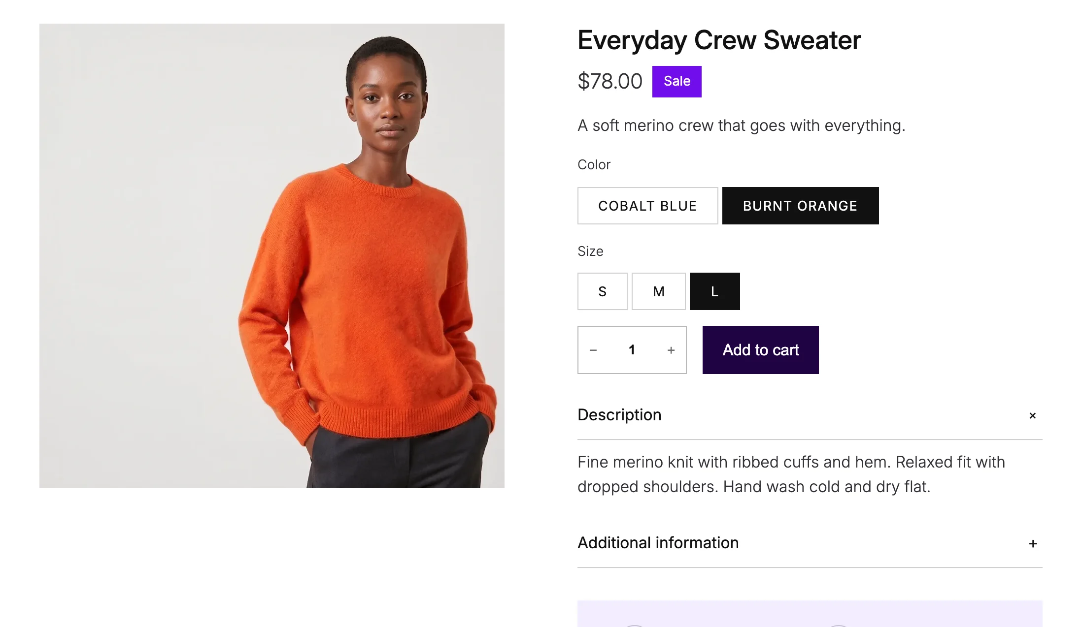
WooCommerce has no setting for a button color per variation. CSS can't do it alone either, because the shopper picks the variation after the page has loaded, so something has to watch for that pick and change the colors.
TLDR
WooCommerce has no setting for this. Install Purplish, and the add to cart button, the selected option and the sale badge follow the variation the shopper picks.
- Each variation takes its color from its photo, with nothing to set up.
- To pick a color yourself, edit the variation and set Page color to Custom, or Off to keep your theme's colors.
- Turn on more parts, like Sale price and Page background tint, in the Purplish panel on the Add to Cart + Options block.
On this page
This is where Purplish started. In a discussion on X, Luigi Teschio suggested letting each variation set its own color, by hand or read from the photo. I built that first. It became the Page color setting, and this guide walks through it from install to a page that follows the shopper's pick.
What you need
WordPress 7.0 or later, WooCommerce 11.0 or later, and a variable product with a photo on each variation. A block theme gets every option in this guide. I test on the free Purple theme. A classic theme works too, with one difference covered at the end.
Install Purplish
In your dashboard, go to Plugins, Add New, search for Purplish, then click Install Now and Activate. There's no account to create and nothing to set up first.
Purplish then reads the color of each variation photo in the background and saves it with the product. It reads the photos on your own server, with the image tools PHP already has, and never sends them anywhere.
Get the next guide the day it's out
- The next step-by-step guide, with screenshots from the demo store.
- Only when a guide is out, never in between.
- One click to unsubscribe, from any email.
Check the Page color on each variation
Edit the product, open Variations in the Product data box, and expand a variation. Purplish adds a Page color field with three choices.
| Choice | What it does |
|---|---|
| Automatic Default | Reads the color from the variation photo. Purplish looks for the product, not the wall behind it. If the color attribute has a swatch color, that comes first. |
| Custom | Uses the color in the Custom color field below it. Click the field to pick a color, or type a hex code like #dc4a24. |
| Off | Keeps your theme's colors for this variation. |
Under the field, Purplish shows what it found, like "Color from the photo: #dc4a24". If it says the color isn't read yet, give the variation a photo and save it. Purplish reads it in the background after that.
Most of the time Automatic is right, and you can leave every variation on it. Switch to Custom when the photo is busy, since a model in a furnished room can point Purplish at the wrong part of the picture.
Save the variations, then update the product. A simple product has the same Page color field on its General tab, with one color for the whole page.
Choose what takes the color
Open Appearance, Editor, Templates, then Single Product. Click the Add to Cart + Options block, which holds the variation choices and the add to cart button. In the Block tab of the sidebar, open the Purplish panel.

The panel starts with five switches: Add to cart button, Selected option, Sale badge, Sale price and Page background tint. The first three are on by default, so the button follows the variation as soon as Purplish is active.
Turn on Sale price for a deeper shade of the color on the price, and Page background tint for a pale wash of it behind the product. Once the tint is on, a Mesh background switch shows up. It adds soft blobs of the color over the tint, and they move each time the color changes.
Photo transition sets how the photo changes along with the color. Blur is the default, and the other choices are Fade, Zoom, Slide, Flip, Wipe, Circle reveal, Color wash and None. Save the template when you're done. The choices are saved on the block in this template, so another template can look different.
Try it on your store
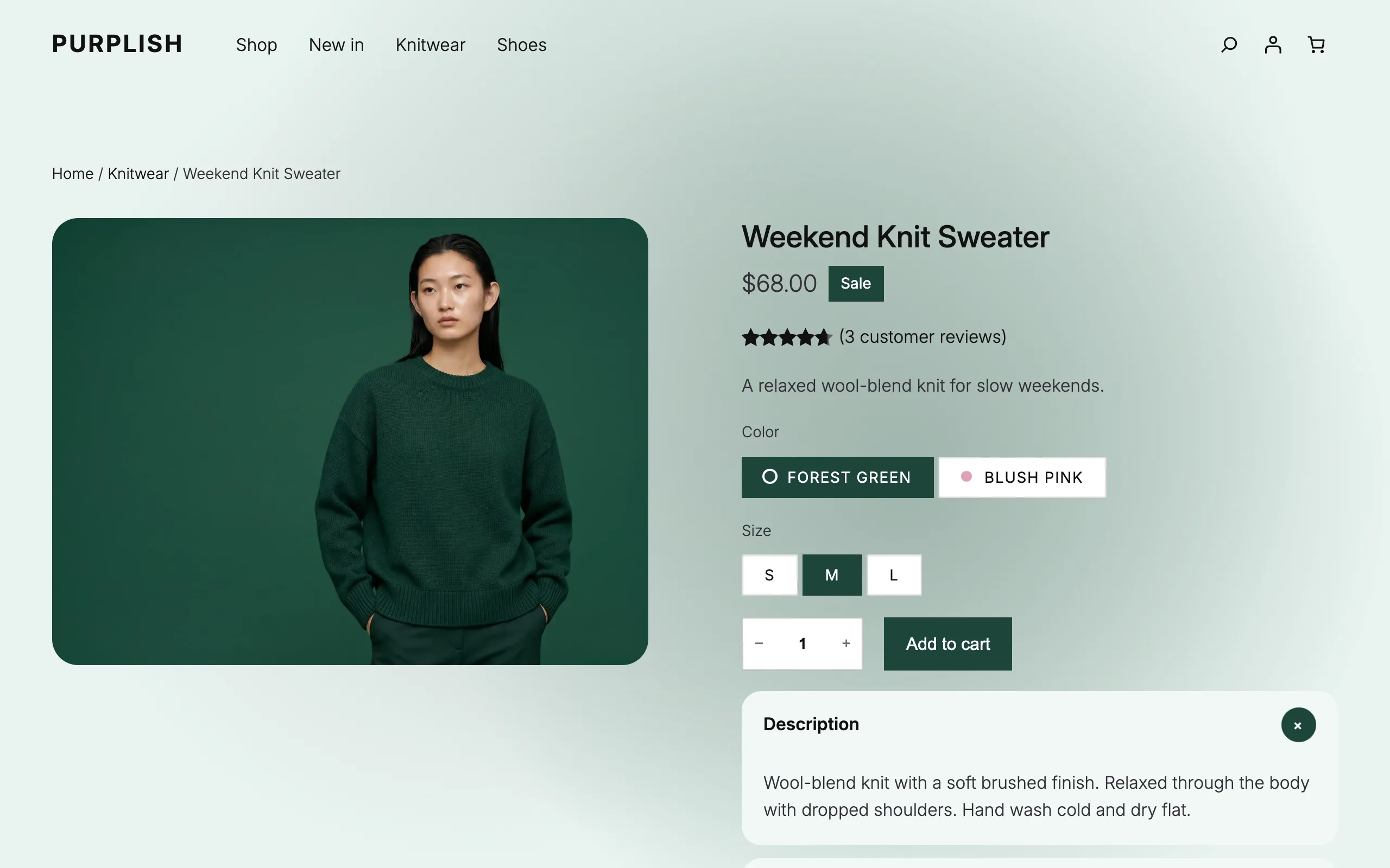
Open the product on your store and pick another color.
Then pick Blush pink.
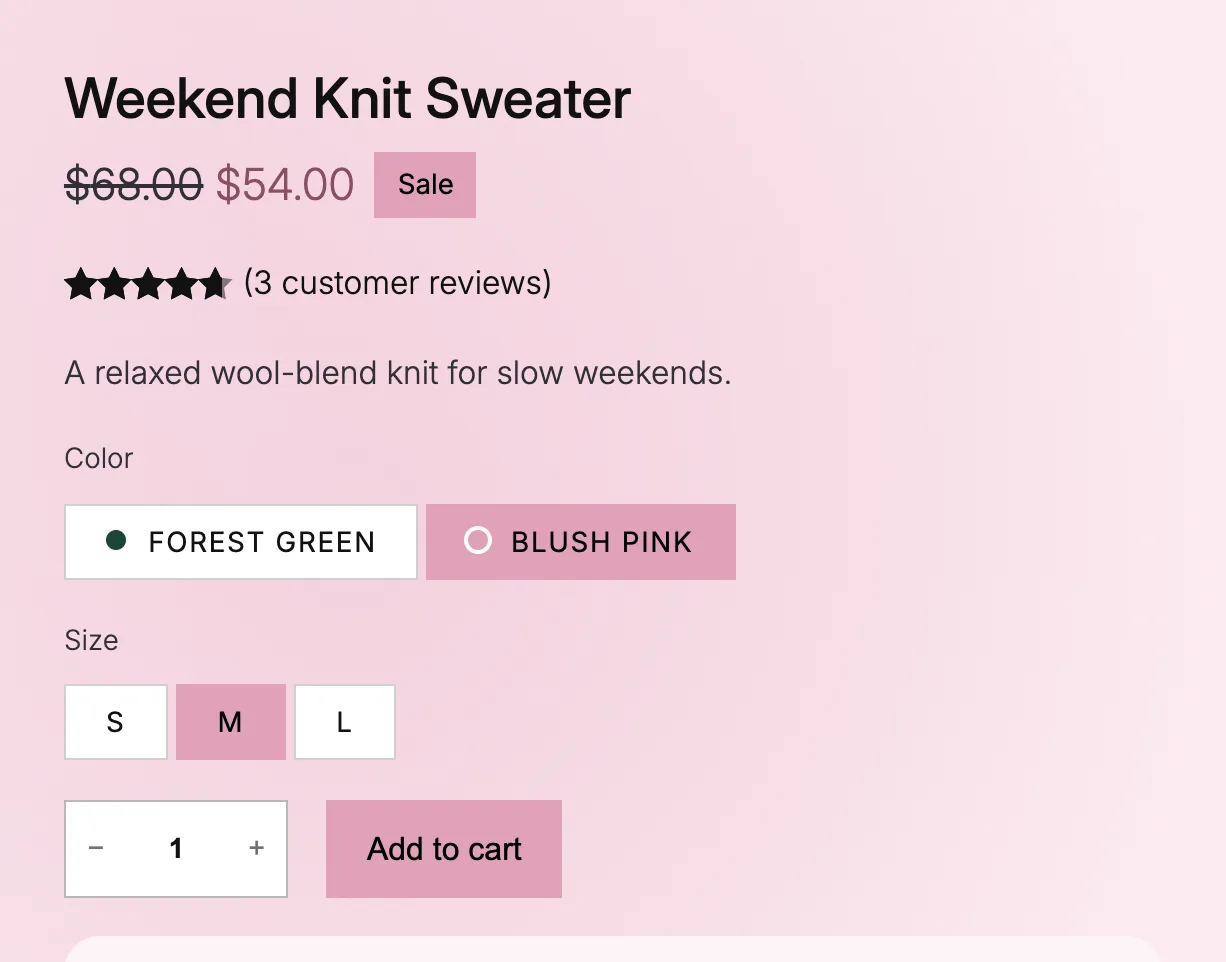
The button isn't the exact pink of the photo. A color read from a photo is often too dark or too pale for a button, so Purplish keeps the hue and adjusts it for each use: a button color with readable black or white text, a deeper shade for the sale price and a pale tint for the background.
The page also opens in the default variation's color, so shoppers never see your theme's colors flash first. To see the other parts that follow the color, like the photo transitions, open product page colors.
If something looks off
Good to know
- A color looks wrong: set that variation's Page color to Custom and pick the color yourself.
- One variation should keep the theme's colors: set its Page color to Off.
- On a classic theme, the parts are under WooCommerce, Settings, Products, Purplish. Selected option isn't there, since classic themes show a dropdown.
- Visitors who turn on reduced motion on their device get the colors without the transition.
- The color script loads on variable products only, so the rest of the store doesn't load it.
If Automatic picks the wrong color on one of your photos, open an issue on GitHub with the photo attached. Those are the cases I want to see.

Leave a question or note