

Search for how to show WooCommerce variations as buttons instead of a dropdown, and most of the top results sell you a swatch plugin. Another one hands you a PHP filter plus some JavaScript. On a block theme you need neither, because WooCommerce's own Add to Cart + Options block already draws the options as buttons.
TLDR
WooCommerce calls these buttons Chips. Set Style to Chips on the variation options inside the Add to Cart + Options block, and add Purplish only if you want a dot of each color on them.
- Open the Single Product template in the Site Editor and select the variation options.
- Chips is the default Style, and Dropdown is the other choice.
- For a swatch look, turn on Color dots on options in the Purplish panel on the same block.
On this page
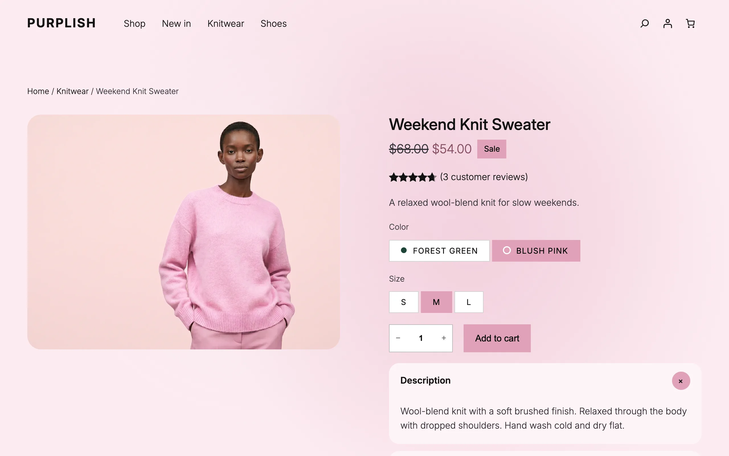
I build Purplish and test every guide on the demo store you see in these screenshots. The chips in it come from WooCommerce, not from my plugin. The dots are the one part Purplish adds, so this guide does the free part first and the dots last.
Why you get a dropdown
On a classic theme, WooCommerce draws each attribute as a select box. The shopper sees a Color label next to a box that says "Choose an option", clicks it, and picks from a list. Size works the same way, so a sweater in two colors and three sizes means two dropdowns to open before the add to cart button does anything.
Block themes can still end up with that box. Older single product templates use the classic Add to Cart with Options block, which draws the same form. The newer Add to Cart + Options block builds the form from smaller blocks, and its variation part can show buttons.
What you need
A block theme and a variable product. For the whole guide, including the dots, you need WordPress 7.0 or later and WooCommerce 11.0 or later. I test on the free Purple theme, whose Single Product template already uses Add to Cart + Options.
Use the Add to Cart + Options block
Go to Appearance, Editor, Templates, then Single Product. Click the area that holds the add to cart button.
If the sidebar shows a notice that starts with "Upgrade to the Add to Cart + Options block", the template has the older block. Click Use the Add to Cart + Options block in that notice. The notice says you can switch back anytime.
Next, open the product type switcher in the block toolbar and pick Variable product. The editor then shows sample Color and Size options to work on: Blue, Red and Green, then Small, Medium and Large.
Set the style to Chips
Click one of the sample options and select its parent block, Variation Selector: Template. One template draws every attribute, so a change here applies to Color, Size and any other attribute on every variable product that uses this template.
| Setting | What it does |
|---|---|
| Style | Chips Default shows each option as a button. Dropdown brings back the select box. |
| Auto-select when only one option is available | Off by default. When on, WooCommerce picks an option for the shopper if it's the only valid choice left. |
| Invalid options | Grayed-out Default or Hidden, for options that don't exist with the shopper's other picks. |
Chips is the default, so a fresh Add to Cart + Options block shows buttons right away. If yours still shows a select box, Style is set to Dropdown.
To style the buttons, click the chips themselves to select the Chips block. It has color settings for unselected and selected chips, each with text, background and border, plus border radius, padding and font size. Save the template when it looks right.
Get the next guide the day it's out
- The next step-by-step guide, with screenshots from the demo store.
- Only when a guide is out, never in between.
- One click to unsubscribe, from any email.
Add a dot of each color
Chips show the option names and nothing else, so every color chip looks the same until you read it. Purplish adds a small dot of the color before each name and keeps the name.
Purplish is free. In your dashboard, go to Plugins, Add New, search for Purplish, then click Install Now and Activate. Back in the Single Product template, select the Add to Cart + Options block and open the Purplish panel in the Block tab of the sidebar.
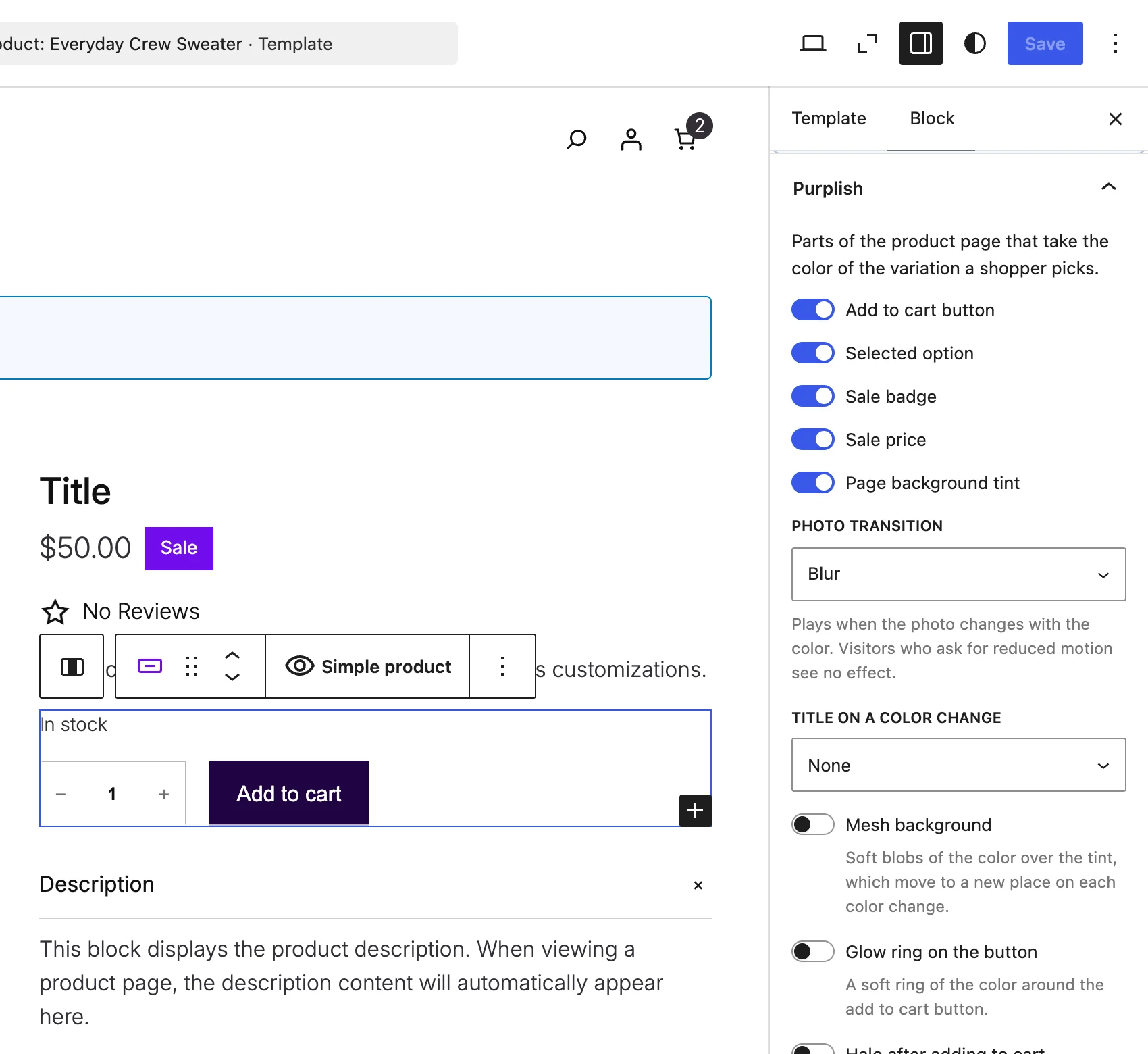
Color dots on options is the last switch in the panel, and it's off by default. Turn it on and save the template.
Each dot takes the color Purplish has for that variation. That's the color it read from the variation photo, or the one you set yourself in the variation's Page color field. If your color attribute has WooCommerce swatch colors, Purplish uses those first.
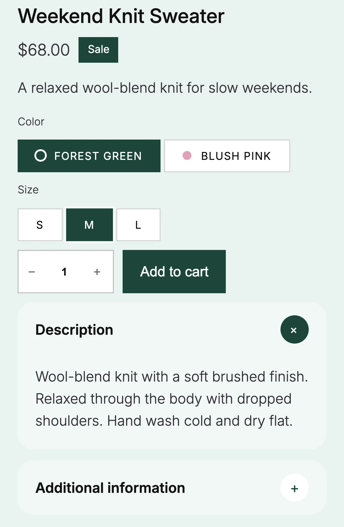
Look at the size chips. An option gets a dot only when every variation with it has the same color. Every size on this sweater comes in green and pink, so S, M and L have no single color to show and get no dot. On the picked chip, the dot turns the chip's text color so it stays visible.
The green fill on the picked chips comes from Purplish too. Its Selected option switch is on by default and fills the picked chip with the variation's color. Turn it off to keep the chip colors you set on the Chips block. The other parts that follow the color are on the product page colors page, and to change the color behind the buy box, see how to change the WooCommerce product page background color.
A few limits
Good to know
- WooCommerce still marks Add to Cart + Options and the Variation Selector as Beta in their block names.
- Classic themes keep the dropdown, so they get no chips and no dots.
- WooCommerce lists Color swatches for attributes under Experimental features in WooCommerce, Settings, Advanced, Features. It's off by default, and this guide doesn't need it.
- The chips and dots live on the product page. Product cards on the shop page use the Product Collection block, which I cover in how to customize the WooCommerce shop page.
If a color option on your store shows no dot and you expected one, check whether all its variations share one color first. If they do and the dot is still missing, open an issue on GitHub with the product's variations listed, and I'll look at it.

Leave a question or note