

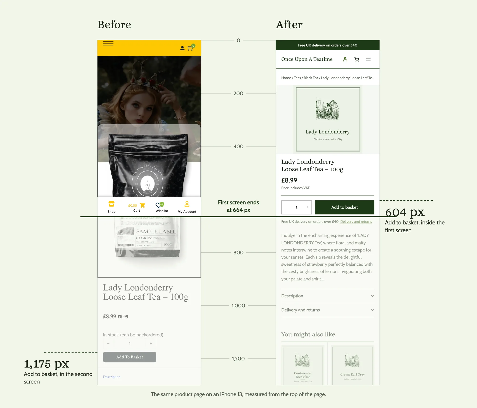
On the old product page, a shopper on a phone scrolled 1,175 px to reach Add to basket. On the rebuild, the button sits at 604 px, inside the first screen. Nothing about the product changed. The page around it did.
I took a real WooCommerce store, a UK loose leaf tea shop with 322 products, and rebuilt it with blocks: Purple, WooCommerce's default block theme, core and WooCommerce blocks, and Purplish, my free plugin that adds design options to those blocks. No page builder and no custom blocks. Then I ran the same tests on both versions.
You can click through the rebuild on the demo store. It's a copy made for this case study, so orders are turned off.
| Before | After | |
|---|---|---|
| Usability score (Nielsen heuristics) | 16/40 | 30/40 |
| Technical health | 8/20 | 15/20 |
| Contrast failures per page | 2 to 27 | 0 |
| Add to basket on a phone | 1,175 px down | 604 px, first screen |
| Shop page weight | 3.4 MB | 1.0 MB |
| Third-party scripts and hosts | 8 | 0 |
| Checkout fields | 13 | 10 |
TLDR
A real tea shop, rebuilt with Purple (WooCommerce's default block theme), core blocks and Purplish. The products and content stayed the same. Its usability score went from 16/40 to 30/40, every contrast failure is gone, and every step to checkout sits about half as far down the page on a phone. The child theme needs 960 lines of CSS and no JavaScript.
On this page
The store and the challenge
The shop sells loose leaf tea and teaware with an Alice in Wonderland theme. The brand is lovely. "All the Best Teas Are a Little Mad" is a line people remember, and the checkout already had Apple Pay and Google Pay at the top.
The store was built with a page builder, with colors and sizes set element by element. Over time that setup had drifted away from what a shopper on a phone needs:
- 165 of the 208 teas used the same photo, a pouch printed "TEA PLACEHOLDER FOR ILLUSTRATION PURPOSES ONLY".
- The product name sat 916 px down the page on a phone, under decoration.
- Delivery cost didn't show up on the product page, the basket or the checkout summary. The site gave three different free-delivery thresholds in three places.
- The brand green carried prices and buttons at a 2.38:1 contrast ratio on white, well below the 4.5:1 that WCAG asks for text.
- The basket had four names across the site: Basket, Shopping Cart, Cart and My Bag.
Most of it is hard to spot from the admin, because the admin doesn't show the store the way a shopper on a phone sees it.
The delivery cost matters most. In Baymard's cart abandonment research, extra costs like delivery are the top reason shoppers leave, at 40% once people who were only browsing are set aside.
I'm not naming the store until the owner has seen this work.
The rules I set
The point was to show what blocks can do on their own, so I kept the rules tight:
- Only Purple, core and WooCommerce blocks, and Purplish. No other plugins.
- A small child theme for templates, theme.json and as little CSS as possible.
- The store's own products, prices and photos. Where a photo was a placeholder, I drew a label for each tea category and marked it as my artwork, not the store's.
- The same seven pages tested before and after with the same scripts: home, shop, a simple product, a variable gift set, the add-to-basket step, the basket and the checkout. Phone first, then desktop.
The scoring used public standards anyone can check: Nielsen's 10 usability heuristics, axe-core against WCAG 2.2 AA, a cognitive load checklist, and a script that measures how far down the page each main action sits on a phone.
What changed, page by page
Home
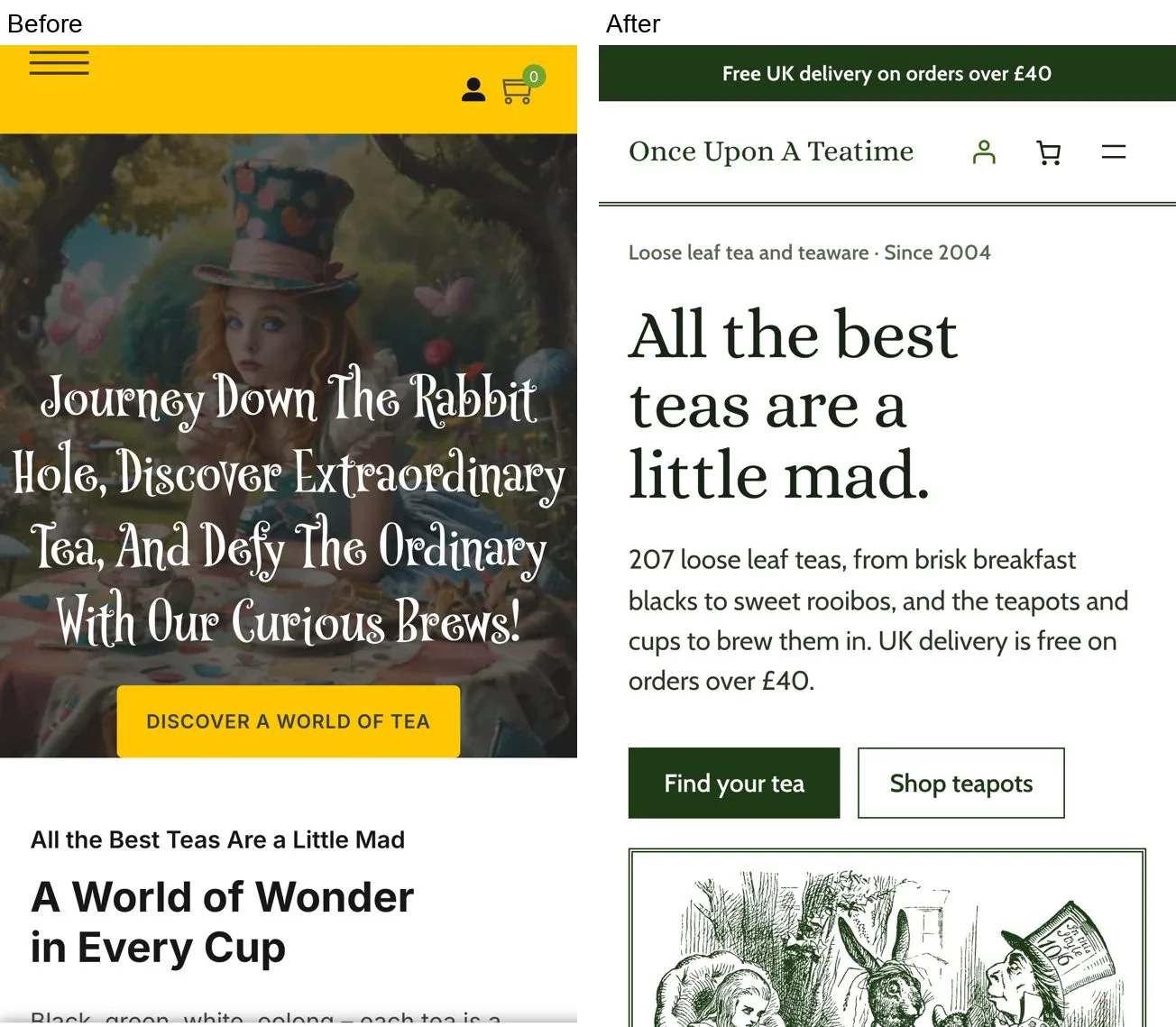
The old home page was 14,289 px tall on a phone and scrolled sideways, because a decorative divider pushed it to 1,820 px wide. Its service promises sat on top of Lorem ipsum, and four of five promo tiles were blank.
The new one is 4,348 px tall and exactly as wide as the screen. Near the top sits a "find your tea" chooser: one card per tea type, each with a count, so a first-time visitor has a way in to 208 teas. The free UK delivery line sits in the top bar.
Shop
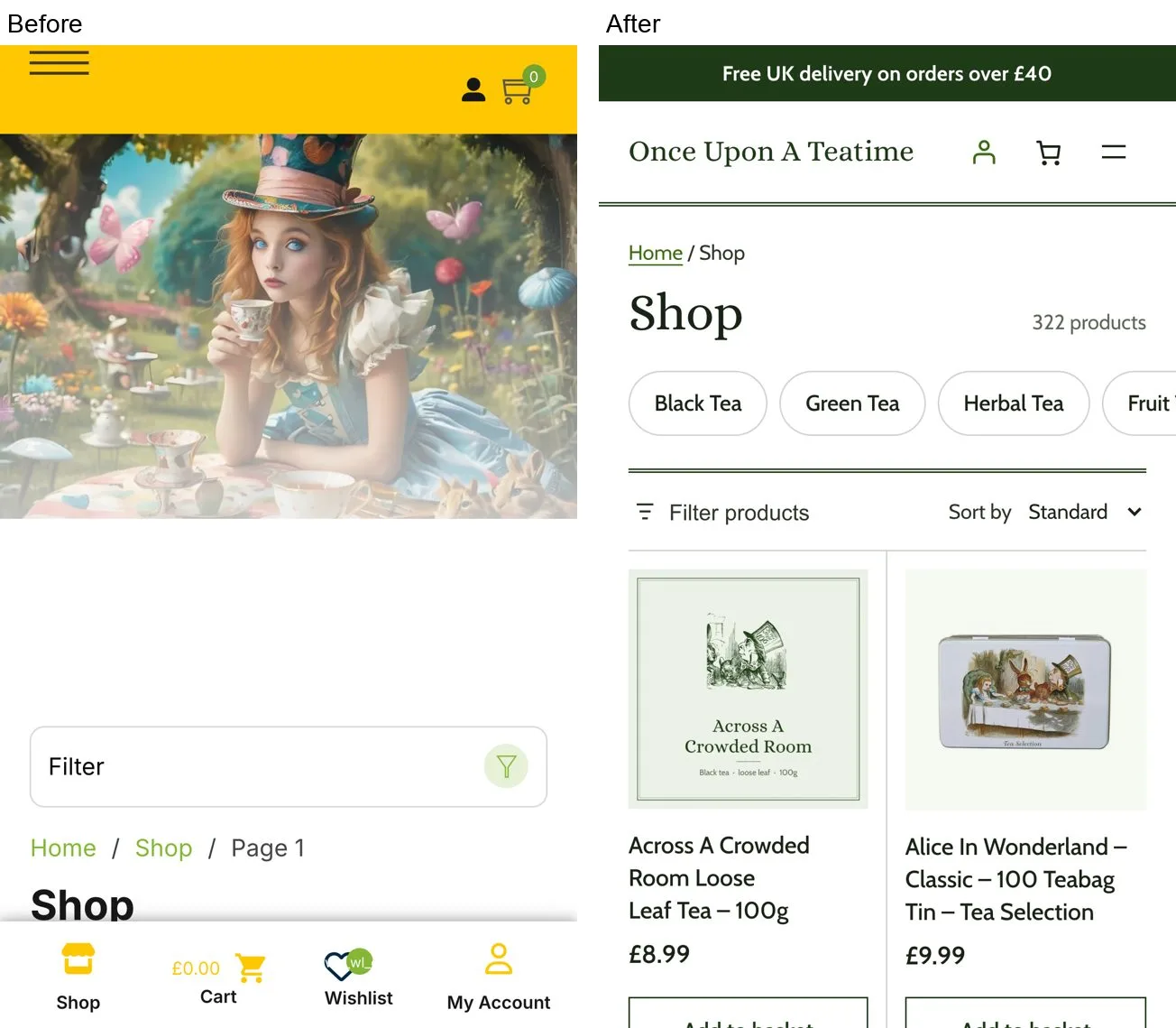
The first product used to sit at 619 px, below the first screen. Page one showed 12 products and none of them was tea, in a shop that sells mostly tea. Each card had five actions, including wishlist and compare icons at 18x18 px.
Now the first product sits at 342 px, the first 12 products are all tea, and a result count, sort and filters sit above the grid. Each card has one action: Add to basket. The grid uses Purplish's ruled cards and photo wash, which give mixed product photos one calm look.
Product page
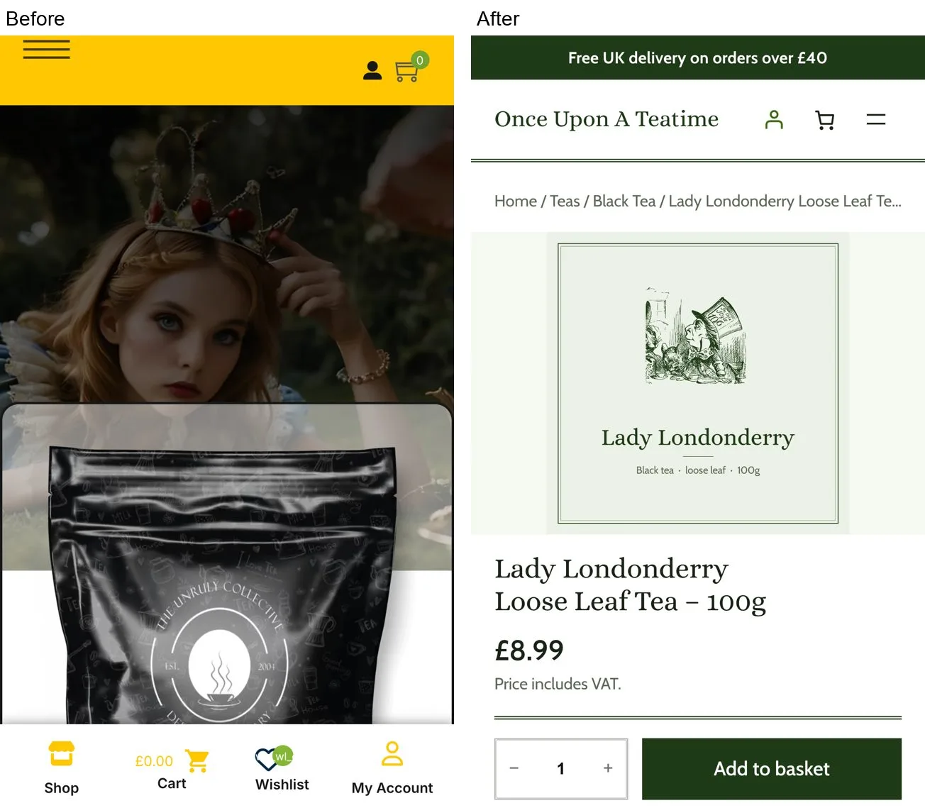
The fonts declared on the old product page never loaded, so it fell back to the browser's default serif. The price printed twice, "£8.99 £8.99".
The rebuild has one price with "Price includes VAT." under it, and the delivery promise under the button. The product name moved from 916 px to 445 px and Add to basket from 1,175 px to 604 px. Hiding the gallery thumbnails on phones with core block visibility saved 144 px on its own.
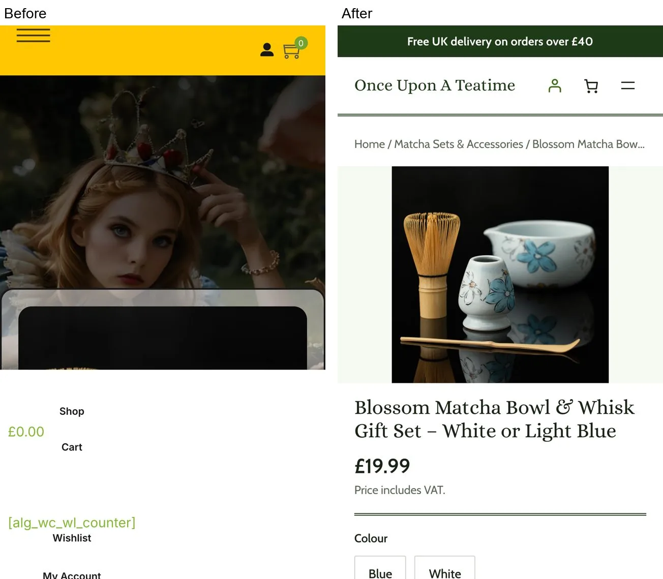
On the variable gift set, the old dropdown became option buttons. The Add to basket button keeps the brand green when an option is picked. Purplish's Add to Cart options put the selected color on a chip and badge instead of the button.
Basket and drawer
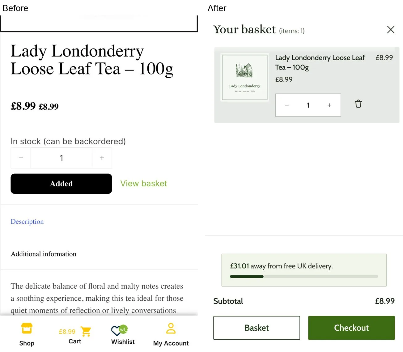
Adding to the basket used to show a small "View basket" link. Now a drawer opens with the item, the subtotal and a meter that reads "£31.01 away from free UK delivery."
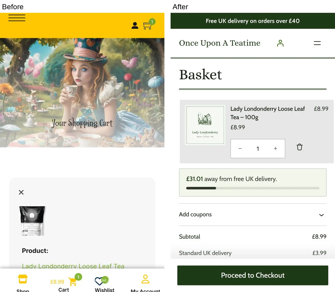
The same meter sits in the basket. The remove control grew from 17x38 px to 44x44 px, the total updates on its own without an "Update basket" button, and Proceed to checkout sits in a sticky bar at 601 px instead of 1,184 px.
Checkout
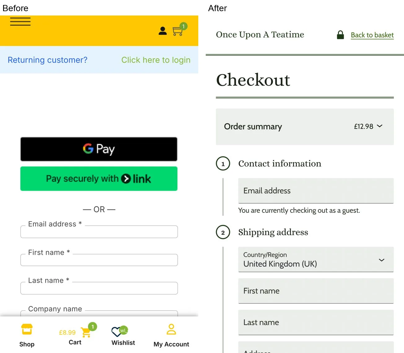
The checkout dropped the full menu, the bottom bar and the marketing footer with its subscribe form. It asks for 10 fields instead of 13, and 6 required instead of 9, which puts it under the 11.3-field average in Baymard's checkout study. The order summary with delivery sits above the form. The last button reads "Place order £12.98" in the brand green, where the old one was a pale grey that looked disabled.
Where Purplish did the work
Every design choice in this rebuild is a block setting, a theme.json value or a short CSS rule. Purplish covers the gap between what core and WooCommerce blocks offer and what a finished store needs.
- Free-delivery meter. The Mini-Cart and Cart meters replaced 217 lines of custom PHP and JavaScript with two settings.
- Product grids. Ruled cards, photo wash, three columns on tablets and a closing rule under the grid, all from Product Collection settings.
- Buy button. Add to Cart options that keep the button color steady while the shopper picks a variation.
- Theme tokens. The wash and rule colors live in theme.json, so the whole store changes from one place.
The child theme's CSS shows the effect. The first full build needed 1,435 lines. Each time a rule turned out to be a missing block setting, I added that setting to Purplish instead of keeping the CSS. The theme now has 960 lines of CSS, 29 lines of PHP and no JavaScript.
| Step | Theme CSS |
|---|---|
| First full build | 1,435 lines |
| With Purplish 1.3.2 | 1,165 lines |
| With Purplish 1.3.3 | 957 lines |
| Spacing, color and type moved into block settings | 941 lines |
| Final touch-target and phone fixes | 960 lines |
What's left in CSS is mostly rules a phone media query overrides, and things theme.json can't express yet, like text-wrap, tabular figures and accent-color.
The results
| Area | Before | After |
|---|---|---|
| Usability (Nielsen) | 16/40, poor | 30/40, good |
| Technical health | 8/20, poor | 15/20, good |
| Cognitive load checklist | 2 of 8 pass | 6 of 8 pass |
| Pages with 0 axe violations (12 page and screen pairs) | 0 | 5 |
| Contrast failures per page | 2 to 27 | 0 |
Of the 28 changes the audit proposed, 22 are fixed and 4 are improved. The 2 not fixed need product data the store doesn't publish, like brewing times and caffeine levels. A theme can't invent that, and I didn't.
Where each main action sits on a phone, in pixels from the top of the page. The first screen ends at 664 px.
| Step | Before | After |
|---|---|---|
| Shop, first product | 619 | 342 |
| Product, name | 916 | 445 |
| Product, Add to basket | 1,175 | 604 |
| Basket, Proceed to checkout | 1,184 | 601 |
| Checkout, Place order | 2,072 | 1,835 |
Page weight on a phone, after scrolling to the bottom:
| Page | Before | After |
|---|---|---|
| Home | 2,089 KB | 1,221 KB |
| Shop | 3,405 KB | 1,028 KB |
| Simple product | 1,032 KB | 639 KB |
| Variable product | 4,069 KB | 1,391 KB |
| Checkout | 1,903 KB | 1,523 KB |
Third-party hosts went from eight, including Google Tag Manager, Bing and a broken image host, to none. The basket is the one page that got a little heavier, from 1,624 KB to 1,722 KB, because the cart block loads its own scripts and the basket now suggests a few products.
On speed, Lighthouse on mobile went from 56 to 92 on the home page, 71 to 91 on the shop and 38 to 90 on the product page. Total blocking time dropped to 0 ms on every page, and the product page's layout shift went from 1 to 0. These are lab numbers from local runs on both versions. For reference, PageSpeed Insights scores the live store at 73, 64 and 69 on mobile.
Three checks for your own store
You don't need an audit to find most of this. Open your store on your phone and check three things:
- How far you scroll on a product page before you reach Add to basket. If it's below the first screen, start there.
- Where your delivery cost first appears. If a shopper only sees it at checkout, put a delivery line under the buy button and a meter in the basket.
- How many outside hosts load on your product page. Open your browser's network panel and sort by domain. Every tag manager, pixel and hotlinked image costs load time.
WooCommerce, Purple and Purplish are all free, and with a small child theme for the look, they were everything this store needed in the block editor. Purplish is on WordPress.org, and every setting used here is covered in the docs.
If you'd like your own store reviewed the same way, get in touch or send me a DM on X.
Leave a question or note