
Where to find it
Open the template with your products, like Appearance, Editor, Templates, Product Catalog. Select the Product Collection block, then turn on Ruled cards in the Purplish panel of the block sidebar.
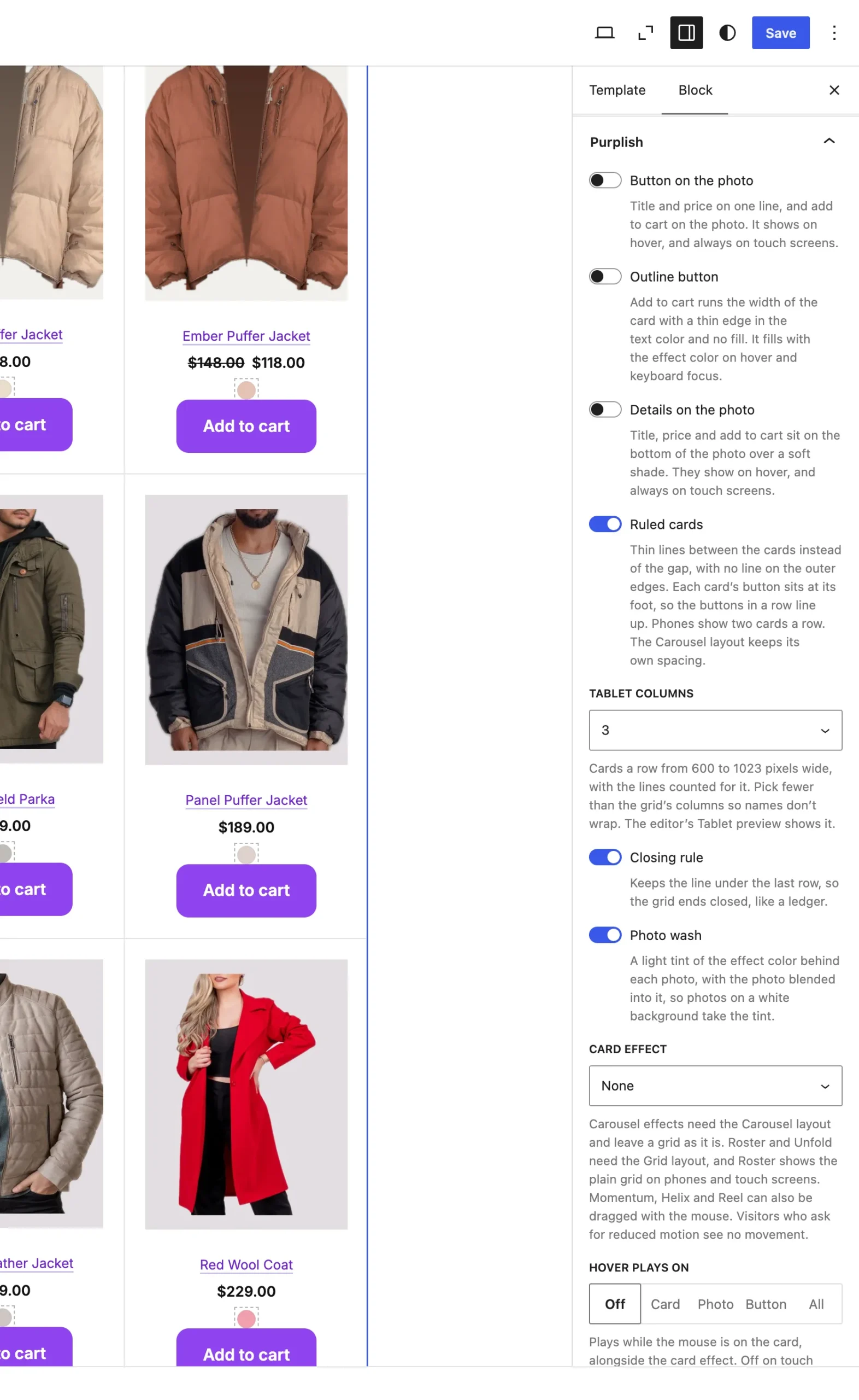
Ruled cards sits under Details on the photo. Tablet columns and Closing rule show under it while it's on.
What it does
A switch, off by default.
| Choice | What it does |
|---|---|
| Off Default | The cards keep your theme's gap. |
| On | Thin lines sit between the cards instead of the gap, with no line on the outer edges. Each card's button sits at its foot, so the buttons in a row line up. |
Tablet columns, under Ruled cards:
| Choice | What it does |
|---|---|
| Same as the grid Default | Tablets show the grid's own column count. |
| 2, 3, 4 or 5 New in 1.3.3 | Cards a row on screens 600 to 1023 pixels wide, with the lines counted for that number, so the outer edge and the last row still have no line. Pick fewer than the grid's columns so names don't wrap. |
Closing rule, under Ruled cards:
| Choice | What it does |
|---|---|
| Off Default | No line under the last row. |
| On New in 1.3.3 | Keeps the line under the last row at every width, so the grid ends closed, like a ledger. The outer side edges stay open. |
Good to know
Before you turn it on
- It follows the grid's column count, from 2 to 6, or the count shoppers pick with Grid switch. Screens under 600px wide show two cards a row, and Tablet columns sets the count from 600 to 1023px.
- The Carousel layout keeps its own spacing.
- It's greyed out with the Roster card effect, which shows the cards as its own list.
- Ruled cards have square corners, and the Ring hover look draws inside each card.
- Tablet columns and Closing rule show while Ruled cards is on. The editor's Tablet preview shows the tablet count.
- A block theme can set the line color in theme.json. See Corners, shadow and colors.