

Purplish 1.3 is out, and it's the biggest update the plugin has had. Until now, Purplish was mostly about the product page. With 1.3, the home page, the menu, the shop page, the cart and the checkout get their own blocks, patterns and options too. That adds up to five new blocks, 17 patterns and three full shop pages.
I didn't start this release in the editor. I started by reading. Baymard Institute's 2026 navigation benchmark found that 64% of online stores don't let shoppers go straight from an outfit photo to the products in it. That one number became Showfloor, the first block in 1.3.
TLDR
Purplish 1.3 adds five blocks for WooCommerce stores: Showfloor, Changing Room, Wardrobe, Shelf Tag and Color Dots. It also brings 17 patterns, three of them full shop pages, and new options for WooCommerce's filters, product grid and pagination. Every piece was planned from ecommerce UX research.
On this page
- Showfloor: shop the look
- Changing Room: mix and match before you buy
- Wardrobe: a mega menu for the Navigation block
- Three shop pages, and the options behind them
- Flagship: a full store home page
- Cart and checkout patterns
- More looks for blocks you already use
- Abilities for AI agents
- Fixes and accessibility
- Tested on 11 themes
- Before you update
The rest of 1.3 went the same way. I read what research says about shop pages, menus, carts and checkout, and how shoppers really use them. Then I planned each pattern from those findings.
For each piece, I tried different ways to extend WooCommerce's own blocks and kept the one that worked best. Some of that was finding where core blocks quietly drop a setting. A Group drops a gap written with clamp(), and a Cover ignores a minimum height set in its styles. The patterns work around those, so you never run into them.
Whatever survived went into Purplish as an option or a block. So every pattern in 1.3 is built from WooCommerce blocks and Purplish options, with no custom CSS and no page builder.
Showfloor: shop the look
Most stores show their best outfits as one big photo. Shoppers who like the look then have to hunt for each piece. Baymard's 2026 navigation benchmark counts this as a common gap, with 64% of sites getting it wrong.
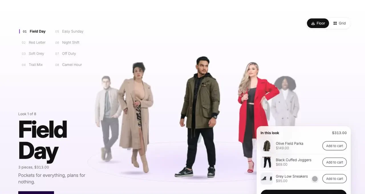
In Showfloor, cut-out looks stand on a floor that turns. A shopper picks a look, sees every piece with its price, and adds one piece or the whole look. The whole look goes into the cart as one Store API request instead of one per piece.
Looks can also come from a pattern. Patterns can't point to images in your Media Library, so I drew eight figures that ship with the plugin. Swap them for your own product photos when you're ready.
Try it on the Showfloor demo, or read the WooCommerce shop the look page and the Showfloor doc.
Changing Room: mix and match before you buy
Clothes that don't fit come back. Baymard found that 83% of apparel sites don't give enough sizing information, and that a product that doesn't fit will need to be returned.
So Changing Room puts the outfit and the sizes in one place. Tops and bottoms turn in two rings around a model. A shopper drags a piece onto the model, opens it to check the sizes and adds the outfit to the cart.
Behind it is a plain photo swap, so you take one photo for each top and bottom pair. Three tops and three bottoms means nine photos. Six of each means 36, so I'd start small.
Each outfit gets its own link too, so a shopper can send someone the exact pair they picked.
The Changing Room demo uses real products with one photo per pair. The WooCommerce outfit builder page and the Changing Room doc cover the setup.
Wardrobe: a mega menu for the Navigation block
Nielsen Norman Group's research says mega menus work well for store navigation, because they show everything at a glance and can hold pictures. The Navigation block in WordPress only opens submenus as plain lists of links.
Wardrobe is a menu item you add inside Navigation. It opens a panel, and you fill the panel with any blocks you like: category photos, a featured look, a list of links.
It waits a moment before opening on hover, so a mouse passing over the menu doesn't flash it open. Escape closes it and puts focus back on the menu label. Touch screens have no hover, so on phones it's a plain link.
Open the menu on the Wardrobe demo, or read the WooCommerce mega menu page and the Wardrobe doc.
Three shop pages, and the options behind them
The shop page took most of my time on this release. I planned three full shop pages, Flagship, Atelier and Boutique, and each one needed options WooCommerce's blocks didn't have yet.
I didn't want those options to be plain on and off switches. Where a block gets a new option, it comes with a few looks to pick from, so two stores using the same pattern don't have to look the same.
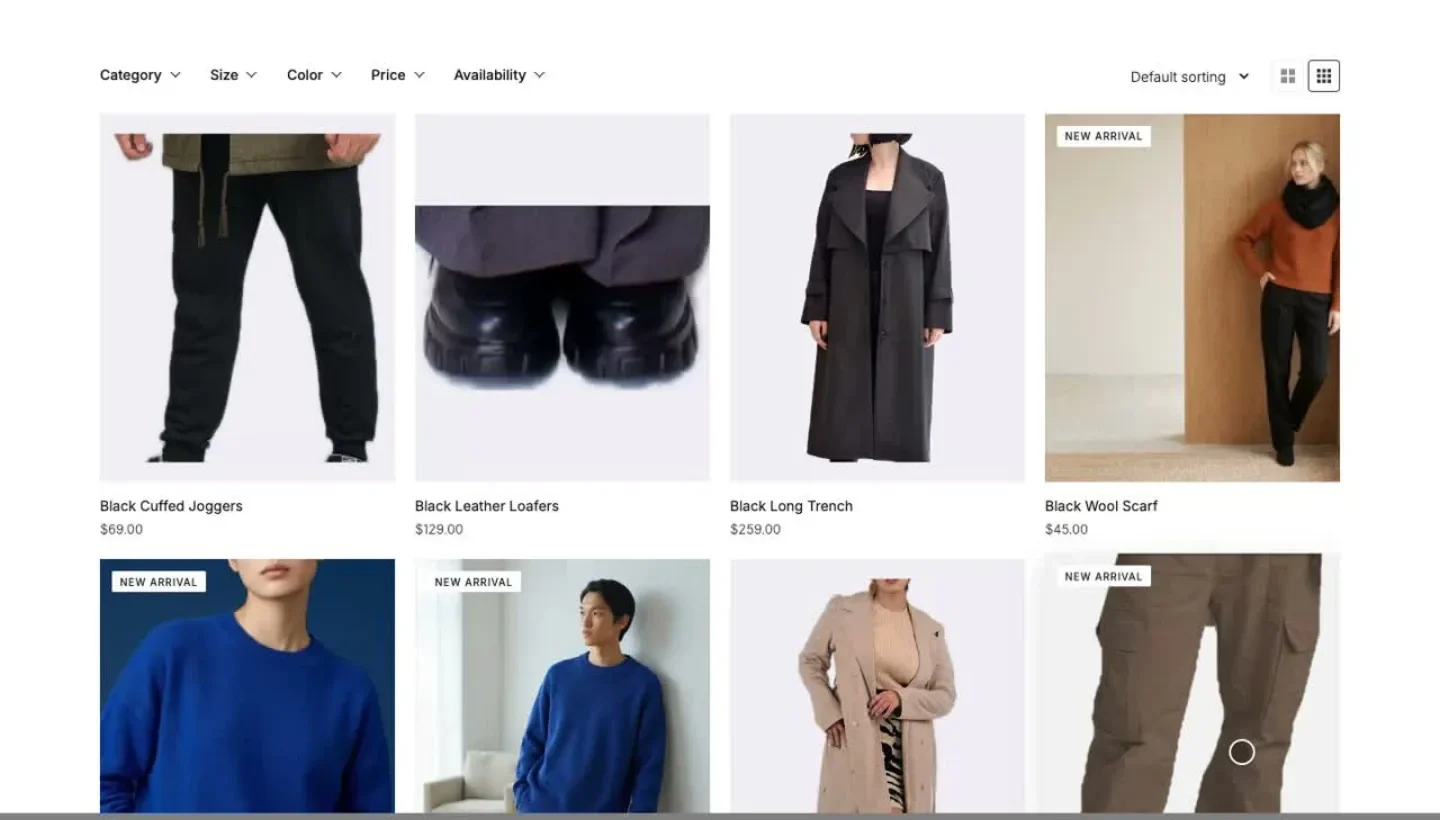
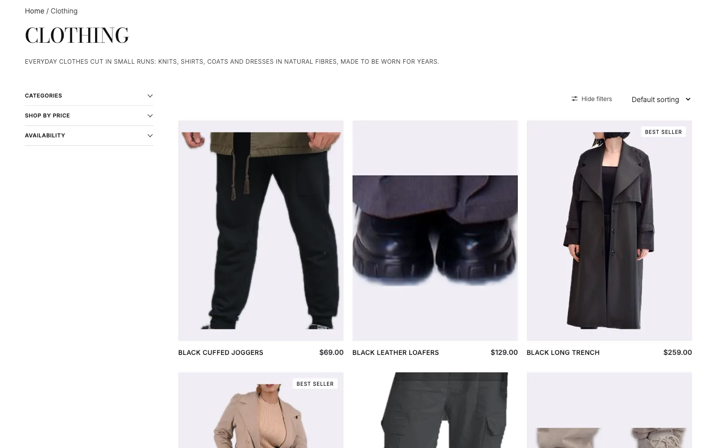
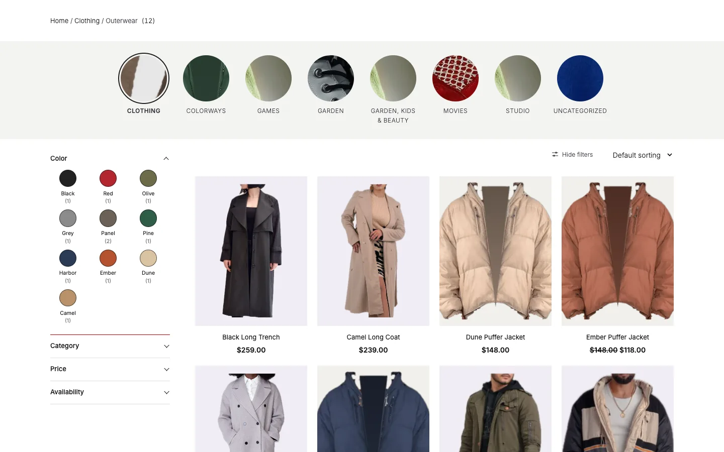
You can click through all three: the Flagship shop demo, the Atelier shop demo and the Boutique shop demo. The WooCommerce shop page design page covers every option below.
Shelf Tag
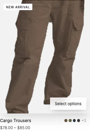
WooCommerce's Sale Badge only shows on products that are on sale, so it can't say New or Best seller. Shelf Tag is a new block for Best seller, New arrival and Featured tags.
Baymard's notes on badges warn that when most items carry a badge, it stops working as a highlight. So each tag follows a rule. Best seller comes from the store's own sales, checked every six hours, and only the top sellers get it. The Shelf Tag doc has the settings.
Color Dots
Nothing on a WooCommerce product card shows the colors a product comes in. Baymard found that 57% of sites don't show all color swatches in mobile product lists, even for products people choose by look.
Color Dots puts a dot for each color under the card. Point at a dot and the card photo swaps to that color. It reads WooCommerce's color swatches, and when a product has no color attribute, it uses the Purplish page colors you already set. The Color Dots doc explains both.
Filters in a row, a folding sidebar and color names
Product Filters only stack in a column, and the overlay is the only way to hide them. 1.3 lets the filters sit in one row with a dropdown for each, and lets the sidebar fold away.
Baymard cautions against horizontal filter bars once a store has more than six to eight filter types. So the row is one choice, not the only one. A store with a few filters gets the row, and a store with many keeps the sidebar and can fold it.
WooCommerce 11.3's color swatches hide the color names, so Purplish can show the names under them. The filter layout doc covers the row and the folding sidebar.
A grid switch and cards that move
Product Collection gives every shopper the same column count. The grid switch lets shoppers pick bigger or smaller cards, and it remembers their choice while they browse. The grid switch doc has the settings.
When filters change the results, WooCommerce swaps the cards with no motion and the grid jumps. In 1.3 the cards move to their new spots instead. Product Collection also gets an add to cart bar that sits on the product photo.
Load more and result counts
Pagination in WooCommerce replaces the grid with the next page. Baymard's research on product lists found Load more is generally the best-performing option, so 1.3 adds a Load more look, plus new page number looks.
Load more keeps the URL, so a reload or the Back button shows the same products. The Load more doc has the details. Nielsen Norman Group says a list like this needs a visible count, so Product Results Count gets shorter count looks that read well next to the grid.
Category tabs, category photos and sold-out cards
Baymard found that 96% of sites don't highlight where the shopper is in their navigation. WooCommerce's Terms Query never marks the category you're on, so its new Tabs look does.
The same benchmark found 39% of sites have missing or hard-to-read category thumbnails. Terms Query gets a Category photos look, and on category pages a Cover can show the category's own photo instead of the first product's.
Stock Indicator also gets a sold-out look, so a sold-out card reads at a glance.
Flagship: a full store home page
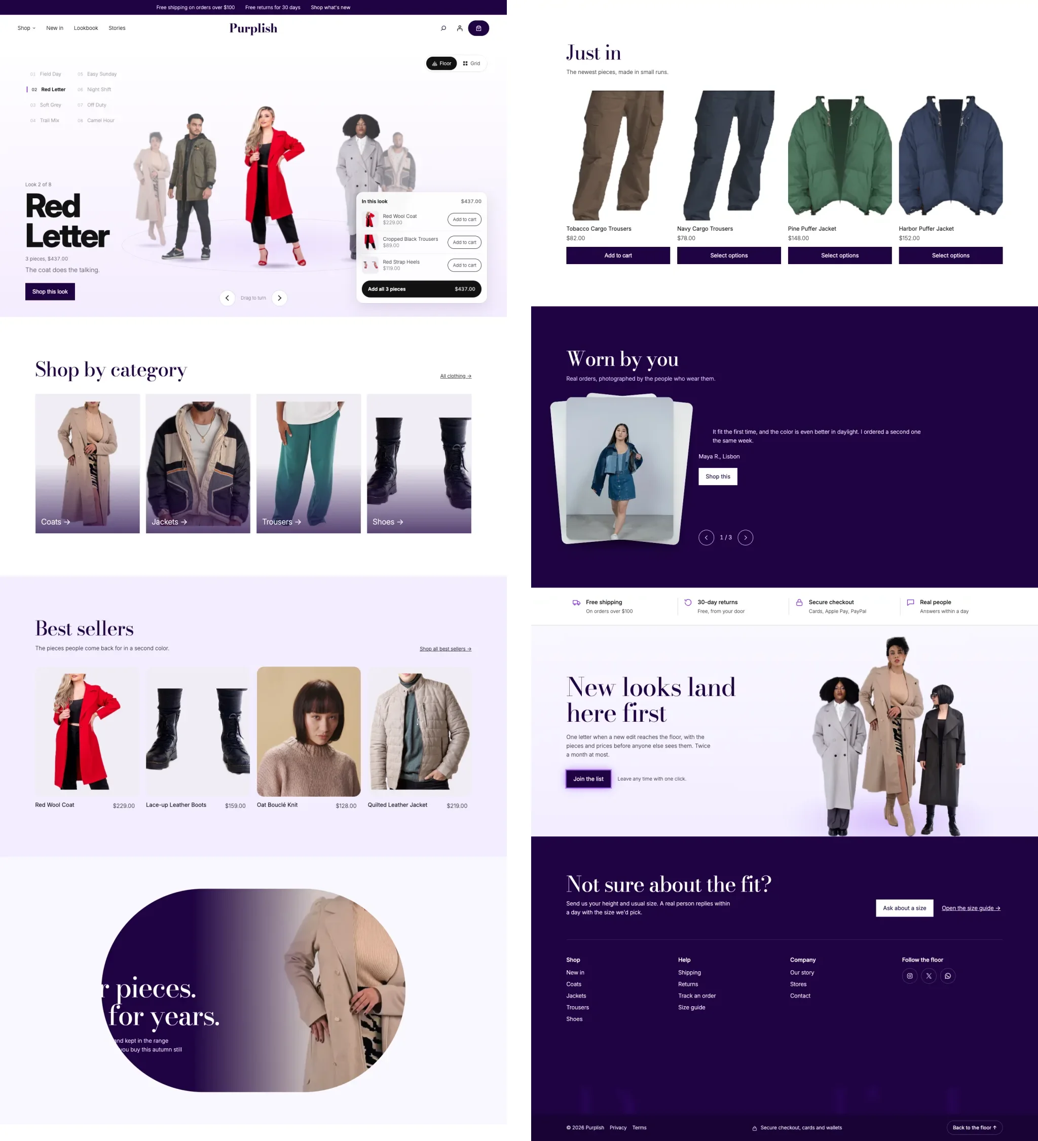
Flagship is a store home page made of patterns: the page itself, its seven sections as patterns of their own, a header, a phone menu and a footer. Use the whole page, or take one section into a page you already have.
Nielsen Norman Group's research on sticky headers says they help shoppers reach the menu but take space and can cover the page. So the header uses a new Group option, Condense on scroll. It narrows into a floating pill as you scroll. It's CSS only, and the page under it never shifts. The Condense on scroll doc shows how to turn it on.
The category tiles are Cover blocks, so the name sits on the photo. Cover gets four hovers for this: Push in, Tilt, Lift and Glare. Featured Category and Featured Product get the same hovers, plus Cover's scroll looks.
See the Flagship home demo. The WooCommerce store patterns page lists every pattern, and the Cover hovers are on the image hover effects page.
Cart and checkout patterns
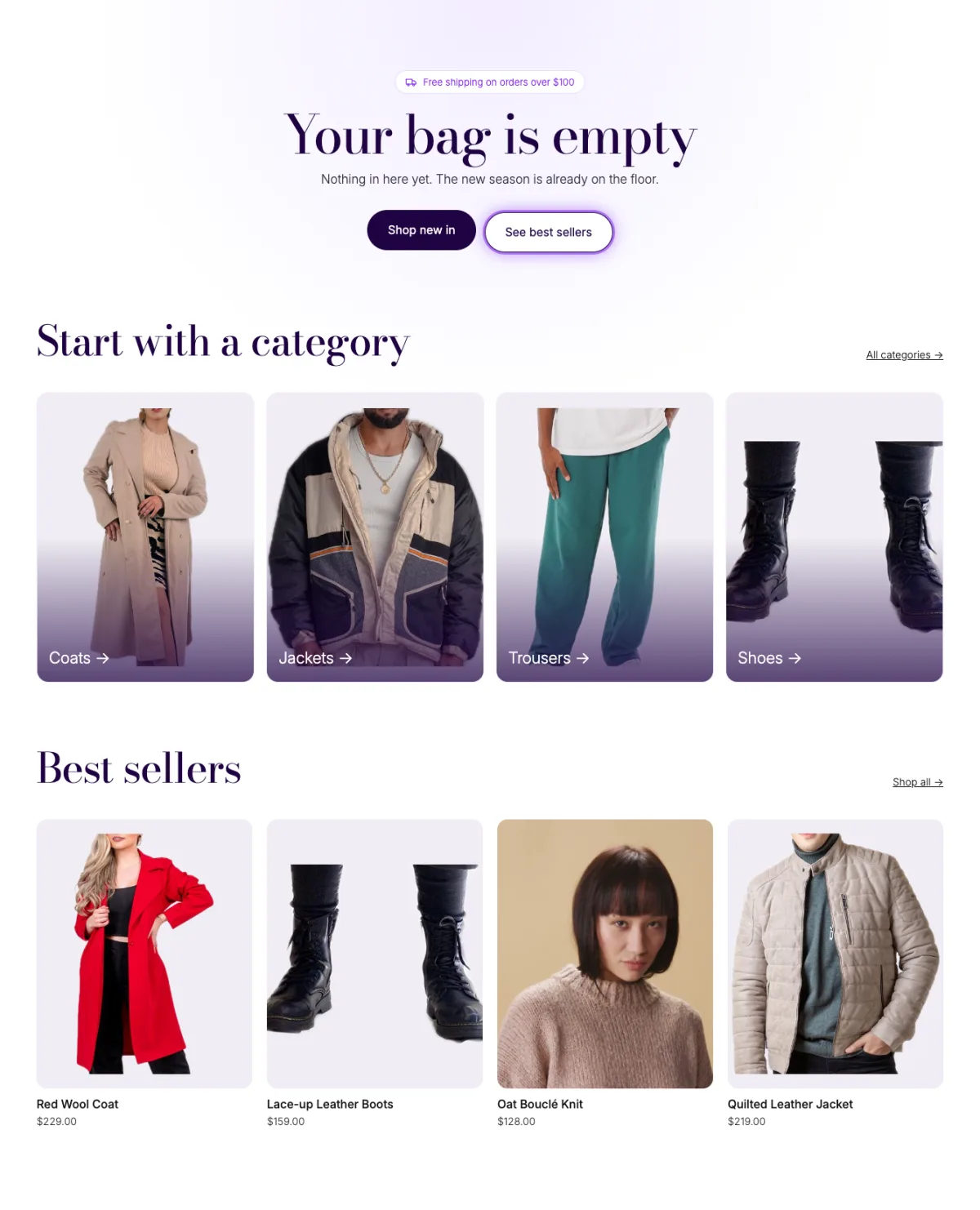
An empty cart is a dead end in most stores. The Empty cart pattern gives the shopper somewhere to go next: new arrivals, best sellers and the main categories.
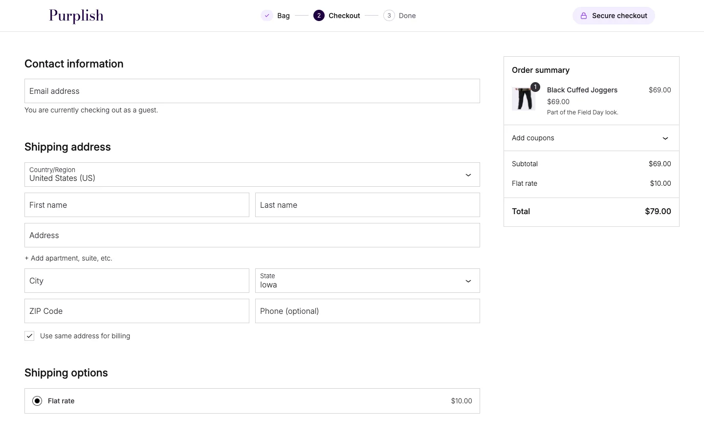
Baymard's checkout research recommends an enclosed checkout, with the main navigation gone and only the logo left as a way back. The Checkout header pattern does that, and nothing in it moves, so the checkout stays calm.
The Money-back guarantee card is for the shoppers who hesitate at the last step. In Baymard's cart abandonment study, 19% of shoppers who left said they didn't trust the site with their card, and 13% said the returns policy wasn't good enough.
The store pages doc covers how to add all three.
More looks for blocks you already use
- Heading gets Rise from the floor.
- Group gets Turn on hover.
- Social Icons get a Ring look.
- Accordion gets a drawn line and a chevron.
Rise from the floor and Condense on scroll are on the scroll animations page. Turn on hover and the Ring look are on the button effects page.
Abilities for AI agents
WordPress has an Abilities API, and the MCP Adapter lets AI agents use it. Purplish 1.3 adds four abilities: read the design catalog, read the designs on a page, set a block's design and insert a pattern.
An agent that can already edit your site can now pick Purplish designs and patterns for you. The abilities doc lists what each one does.
Fixes and accessibility
- The Circle sale badge stays small when WooCommerce shows a discount amount instead of a percentage.
- Googly eyes and liquid glass now follow the mouse on buttons inside the Cart and Checkout blocks. WooCommerce redraws those blocks with React, and the effects lost track of the buttons.
- Hover looks stay off after a tap on phones. They used to stick.
WebAIM's 2026 scan of the top million home pages found WCAG failures on 95.9% of them. I didn't want Purplish adding to that. Before this release, I went through every interactive part of Purplish with a keyboard, a screen reader and a phone, and fixed the gaps I found.
Tested on 11 themes
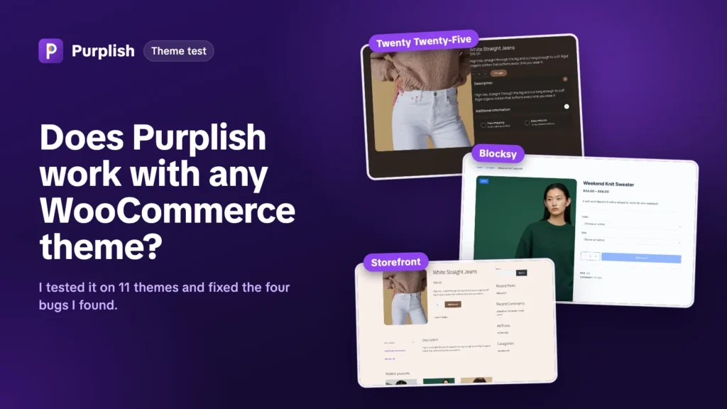
I build and show Purplish on Purple, WooCommerce's default block theme. Plenty of stores run something else, though. So before this release, I ran 1.3 on 11 other themes. Six were block themes: Twenty Twenty-Five, Twenty Twenty-Four, Ollie, Raft, Spectra One and YITH Wonder. Five were classic: Astra, Blocksy, Kadence, GeneratePress and Storefront.
Each theme got the same pages on a desktop and a phone, in a right-to-left language, and in its dark style where it had one. Every block option worked on the classic themes too. No theme threw a console error or a PHP notice.
The test found three bugs, and 1.3 fixes all of them. Light backgrounds washed out the text in dark styles, the classic gallery options did nothing on Blocksy, and the Flagship category grid dropped to one column on narrow phones.
The whole test, with screenshots of every bug and how I fixed it, is in Does Purplish work with any WooCommerce theme?
Before you update
Some 1.3 options work with features that are new in WooCommerce 11.3, like its color swatches and the discount amount on the sale badge. Update WooCommerce to 11.3 first, then Purplish.
The update is on Purplish's WordPress.org page, and every change is in the Purplish changelog.
Purplish is just me, no team. So if something in 1.3 doesn't work the way this post says, or there's a part of your store you still can't design with blocks, leave a comment below. I read every comment myself, and the next release starts from them. Thank you to everyone who has already sent an idea, a question or a bug report. That's how Purplish keeps growing.
Leave a question or note