
Where to find it
Open Appearance, Editor, Patterns, Template parts, Mini-Cart. Or select the Mini-Cart block in your header and click Edit Mini-Cart Drawer template. Select the Go to checkout button, the Mini-Cart Proceed to Checkout Button block, then turn on any of the looks in the Purplish panel. You'll see it in the editor as you pick.
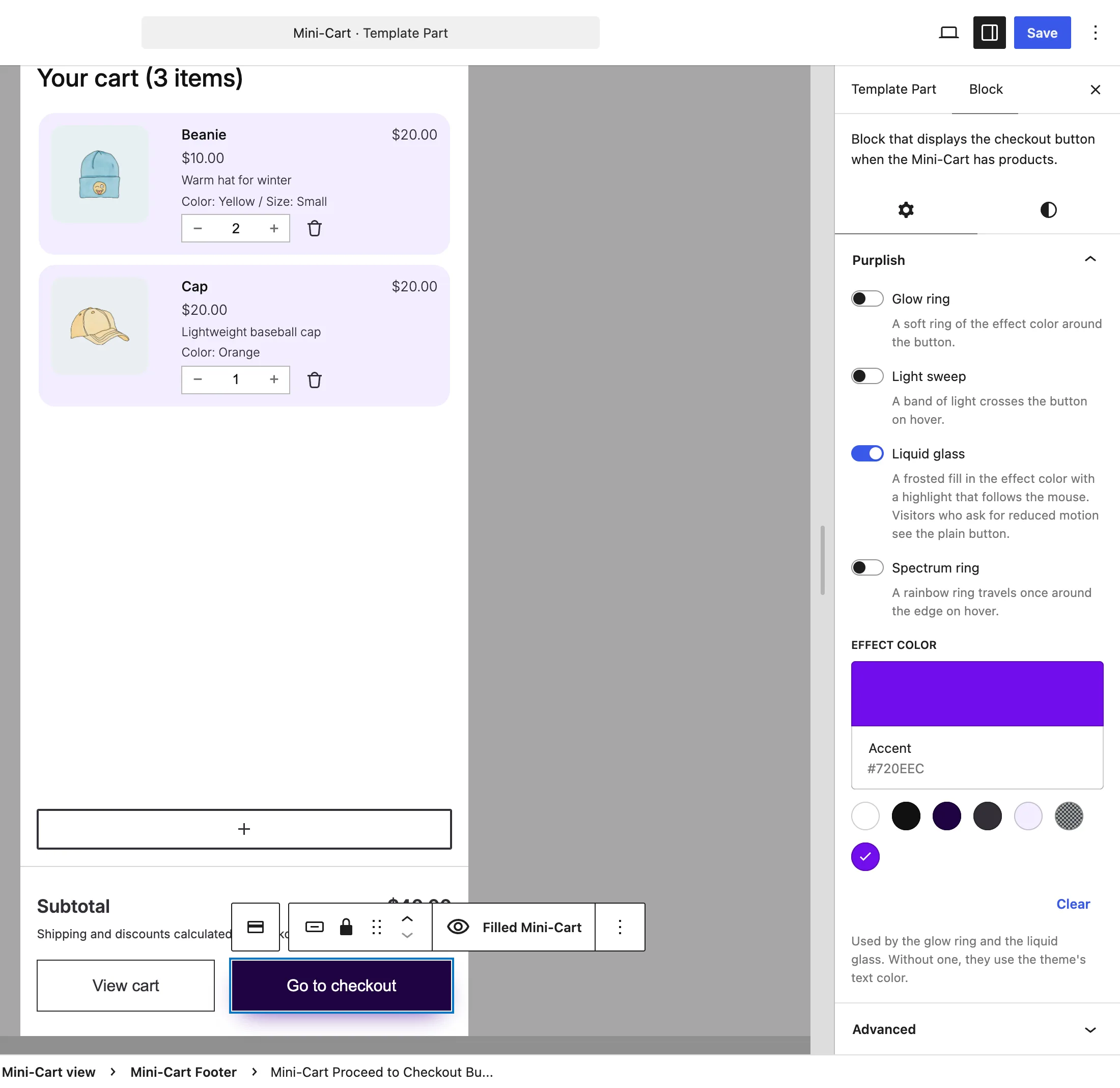
The Purplish panel on the drawer's Go to checkout button.
The choices
Four switches, all off by default. Turn on any mix.
| Choice | What it does |
|---|---|
| Glow ring | A soft ring of the effect color around the button. |
| Light sweep | A band of light crosses the button on hover. |
| Liquid glass | A frosted fill in the effect color, with a highlight that follows the mouse. |
| Spectrum ring | A rainbow ring travels once around the edge on hover. |
See it on the store
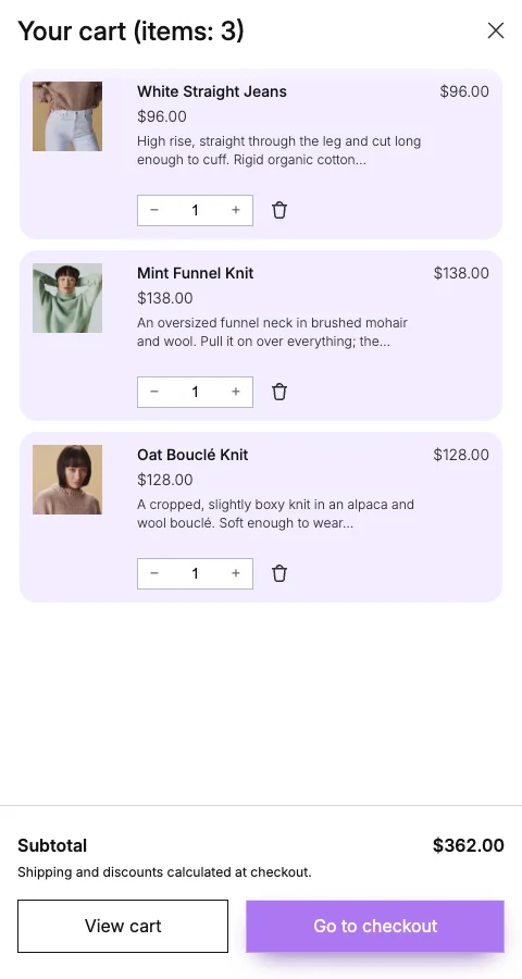
Go to checkout with Liquid glass, in the drawer on the demo store.
Good to know
Before you turn one on
- The glow ring and the liquid glass use the Effect color at the bottom of the same panel. Without one, they use the theme's text color.
- Visitors who ask their device for reduced motion see the plain button in place of the liquid glass.
- The lock icon is only on Place Order, on the checkout.