
Where to find it
Select a Social Icons block in any page, post or template, like your footer, then pick a Look in the Purplish panel. You'll see it in the editor as you pick.
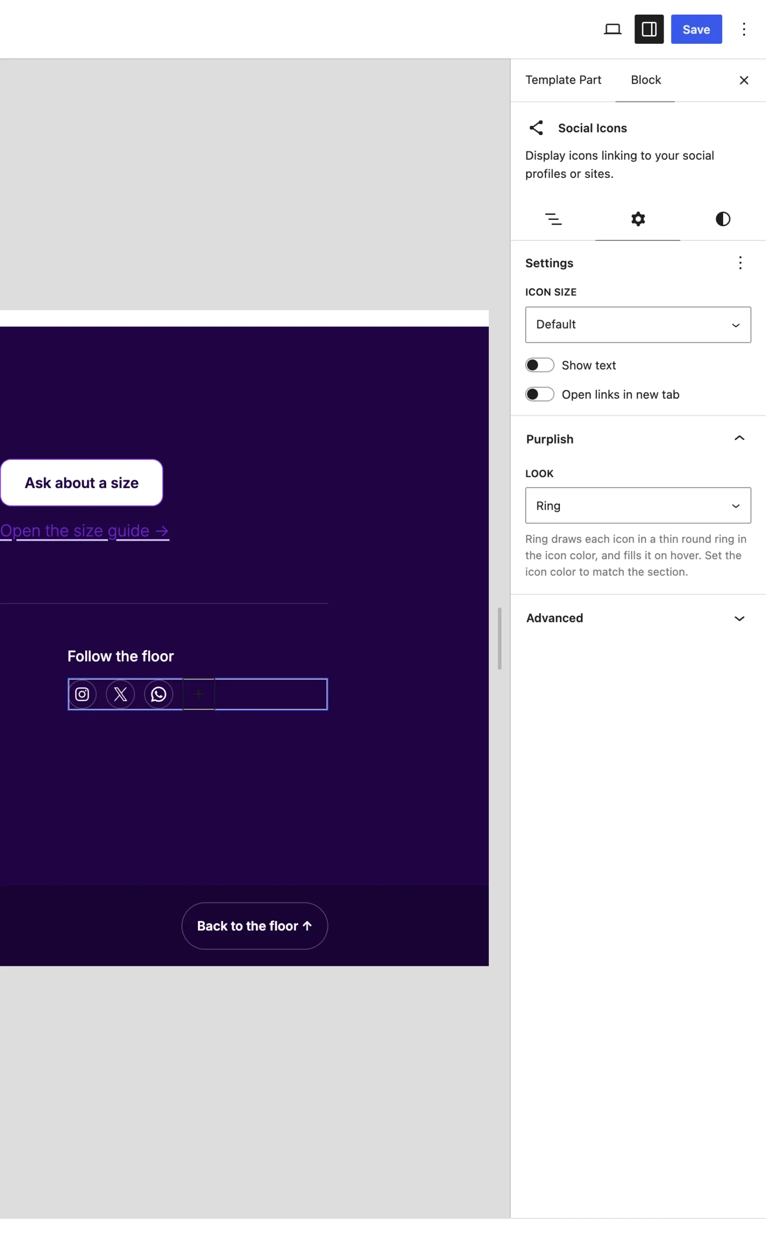
The Purplish panel on the Social Icons block.
The choices
It starts on None.
| Choice | What it does |
|---|---|
| None Default | Keeps the icons as your theme draws them. |
| Ring | Each icon sits in a thin round ring in the icon color. On hover the ring fills softly. |
Good to know
Before you pick one
- Ring draws in the icon color, so set Icon color in the block's Styles to match the section. Left on white, the icons can vanish on a light background.
- Each ring is about 44px at the normal size, a comfortable tap target.
- Touch screens show the ring with no hover fill.
- The Flagship footer pattern uses it.