
Where to find it
Open the template with your product cards, like Appearance, Editor, Templates, Product Catalog. Add a Color Dots block inside the Product Template of a Product Collection block, from the Purplish group of the block inserter. Select it, then pick Swap the photo and a Swap motion in the Colors panel of the block sidebar.
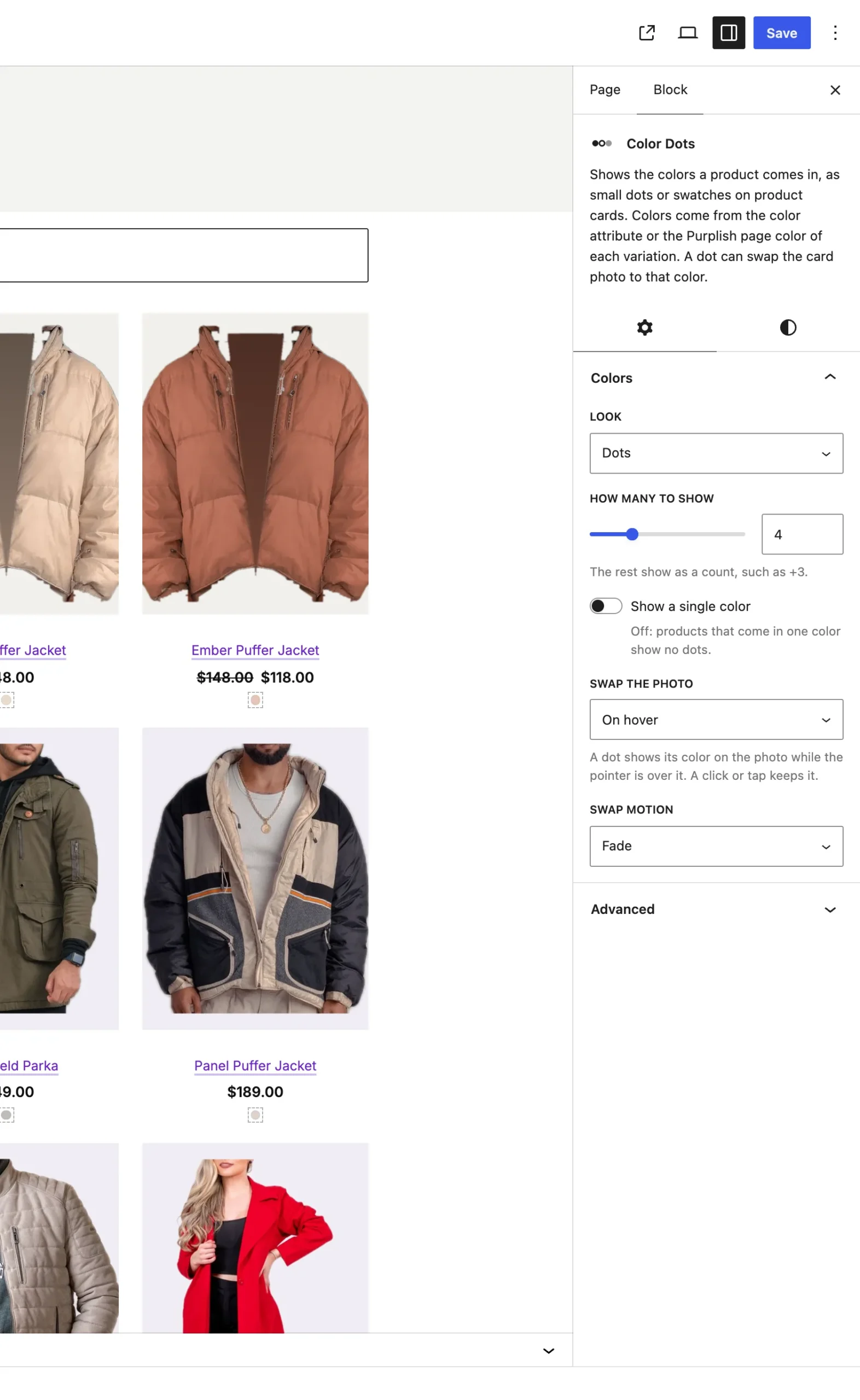
Swap motion shows once Swap the photo is on.
The choices
It starts on Off.
| Choice | What it does |
|---|---|
| Off Default | The dots only show the colors. |
| On hover | A dot shows its color on the photo while the mouse is over it. A click or tap keeps it. |
| On tap | Only a click, tap or Enter on a dot shows its color on the photo. |
Swap motion:
| Choice | What it does |
|---|---|
| Fade Default | The new photo fades in. |
| Wipe | The old photo wipes away upward. |
| Slide | The old photo slides out to the left and the new one comes in from the right. |
Good to know
- Each color uses its first variation photo that isn't the main photo. A color without one shows the main photo, and a product with none gets plain dots.
- Click the chosen dot again to go back to the main photo.
- While a color shows, the photo's alt text adds the color name, like Long Coat, Grey.
- It needs the Product Image block on the card, and it works on cards that Load more or a filter brings in.
- Visitors who ask their device for reduced motion see the photo swap at once.