
Where to find it
Add an Escalator block from the Purplish group of the block inserter, on any page, post or template. Select it, then open the Tile look panel in the block sidebar.
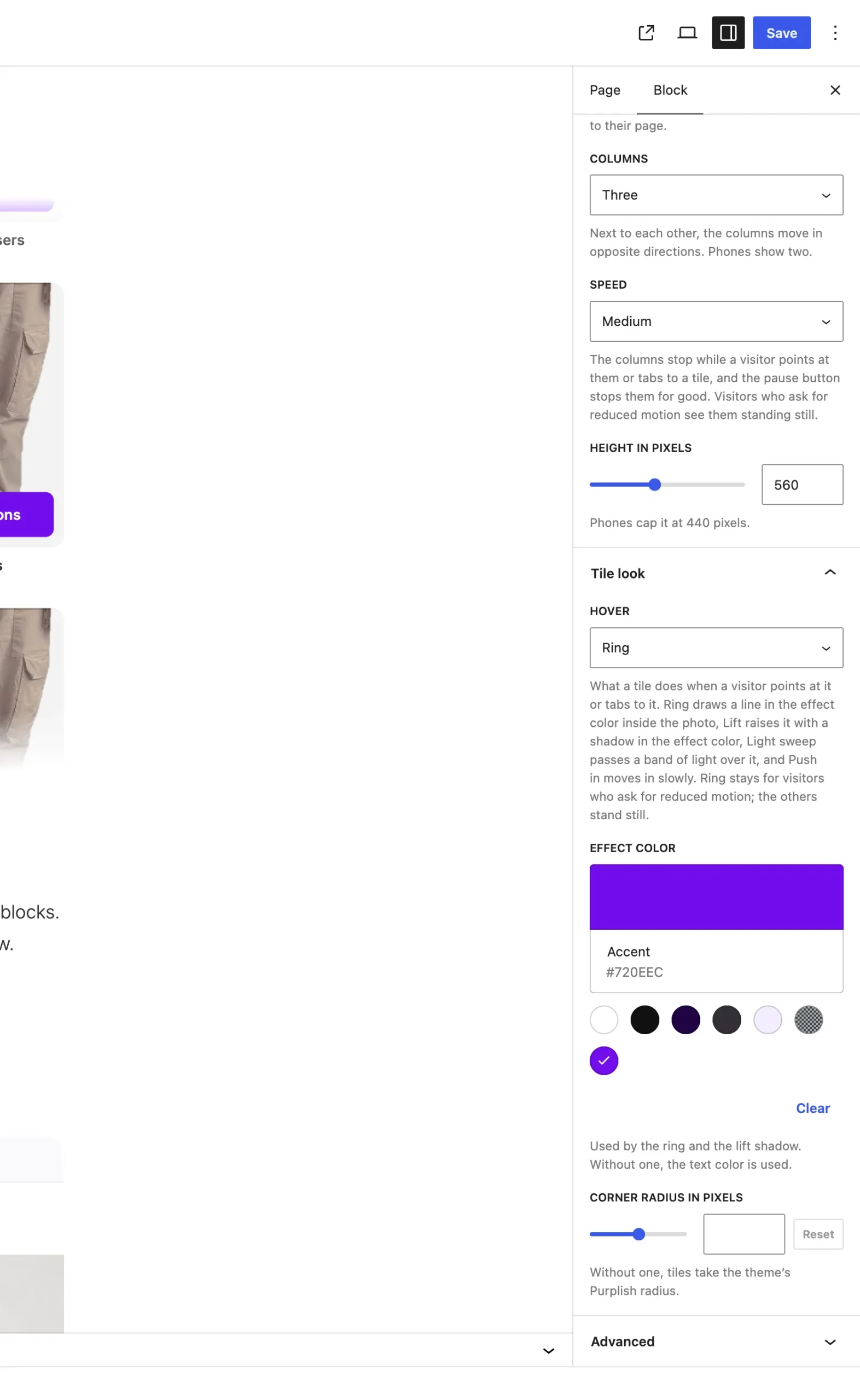
Tile look sits under the Escalator panel.
Hover
It starts on None. A tile plays its look when a visitor points at it or tabs to it.
| Choice | What it does |
|---|---|
| None Default | The tile stays as it is. |
| Ring | Draws a line in the effect color inside the photo. |
| Lift | Raises the tile with a shadow in the effect color. |
| Light sweep | Passes a band of light over the photo. |
| Push in | The photo moves in slowly. |
More settings:
| Choice | What it does |
|---|---|
| Effect color | Used by the ring and the lift shadow. Without one, the text color is used. |
| Corner radius in pixels | 0 to 48. Without one, tiles take the theme's Purplish radius, or 12px. |
Good to know
- Ring stays for visitors who ask for reduced motion. The other looks stand still for them.
- Touch screens don't get the hover looks.
- The Filled add to cart button uses the same effect color.